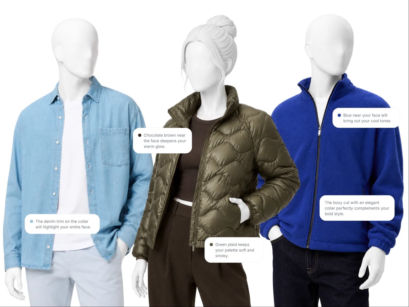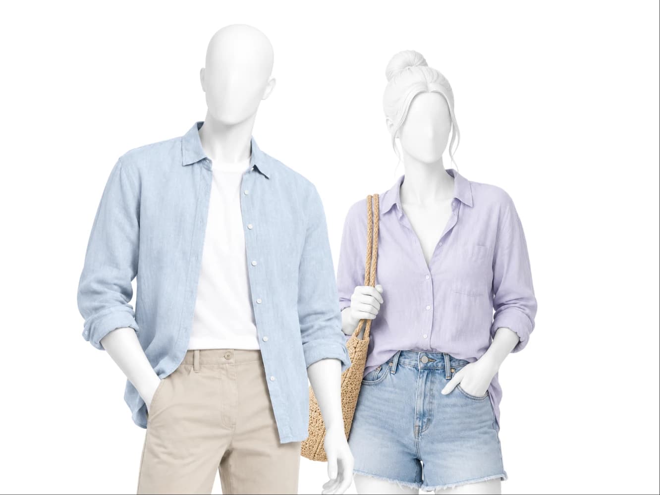
Light Summer is the lightest cool season in the 12 season system, sitting between Light Spring and Soft Summer. The palette runs on periwinkle, soft rose, lavender and dusty blue, all soft and all low in contrast. Soft white replaces optic white, silver replaces gold, and camel is allowed below the waist only.
Am I a Light Summer?
Light Summer coloring is light on the surface and cool underneath. The signals: ash blonde or light ashy brown hair with no gold in it, veins that read blue or purple at the wrist, eyes that look soft at the rim rather than sharply outlined, and photographs where hair, skin and eyes sit close together in brightness instead of splitting apart. The quick check is the wrist. Silver looks clean and correct against Light Summer skin, while gold looks slightly yellow and slightly borrowed. If your coloring gets described as delicate rather than striking, Light Summer is the likely read.
What Light Summer actually means
Four measurements define a season, and Light Summer is the quietest combination of them.
Undertone: cool-neutral. Cool leads, with a neutral edge behind it. That neutral edge is why one or two warm-leaning items, warm greige in particular, can still work, and why Light Summer and Light Spring get mistaken for each other so often.
Value: light. Your coloring is light, so the wardrobe should be. Heavy pieces do not add authority to a Light Summer, they add distance.
Chroma: soft. Colors need to be gentle. Every core color in this palette has a little gray in it, which is exactly what makes them sit well against you.
Contrast: low. Hair, skin and eyes are close together in brightness, so an outfit that splits hard into light and dark draws a line your face cannot match.
Your core colors
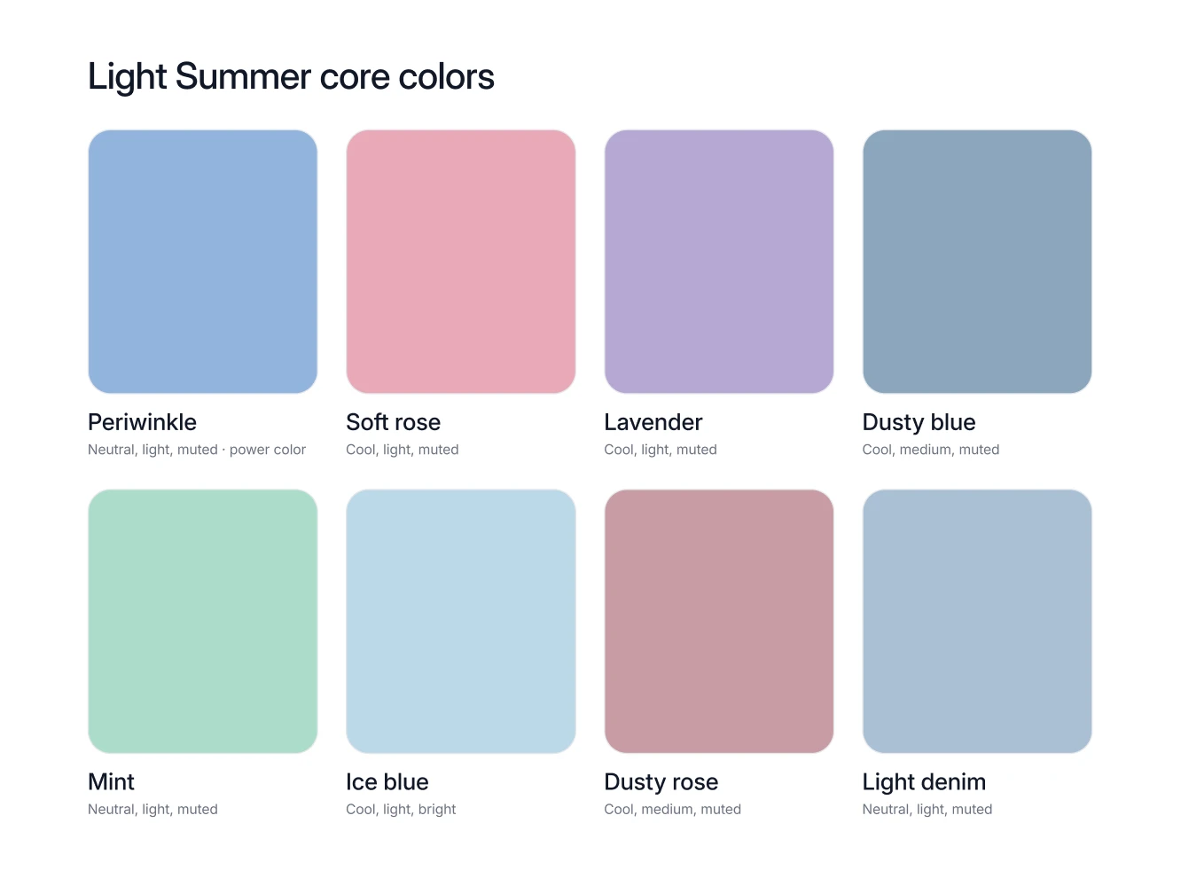
Eight colors carry a Light Summer wardrobe, and none of them shout.
Periwinkle. The power color, and the one to put near the face: a knit, a shirt, a scarf at the collar.
Soft rose. The everyday warmth of the palette, easiest as a blouse, a tee or a lipstick.
Lavender. The color that reads gentle without going pale, best in a knit or a summer dress.
Dusty blue. A core color and a neutral at the same time, which makes it the most useful shirt in the wardrobe.
Mint. The one fresh green here, and it works best in warm months, in a shirt or a light knit.
Ice blue. The cool light that stands in for white when white feels too plain, especially in a summer shirt.
Dusty rose. Soft rose with more gray in it, and the better choice for a full garment like a coat or a dress.
Light denim. A real color in this palette rather than a weekend default, and it pairs with every other core color here.
Your neutrals, your white, your metal
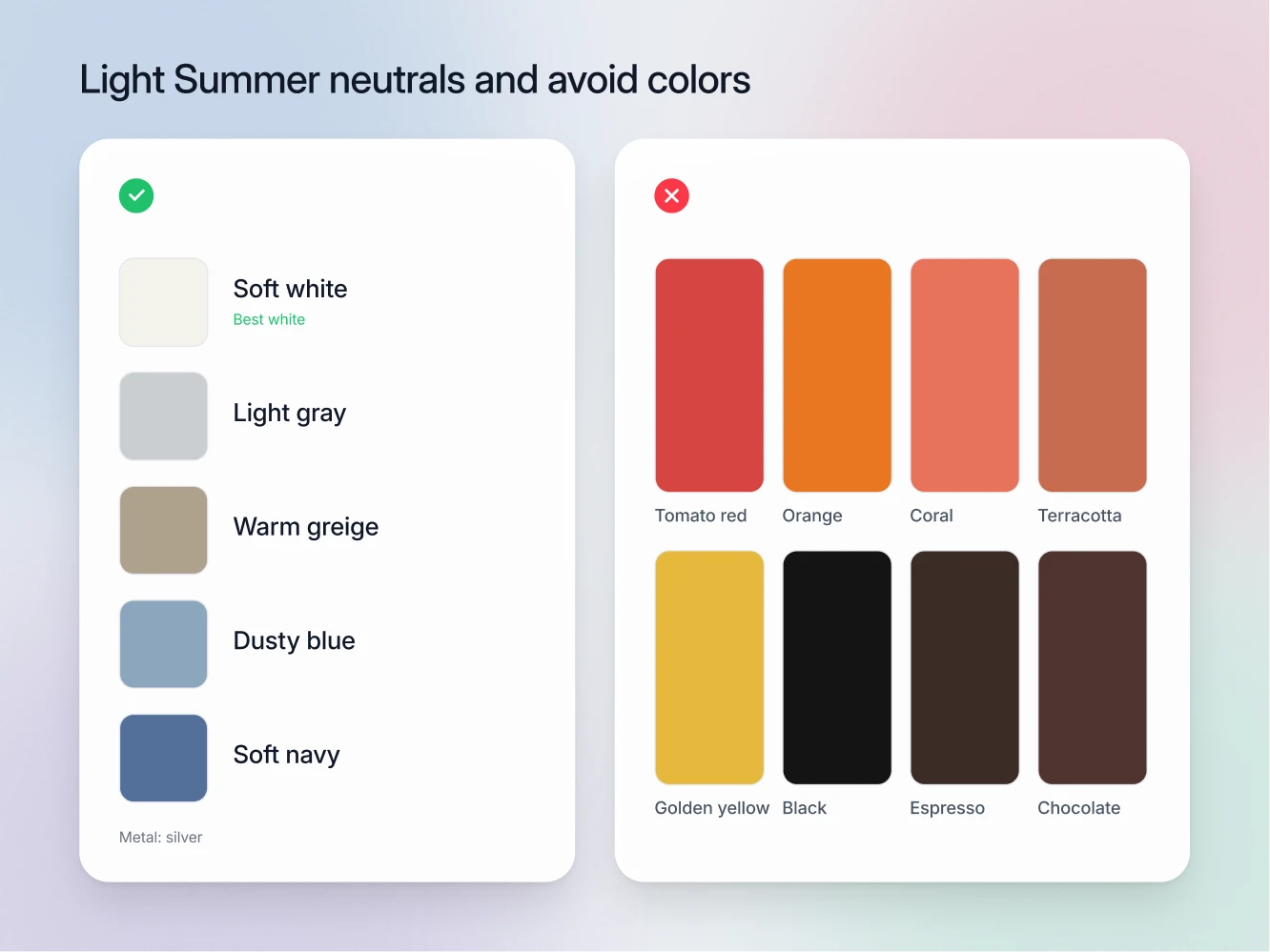
The neutrals: soft white, light gray, warm greige, dusty blue and soft navy. Light gray does the work that black does in other wardrobes, and soft navy is as dark as this palette goes. Warm greige is the one warm-leaning neutral on the list, and it comes with a placement spec: buy it as trousers and coats, and let soft white or light gray take the shirt at the collar.
The white: soft white. Soft white is the Light Summer white, and optic white is the one that fails. Optic white is brighter and harder than anything in your own coloring, so it wins the comparison outright: the shirt becomes the lit object in the photograph and your face drops back behind it, a full step duller than it actually is. Ivory fails from the other direction, going yellow against cool skin. Soft white is bright enough to read as white and quiet enough to lose to your face, which is the entire job.
The metal: silver. Silver, steel and white gold, in the watch, the buckle, the buttons and the frames. Gold reads warm and slightly heavy against cool-neutral skin, and once every metal in an outfit agrees, the whole thing looks considered instead of accumulated.
The colors that fight you
Warm saturated colors: tomato red, orange, coral, terracotta, golden yellow. These are warm and strong at once, so they contradict your undertone and out-shout your chroma in the same move. Coral is the sharpest example, because it belongs to Light Spring, the season most often confused with this one.
Heavy dark layers: black, charcoal, espresso, chocolate, midnight blue. A dark coat or a dark knit next to a light face puts all the weight in the wrong place. The eye goes to the garment and your face becomes the pale thing above it. Soft navy is the substitute, and light gray covers most of the rest.
High contrast pairings. This one is about combinations, not single colors. Soft white with black, or ice blue with charcoal, creates a jump in brightness that Light Summer coloring has no equivalent for, so the outfit looks graphic and the person in it looks faded.
The pattern is consistent. Light Summer is rarely made to look bad by a color. It is made to disappear behind one.
How to combine them
Work tone on tone in cool lights. Periwinkle knit, soft white shirt, light gray trousers. Dusty blue shirt with light denim. Everything stays in the same brightness band, which is what keeps your face at the top of the picture.
Keep contrast low on purpose. If two pieces in an outfit are more than a step apart in brightness, put something in between: light gray between soft white and soft navy does exactly that.
Camel below the waist only. Camel is warm, so it belongs in trousers, a skirt, boots or a bag. Camel in a coat or a knit near the face pulls your undertone the wrong way.
Let soft rose or lavender do the accenting. This palette has no loud accent, and it does not need one. The accent in a Light Summer outfit is a slightly warmer or slightly deeper version of what you already have on.
Seasons Light Summer gets confused with
Soft Summer. The most common mix-up inside the Summer family, because both are cool-leaning and both are soft. The tell is what light neutrals do. Hold soft white and light gray up to your face: on a Light Summer they lift the whole picture, and on a Soft Summer the same lights look thin and the face asks for more weight to sit against.
Light Spring. The other frequent confusion, since both seasons are light, both are low contrast, and both palettes contain periwinkle, warm greige and soft navy. Neither of those shared colors settles it. Metal and white do: Light Spring wants gold and ivory, Light Summer wants silver and soft white. Coral finishes the argument, since coral is a Light Spring core color and does not appear in your palette at all.
FAQ
No. Black is on the Light Summer avoid list. It brings a level of darkness your coloring never reaches, so the contrast lands on the clothes rather than on you. Soft navy for formal, light gray for everything else.
On the palette, as a below-the-waist color. Camel trousers, a camel skirt, camel boots and a camel bag are all good buys. Above the waist the palette has stronger answers, so light gray or warm greige takes the coat and the knit.
Light denim is a core color, so buy the lighter washes rather than the dark ones. It behaves like a neutral and pairs with periwinkle, soft rose and mint without any thought.
A soft white shirt in place of the optic white one. Nothing else in the wardrobe gets worn as often or photographed as often, so one swap keeps paying out every week for years.
Your undertone stays cool-neutral, so the palette holds. Gray hair usually lowers contrast further, which makes soft white, light gray and periwinkle more useful than they already were.