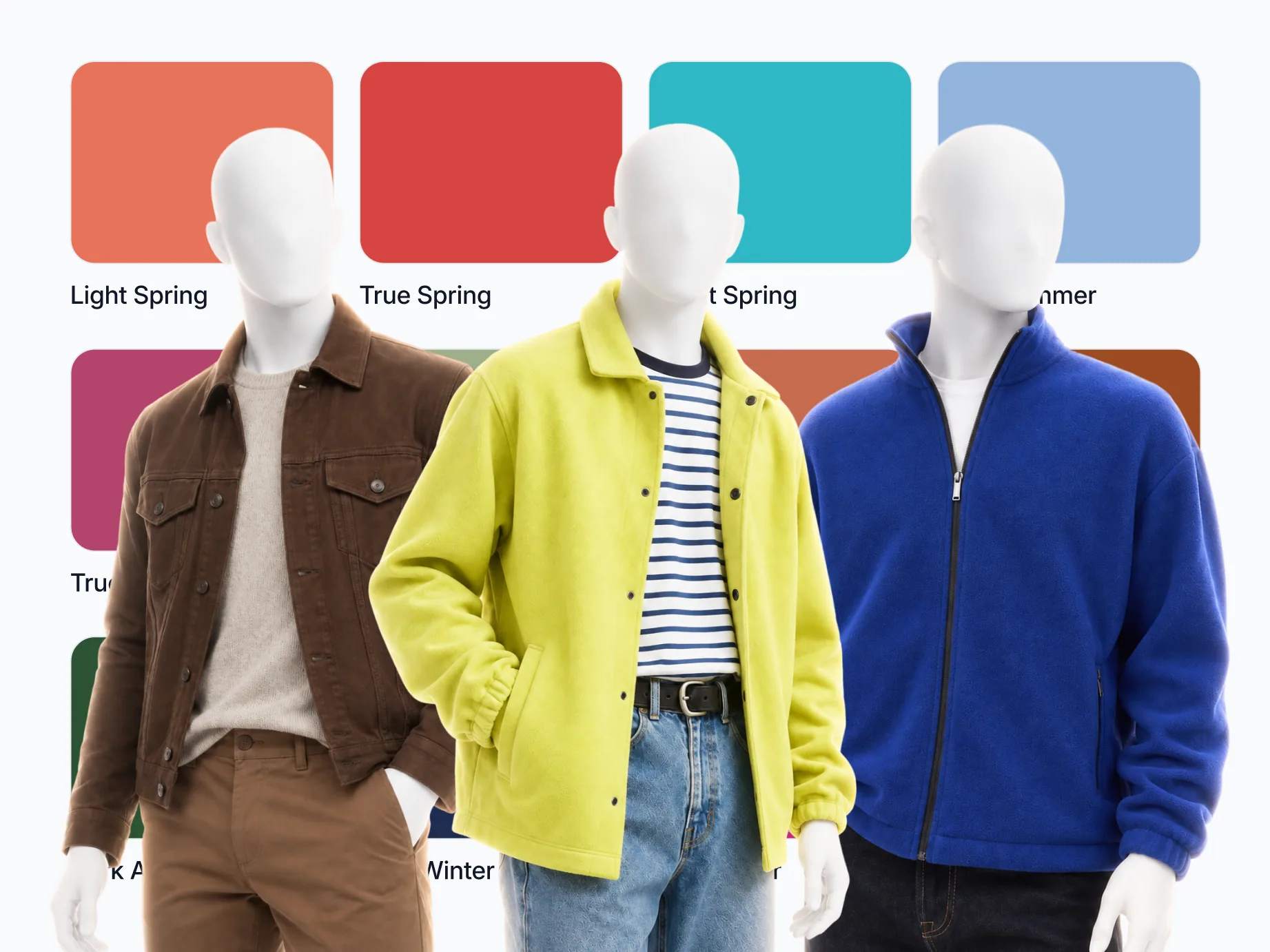
Seasonal color analysis sorts your natural coloring, your skin, hair and eyes, into a season by three qualities: undertone (warm or cool), value (light or dark) and chroma (bright or muted). The modern version has 12 seasons, and each comes with a palette that makes your face look clearer and more rested, plus a list of colors that make it look tired.
On this page
Some colors make you look awake. Others make you look like you slept badly and skipped breakfast. Same face, different shirt. The season is the system's way of saying which colors do which for you, and why.
It isn't a personality quiz, and it isn't about the colors you like. It's about the relationship between the colors you put near your face and the colors you're already made of: your skin, your hair, your eyes. Get that relationship right and you look healthier and more rested. Get it wrong and the clothes wear you.
Here's how the system actually works, where it came from, and how to get a rough read on yourself at home.
What seasonal color analysis is
The idea is old and simple. Everyone's natural coloring leans a certain way, and a specific family of colors flatters it. Analysts sort that coloring into a "season", and each season comes with a palette that makes you look your best, plus an anti-palette that drains you.
Naming people after the seasons is usually credited to Johannes Itten, the Bauhaus color teacher, whose The Art of Color (1961) matched the colors his students picked for themselves to their own coloring and grouped those types under Spring, Summer, Autumn and Winter. The four seasons went mainstream with Carole Jackson's Color Me Beautiful (1980). By July 1984 it had been on the bestseller list for "just shy of three years", with a men's book due that October.
Four seasons are useful, but blunt. Two people can both be "Winters" and still suit very different colors. Color Me Beautiful's UK company says it hit exactly that: under the four seasons it had to tell some clients that several colors in their own palette wouldn't work on them. By the late 1980s it saw the seasons running into each other, and it went on to rebuild its palettes on the Munsell color system, reading every color by one dominant characteristic and one or two secondary ones. The twelve-season system rests on the same idea: each of the four families is split three ways by the quality that leads. That's the system worth knowing, and the one we'll use here.
The three things it actually measures
Forget the season names for a second. Underneath, color analysis measures three properties of your coloring. They come from Albert Munsell's A Color Notation (1905), which describes any color by its hue, value and chroma. On a person, hue becomes undertone. Everything else is built on these.
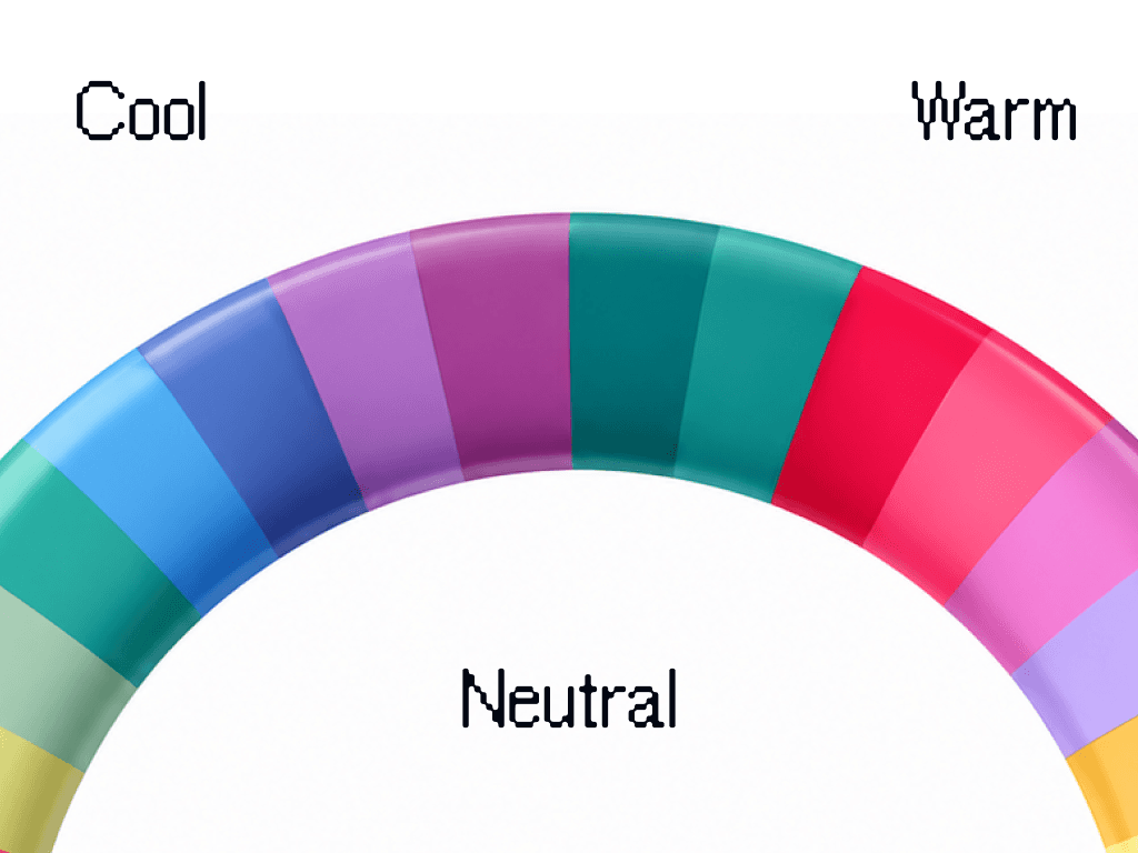
Undertone: warm, cool, or neutral. This is the big one. Warm coloring has a golden, yellow, or peachy cast. Cool coloring has a blue, pink, or ashy cast. Neutral sits in between. Undertone is why the same red can look great on your friend and turn you gray.
Value: light or deep. In Munsell's words, value "is the light of a color": simply how light or dark your overall coloring is. Pale skin with light blonde hair is light. Deep brown skin with black hair is deep. Most people land somewhere in the middle, and it decides whether soft pastels or rich darks suit you better.
Chroma: bright or muted. Munsell's definition is "the strength of a color", and on a person it's the trickiest one. Bright (or "clear") coloring can take vivid, saturated colors without being overpowered. Muted (or "soft") coloring looks best in dusty, grayed-down versions and gets washed out by anything too loud. If a bright fuchsia tee seems to walk into the room before you do, you're probably muted.
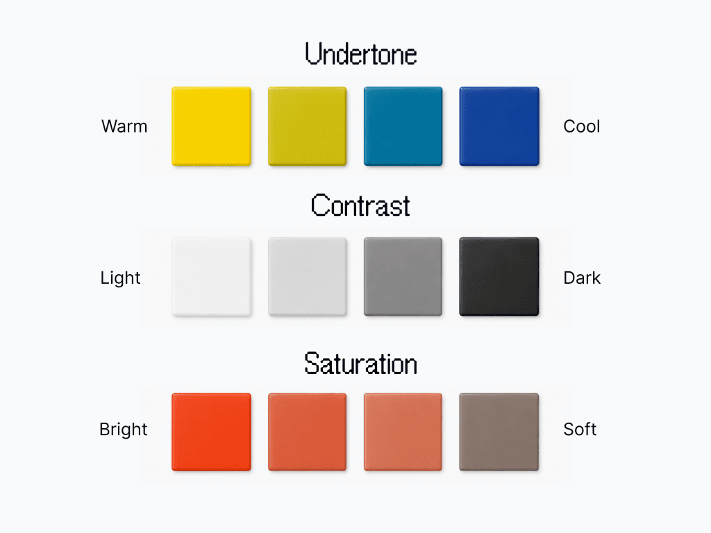
There's a practical fourth: contrast, the gap between your hair, skin, and eyes. Dark hair on fair skin is high contrast and suits high-contrast outfits. A blonde-haired, light-eyed, fair-skinned person is low contrast and looks better in soft, tonal combinations. Wear the wrong contrast level and an outfit looks off even when the colors are "right".
From three dimensions to twelve seasons
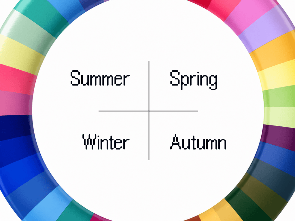
Combine undertone, value, and chroma and you land in one of four families, then one of three sub-seasons. Quick tour:
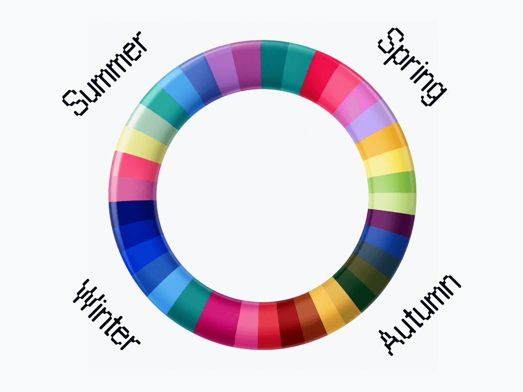
Spring (warm, light to bright). Light Spring, True Spring, Bright Spring. Clear, warm, fresh: coral, golden yellow, warm turquoise. Black is too heavy.
Summer (cool, light to muted). Light Summer, True Summer, Soft Summer. Soft and cool: dusty blue, rose, muted emerald. Orange is the enemy.
Autumn (warm, deep to muted). Soft Autumn, True Autumn, Dark Autumn. Rich and earthy: rust, olive, mustard, chocolate. Cool pastels look sickly.
Winter (cool, deep to bright). Dark Winter, True Winter, Bright Winter. Cool and high-impact: true black and white, fuchsia, emerald, royal blue. Muted, dusty tones go flat.
Each name says which quality leads. A True season is led by its temperature, fully warm or fully cool. A Light, Dark, Bright or Soft season is led by value or chroma, with warmth or coolness second, which is how The Concept Wardrobe's guide lays the twelve out too. That's why Light Spring sits next to Light Summer on the usual 12-season wheel: both are led by lightness and differ only in what comes second.
| Season | Leads with | Then | Three colors that usually suit it |
|---|---|---|---|
| Light Spring | Light | Warm | Coral, peach, light gold |
| True Spring | Warm | Bright | Tomato red, golden yellow, orange |
| Bright Spring | Bright | Warm | Bright turquoise, coral, tomato red |
| Light Summer | Light | Cool | Periwinkle, soft rose, lavender |
| True Summer | Cool | Muted | Raspberry, dusty blue, muted emerald |
| Soft Summer | Muted | Cool | Sage, dusty rose, mauve |
| Soft Autumn | Muted | Warm | Sage, khaki, camel |
| True Autumn | Warm | Muted | Rust, mustard, olive |
| Dark Autumn | Dark | Warm | Rust, forest green, espresso |
| Dark Winter | Dark | Cool | Midnight blue, burgundy, black |
| True Winter | Cool | Bright | Royal blue, true cool red, rich purple |
| Bright Winter | Bright | Cool | Fuchsia, emerald, ice blue |
Names vary between schools. True Spring and True Autumn are also called Warm Spring and Warm Autumn, True Summer and True Winter are Cool Summer and Cool Winter, Bright is Clear in some systems, and Deep Autumn and Deep Winter, which Wearly Labs calls Dark Autumn and Dark Winter, are the same two seasons under another name.
Twelve buckets, and you sit in one. The skill is working out which.
How to get a rough read at home
You can't do a full analysis on yourself in a mirror, but you can get close enough to stop making expensive mistakes. A few honest tests:
- Veins. Look at the inside of your wrist in daylight. Green-ish veins lean warm, blue or purple lean cool, a mix is neutral. A quick first signal, never a decider on its own (the undertone tests in full).
- Gold vs silver. Hold a gold item near your face, then a silver one. One usually makes your skin look healthier and the other makes it look tired. Gold flatters warm, silver flatters cool.
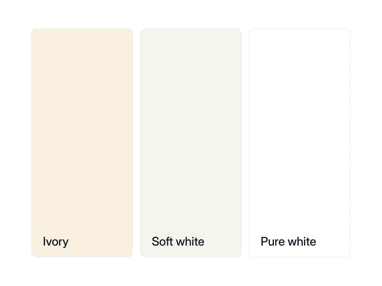
- White vs cream. Same trick with a pure white t-shirt and a cream one. If white looks crisp and cream looks dingy, you lean cool. If cream looks soft and white looks harsh, you lean warm. In the sample analysis, a Dark Autumn, ivory is the white for the collar and pure white goes below the waist: "Clean and bright, but with none of the warmth your face needs."
- Black and white selfie. Take a daylight photo of your face and switch it to black and white. If your hair, skin and eyes turn into clearly different grays, your contrast is high. If they melt into one soft band, it's low. With the color gone, undertone drops out and only value is left.
- One quality at a time. Hold two colors at your chin that differ mainly in one quality: raspberry against rust for cool or warm, royal blue against dusty blue for bright or muted. The one that makes your skin look even and your eyes clear tells you your side of that axis.
- Sun. How easily you burn or tan says more about depth than about undertone: fair skin can be warm, and skin that tans fast can be cool. Read it as a value clue, not a warm or cool one.
Do these in real daylight, near a window, no makeup, no filter. And don't trust a single test. They point in a direction, they don't hand down a verdict.
Why your mirror and your camera lie
Here's the catch that trips up almost everyone: lighting changes color completely. Warm bulbs make everyone look warmer. Cool office lights make everyone look paler. Your phone then "corrects" the white balance and changes it again. That's how the same person gets typed as three different seasons in three different photos.
It's also why a careful analysis never trusts a photo on its own. The good ones weight what you know about yourself, your natural hair color, your veins, how gold and silver sit on you, above whatever the camera captured, and correct for the light the photo was shot in. Wearly Labs does the second part with a plain white sheet of paper held in one photo: it's the one thing in frame whose color is known, so the light can be corrected before your skin is read (how to take the photos). A photo is evidence. Your coloring is the truth.
You can see that order at work in the sample analysis, the real result of co-founder Filip Poláček. His photos on their own pointed to True Autumn. His answers settled it as Dark Autumn, and his page names True Autumn as the closest season, so anything both seasons accept is a safe buy.
The mistakes that throw people off
- Going by eye color alone. Eyes are a clue, not the answer. Two people with blue eyes can be opposite seasons.
- Forgetting dyed hair. This is about your natural coloring. If your hair is dyed, work from your roots or your natural shade.
- Testing with a tan. A summer tan can flip your apparent depth. Use your untanned baseline.
- Confusing "colors I love" with "colors that suit me". You can adore mustard and still look ill in it. The good news: there's almost always a version of any color, lighter, deeper, warmer, cooler, that works for you.
Why bother
Two reasons, both practical. First, money: once you know your palette, you stop buying the things that hang in your closet unworn because "something about them is off". Second, time: getting dressed gets faster when most of what you own already works together and works on you. You're not styling around a mistake every morning.
It's a small bit of self-knowledge that pays off every time you shop and every time you get dressed. Good trade.
Want yours done properly?
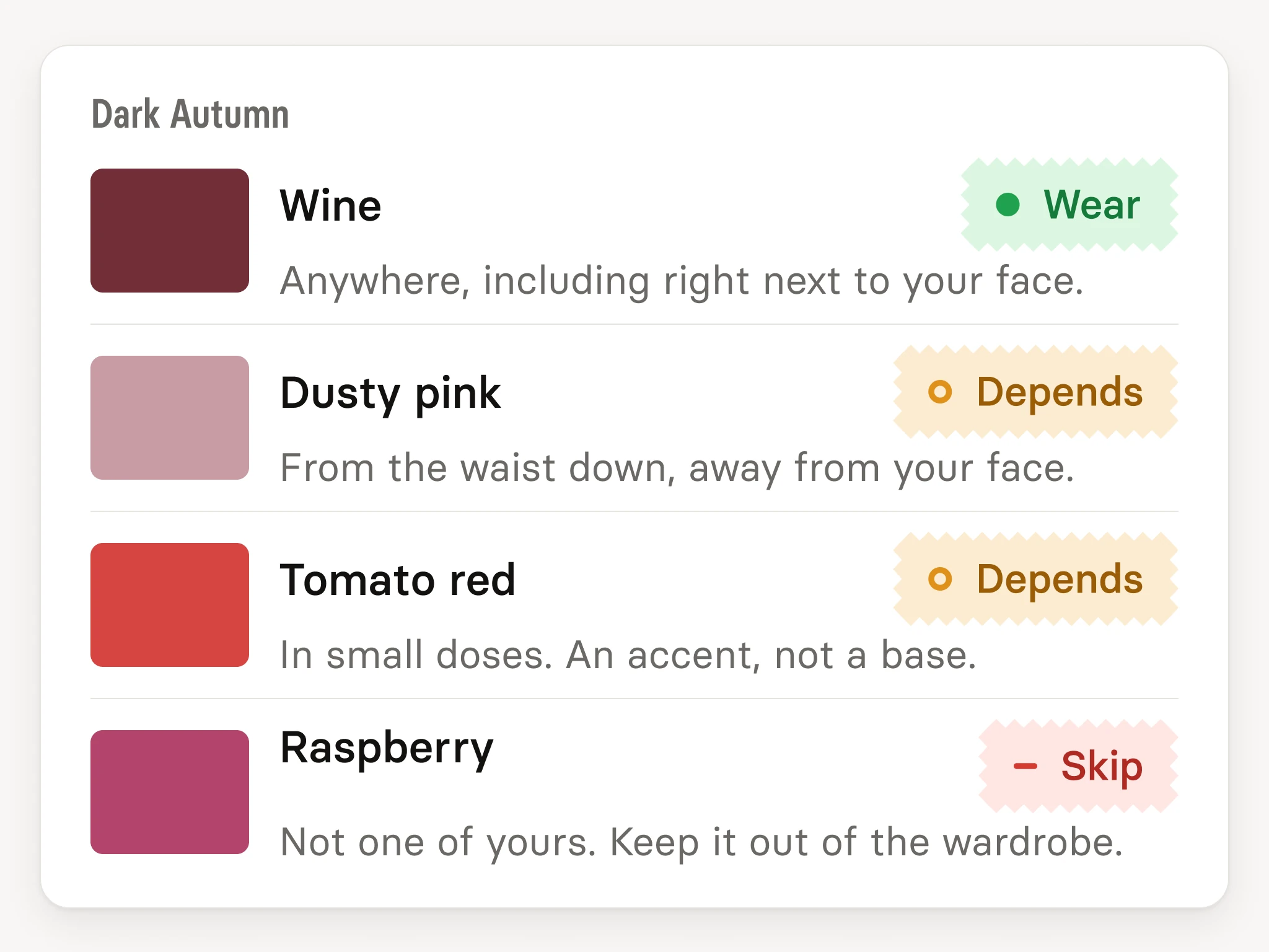
The at-home tests get you a direction. If you want your exact season, a verdict on every color, and the cuts that go with your body shape, without guessing in front of a window, that's what Wearly Labs does. Each of 50 colors gets Wear, Depends or Skip with its reason, and Depends tells you where the color goes: below the waist, or as an accent only. Five photos, one of them with a white sheet of paper, and a short questionnaire, $29 once. The key to your page arrives by email, usually within 10 minutes. Start your analysis
FAQ
Not really. Your undertone is fixed, and the season is built on it. Graying hair or skin changing with age can shift your value and contrast, so a re-check every several years isn't a bad idea, but you don't swap from Winter to Spring.
The 12-season system splits each of the four families into three by the quality that leads, so a Winter becomes a Dark, True or Bright Winter. Two people who were both "Winters" under four seasons can suit different colors, and twelve gives each of them a palette of their own.
Partly. The three qualities it reads are the ones Albert Munsell used to describe any color in 1905, and the effect of a color held near your face is something you can check in a mirror. The seasons are a naming convention on top of that, and schools draw the borders differently: Color Me Beautiful's UK company has moved from the four seasons to a tonal system of its own.
Same thing. "Color analysis" is the umbrella; the seasonal system (4 or 12 seasons) is the most common way to do it.
Yes. Coloring doesn't care about gender, and Carole Jackson followed Color Me Beautiful with a book for men in 1984. The palette is the palette; only the styling around it changes. More in color analysis for men.
Yes, when it reads undertone, value and chroma rather than sorting people into a short list of skin tones. Deep skin can be warm or cool, bright or muted, like any other. What fails more often is the photo: a warm bulb or a phone's white balance shifts anyone's skin, which is why the light has to be corrected.
Usually not very. Most rely on you self-assessing chroma and contrast, the exact parts beginners get wrong, and they ignore lighting entirely. Treat them as entertainment.