Soft Autumn: autumn colors with the brightness turned down
By Wearly Labs · Published · 7 min read
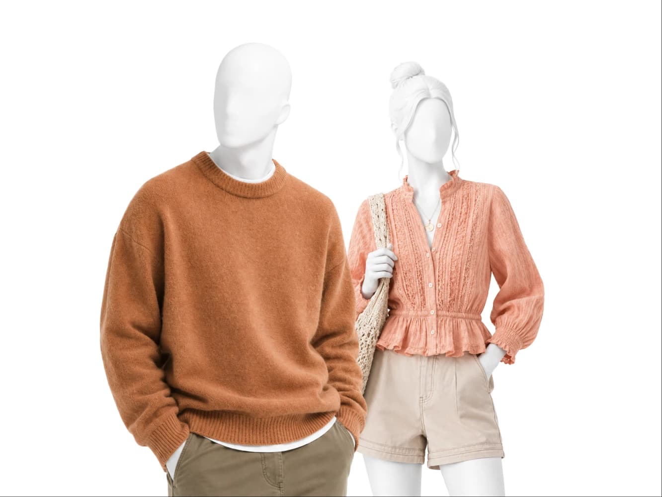
Soft Autumn is the gentlest season in the Autumn family. Undertone runs warm-neutral, value sits medium, chroma is muted, and contrast is low. Sage, terracotta, khaki, camel. The whole palette looks like autumn seen through morning haze rather than autumn in direct sun. Brightness is the enemy here, not warmth.
Am I a Soft Autumn?
Three signals, checked in daylight without makeup.
Eye clarity first. A Soft Autumn eye has soft edges. The iris blurs at conversation distance rather than resolving into sharp lines, and the color is usually a mixed hazel, soft green, or muted brown rather than anything vivid. Veins second. Turn your wrist to the window. Soft Autumn veins read green, or a mix of green and blue, which is what warm-neutral looks like from the outside. Coloring third, and this is the one people recognize instantly. Soft Autumn coloring is warm but dusty. There is gold in it, but the gold is dimmed, never polished.
The confirming test is easy. Hold khaki under your chin, then hold an icy pastel. Khaki should give your face shape. The icy pastel should make you look drained and slightly gray. That result is Soft Autumn.
What Soft Autumn actually means
Undertone: warm-neutral. Warm leaning, but not absolutely warm. That neutral tolerance is why sage sits comfortably in this palette next to terracotta.
Value: medium. Nothing here is pale and nothing here is deep. Your natural coloring sits in the middle band, which is why camel and khaki feel like home and very dark neutrals feel borrowed.
Chroma: muted. Every Soft Autumn color is a softened version of itself. Muted rust rather than rust at full strength. Muted terracotta rather than a fired clay pot.
Contrast: low. Your hair, skin, and eyes sit close together in depth. Outfits built on a big light to dark jump will read as the outfit doing the work while your face waits behind it.
Your core colors
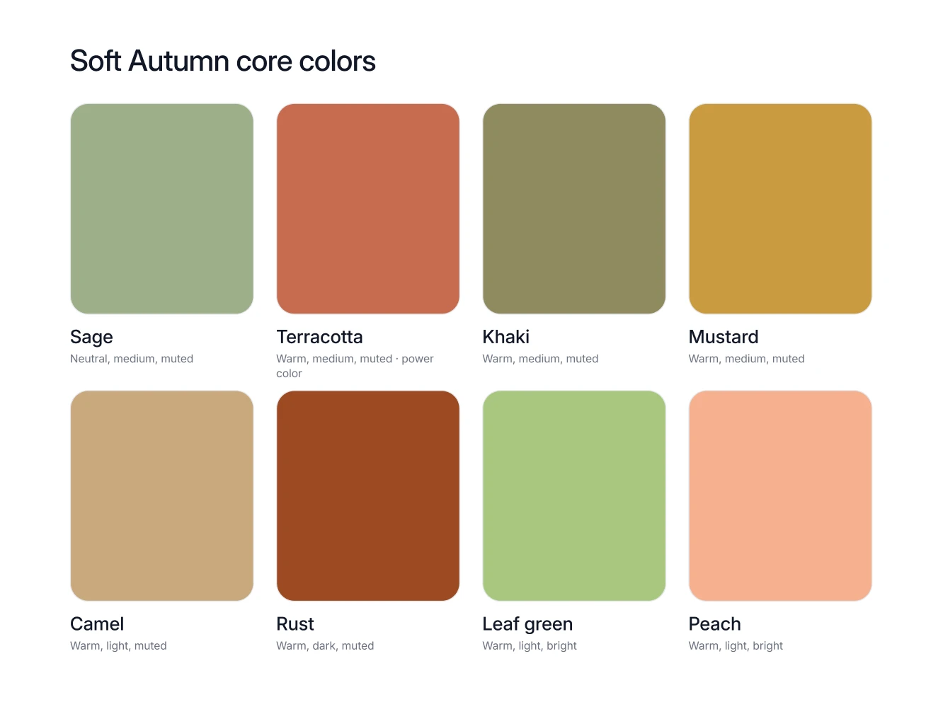
Sage. The most useful color in the season. A sage knit, a sage shirt, a sage overshirt, all of it sits happily against khaki and latte.
Terracotta. Your near-the-face color and the source of your power color. A terracotta scarf or top gives your skin warmth without turning orange on you.
Khaki. Not only trousers. A khaki shirt, a khaki jacket, a khaki dress. Khaki is doing double duty as color and neutral in this palette.
Mustard. The one that surprises people. A mustard knit over khaki reads rich rather than loud, because both are already muted.
Camel. The coat color. A camel coat over ivory and chocolate is the cleanest Soft Autumn outfit there is.
Muted rust. Autumn without the shout. Wear it as a sweater or a dress. Note the word muted, since rust at full strength belongs to True Autumn, not here.
Leaf green. Your deeper green, best in a jacket, a knit, or trousers. It anchors an outfit the way navy does in cooler seasons.
Peach. The lightest warm thing that suits you, and a genuine Soft Autumn color. Keep it matte and keep it near the face.
Your neutrals, your white, your metal
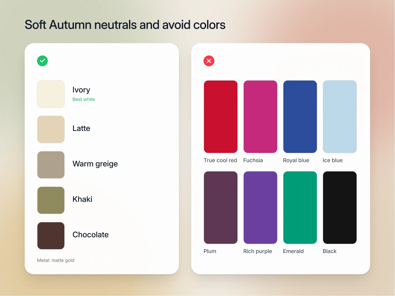
Soft Autumn neutrals are ivory, latte, warm greige, khaki, and chocolate for bottoms. That last note matters. Chocolate is deep enough to break your low contrast if you put it at your collar, so it earns its place below the waist, where it grounds an outfit without competing with your face.
Your white is ivory, and optic white is the white that fails you. Optic white is colder and brighter than anything in warm-neutral muted coloring, so the skin next to it looks tired and the outfit picks up a hard edge of contrast your face has no way to answer. Soft white, the correct white for the Summer seasons, is closer but still slightly cold. Ivory has the warmth your undertone already contains, so it disappears into the outfit and lets your face come forward. If your white shirts are optic white, replace one and watch what happens.
Your metal is matte gold. Matte, not polished. Polished gold introduces a hard shine that behaves like high chroma, and high chroma is exactly what a muted season cannot carry. Brushed gold, antique gold, and warm bronze all belong here.
The colors that fight you
The Soft Autumn avoid list is short to state and wide in practice: bright cool colors, icy pastels, and anything at full saturation.
Bright cool colors fail on two counts at once. They are cool, which contradicts your warm-neutral undertone, and they are bright, which contradicts your muted chroma. That double mismatch is why a color can look wonderful on the hanger and hostile the moment it reaches your jaw.
Icy pastels fail on value and temperature together. They sit far lighter than your medium coloring and they carry a cold cast, so they wash you out from above while draining warmth from your skin at the same time.
Anything at full saturation fails on strength. Your coloring is muted, so a pure color will always be the loudest thing in the frame. The garment reads first, your face reads second, and that order is backwards. This applies even to colors from your own family. Rust at full intensity is a True Autumn color. Muted rust is yours.
How to combine them
The rule is warm grayed layers at low contrast, with no bright cools in the frame.
Layer within a narrow value band and let the warmth carry the outfit. Sage overshirt, ivory tee, khaki trousers. Camel coat, latte knit, chocolate trousers. Mustard sweater, warm greige trousers, matte gold at the wrist. Every one of those is three warm muted pieces with almost no light to dark jump, which is exactly what low contrast dressing looks like when it is done on purpose.
When you want a focal point, use muted terracotta as your power color and put it at the top. Muted terracotta with khaki and ivory is a complete look, and it will get more comments than any bright color ever did. If an outfit feels flat, do not raise the brightness. Raise the texture instead. Suede, brushed wool, and raw linen add interest to a Soft Autumn without touching chroma.
Seasons this one gets confused with
Soft Summer. Both are muted, both are low contrast, both sit at medium value, and this is the single most common confusion in the twelve season system. The tell is your white. Soft Autumn looks correct in ivory and slightly grubby in soft white. Soft Summer is the reverse. Peach settles it too, since peach is a Soft Autumn core color and sits on the Soft Summer avoid list.
True Autumn. Same family, same warmth, so undertone tells you nothing. The tell is intensity. True Autumn takes rust and golden yellow at full richness and grows into them. Soft Autumn needs the same colors dialed down, which is why your power color is muted terracotta rather than rust. Hold full strength rust at your jaw. If it takes over, you are Soft Autumn.
FAQ
Is Soft Autumn warm or neutral?
Warm-neutral. It leans warm, which is why matte gold and ivory work, but it holds enough neutrality to wear sage and warm greige comfortably.
What is the Soft Autumn power color?
Muted terracotta. Worn near the face, against khaki, ivory, or latte, it does more for this season than any other single purchase.
Can I wear chocolate near my face?
Chocolate is on the Soft Autumn palette as a below-the-waist neutral, and that placement is the spec rather than a caveat. Buy it in trousers, skirts and boots, where it grounds an outfit, and let camel, latte or ivory take the collar.
Why does bright turquoise look so wrong on me?
Because it is both cool and bright, and Soft Autumn is warm-neutral and muted. It misses on temperature and on chroma at the same time, which is the worst possible combination for this season.
Do I have to avoid all pastels?
Only the icy ones. Peach is a Soft Autumn core color and it is light. The test is not lightness, it is whether the color carries warmth and whether it has been softened.