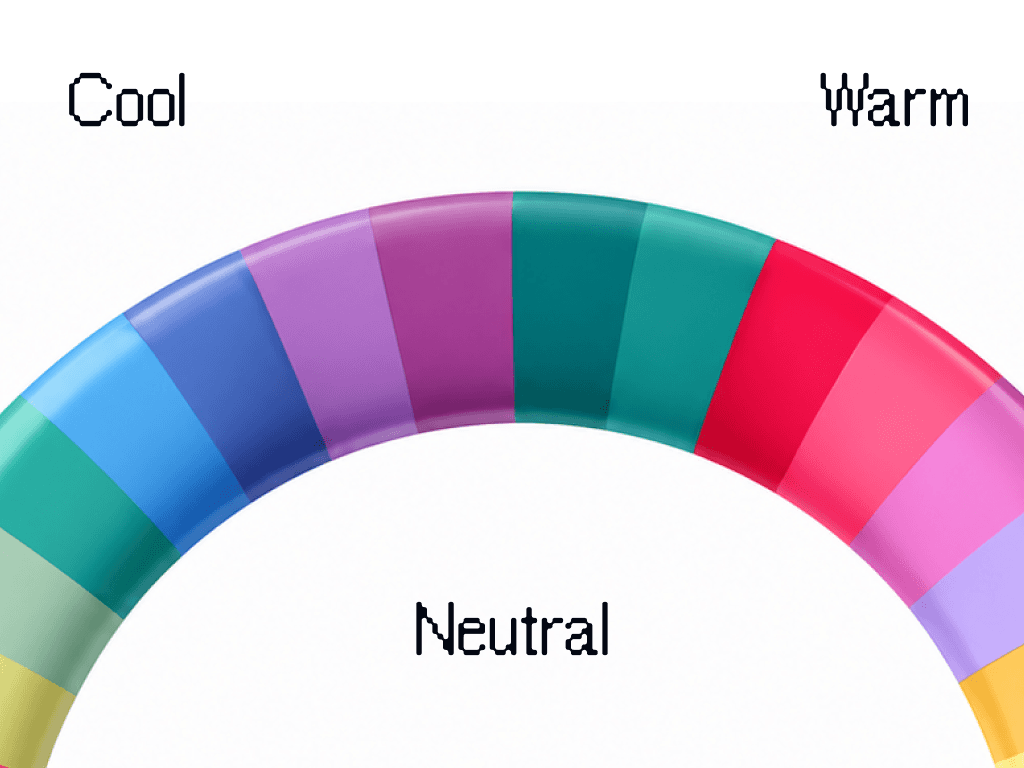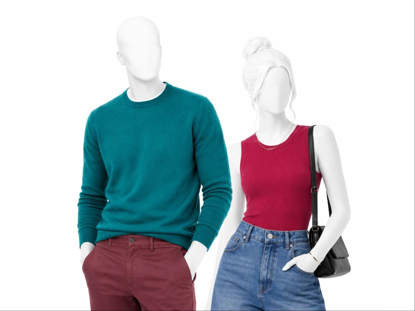
True Winter is the coldest and cleanest season in the 12 season system. The undertone is fully cool, the value runs medium to deep, the chroma is bright, and the contrast is high. The palette is royal blue, fuchsia, emerald and true cool red, worn in clean blocks against black, pure white and charcoal.
Am I a True Winter?
True Winter coloring is cool with no warm compromise in it. Veins on the inside of the wrist look blue or purple. The eyes read cool, blue, gray or a cool brown with clear definition rather than a soft golden one. And the gap between hair, skin and eyes is obvious in photographs, not subtle.
The shop test is a fuchsia top and a rust top, held one after the other. On True Winter coloring fuchsia makes the face look clearer and rust makes it look flushed and tired. If clean bright color helps you and anything warm or dusty flattens you, True Winter is the season to test first.
What True Winter actually means
Fully cool undertone. This is the strictest undertone in the system. Warm is not a matter of degree for True Winter, it is simply out.
Medium to deep value. Your palette is not restricted to the very dark end. A royal blue at medium depth is as correct on you as charcoal.
Bright chroma. Colors have to arrive at full saturation. The same shade softened or grayed off loses the effect entirely.
High contrast. You can wear the lightest and darkest things you own in one outfit and it will look composed.
Your core colors
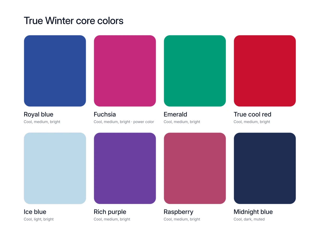
Royal blue. One of the two True Winter power colors. A royal blue knit, shirt or coat is the most reliable purchase on this list.
Fuchsia. The other power color. Wear it near the face, a top or a scarf, where the brightness reaches your skin.
Emerald. True Winter green, clean and cool. Good in knitwear and good as a dress or a shirt.
True cool red. Red with blue in it rather than orange. This is the red for coats, lipstick and anything meant to be seen.
Ice blue. The light in the palette. Ice blue works as a shirt or a summer top and reads as a pale neutral without going dusty.
Rich purple. Deeper and more saturated than lavender. Rich purple carries an outfit on its own against black.
Raspberry. The cool clean pink of the season. Keep it bright, never softened into rose.
Midnight blue. Your alternative to black, and a neutral as well as a color. Midnight blue tailoring is a True Winter staple.
Your neutrals, your white, your metal
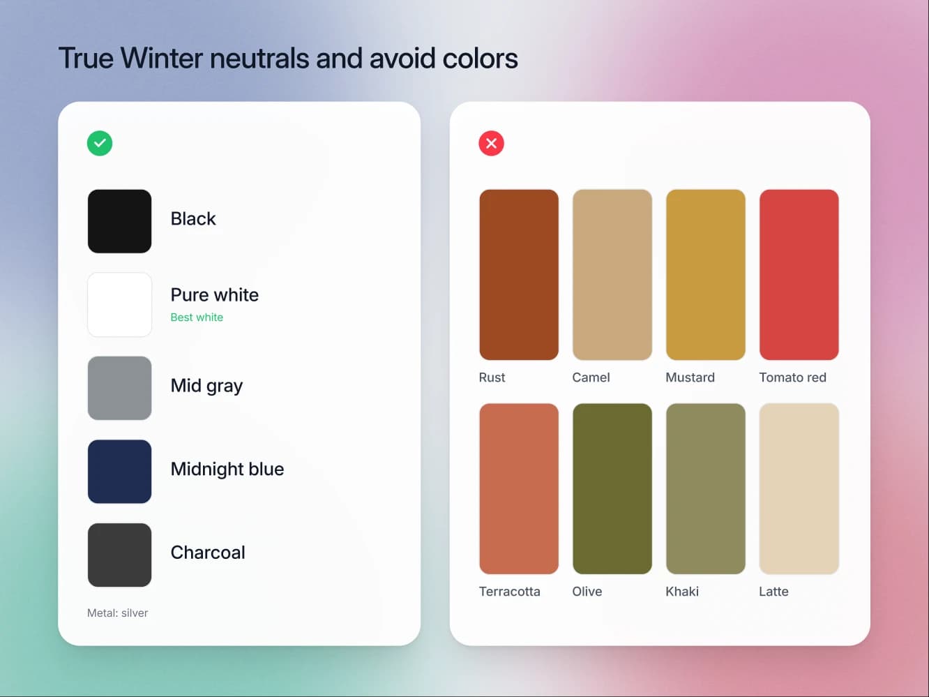
True Winter neutrals are black, pure white, mid gray, midnight blue and charcoal. There is no brown, no beige and no camel on that list, and the absence is the point.
Your white is pure white, and ivory is the white that fails you. On a palette with no warm register anywhere, ivory reads less like a shade and more like a mark on the fabric: the cream cast settles on fully cool skin as dullness and deeper shadow under the eyes, and it takes the snap out of any fuchsia or royal blue sharing the outfit. Pure white does the opposite. It makes the skin look clearer and gives your black pieces something to work against. Most people own the wrong white for years without ever suspecting the shirt is the problem.
Your metal is silver. Steel, white gold and platinum. Gold reads as a warm intrusion on a palette that has no warmth anywhere else in it.
Your power color is fuchsia or royal blue. Both do the same job. Pick whichever one you will actually wear.
The colors that fight you
True Winter has two rules, plus a short list of neutrals that slip past both of them.
Nothing warm: rust, camel, mustard, tomato red, coral, terracotta, orange and golden yellow. Any shade with an orange or golden cast fights a fully cool undertone head on. All eight put warmth right next to skin that has none, and the result is a face that looks flushed in some lights and drained in others.
Nothing muted or dusty: dusty rose, mauve, sage, dusty blue, soft rose and soft navy. True Winter runs on bright chroma. A dusty or grayed off color takes the one quality your palette depends on and removes it. The garment goes quiet, your face goes quiet with it, and the outfit looks like it has been through the wash too many times.
The neutrals bought by accident: ivory, latte, khaki, warm greige and soft white. Nobody examines a neutral, because a neutral feels like the safe purchase. Every one of these is either warm or softened, and they do their damage in the biggest pieces you own: the shirt, the coat, the trousers.
Put the rules together and you can shop from across the room. If a color looks either warm or foggy on the rail, it is not a True Winter color, whatever the label calls it.
Then use the test that only works for a season built like this one. Judge a candidate color against black rather than against your skin alone, because True Winter is one of the few palettes with black among its neutrals, so what a color does beside your darkest piece is the question that actually decides it. Hold the garment against a black sleeve in daylight. A True Winter color stays separate and keeps its own edge, which is what fuchsia, royal blue and emerald all do obviously. A warm or dusty color sinks into the black and turns into a smudge at the seam, and that is exactly what it will do at your collar.
How to combine them
True Winter dresses in clean blocks. One color, one neutral, a sharp edge between them, nothing blended. Black trousers with a fuchsia top. A pure white shirt under a midnight blue suit. Charcoal with royal blue.
Maximum contrast is allowed here, which is rarer than it sounds. Where other seasons have to narrow the gap between light and dark, True Winter is at its best when that gap is as wide as it goes. What you cannot do is dilute. One warm accessory or one dusty knit undoes the whole effect, because this palette has no muted register to absorb it.
Seasons this one gets confused with
Deep Winter. Both are cool, bright and high contrast, and both wear silver and pure white. The tell is where the work happens. Deep Winter leans on depth and its power color is cool burgundy. True Winter leans on clarity, and fuchsia or royal blue at medium depth does more for you than near black does.
Bright Winter. The closest neighbor of all. Bright Winter runs at very bright chroma and very high contrast, on a cool-neutral undertone rather than a fully cool one. The tell is lemon. Lemon is a Bright Winter core color and it is not in the True Winter palette, so if a clean lemon yellow suits you, you are probably looking at Bright Winter.
FAQ
Yes. True Winter and Cool Winter are two names for the same season.
No. Both are warm, and True Winter has no warm register at all. Charcoal, midnight blue and mid gray replace them.
Ice blue is the light color in the True Winter palette and it is a core color, so no. What does not work is a dusty or warm pastel, which loses the brightness this season runs on.
Pure white. Ivory belongs to the warm seasons, and this is the change most people notice first when they switch.
Silver. On a fully cool palette, gold is the one metal that always looks borrowed.