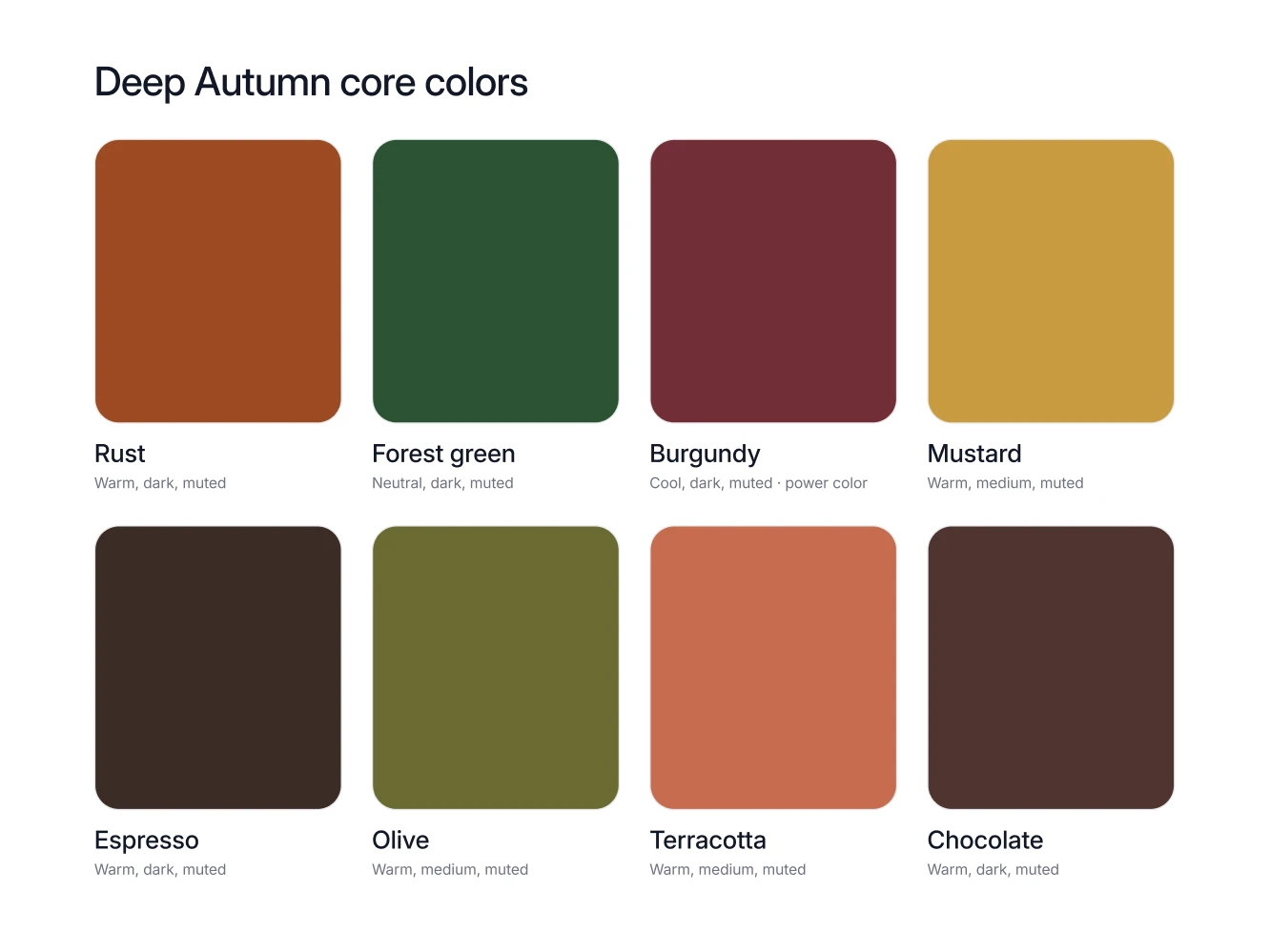
Deep Autumn is the darkest warm season in the 12 season system. The undertone is warm-neutral, the value is deep, the chroma is medium, and the contrast is high. The working palette runs on rust, forest green, mustard and espresso, and it takes ivory as its white, never a pale cool pastel.
Am I a Deep Autumn?
Deep Autumn coloring is dark and warm at the same time. Dark brown or black hair, skin with a warm cast under it, and enough distance between hair, skin and eyes that photographs of you read as high contrast rather than soft. The shop test takes ten seconds. Hold a rust knit and a forest green knit under your chin, then hold a pale icy blue. If the first two look like they were made for you and the third makes your face look tired and gray, Deep Autumn is the season to test first. Deep Autumn is never the pale end of anything. When the darkest garments you own are the ones people compliment, that is the signal.
What Deep Autumn actually means
Warm-neutral undertone. Gold sits under your skin, but not so strongly that every cool color is off limits. Midnight blue works. Icy cool colors do not.
Deep value. Value is how light or dark a color is, and yours lives at the dark end. Espresso, chocolate and forest green are your version of a neutral background.
Medium chroma. Chroma is how pure a color is. Deep Autumn wants pigment, rich and saturated, but not fluorescent. Rust, not neon orange.
High contrast. You can put two very different depths in one outfit, an ivory shirt under a chocolate coat, and it will look deliberate rather than harsh.
Your core colors
Rust. The easiest Deep Autumn purchase there is. A rust knit or a rust suede jacket carries a whole outfit without needing anything else to be interesting.
Forest green. Wear it big. A forest green overshirt, coat or shirt reads almost like a neutral, so you can build the rest of the outfit on top of it.
Burgundy on its warm edge. Deep Autumn burgundy leans warm, wine with brown in it rather than a cool berry. It works best away from cool styling, so pair it with espresso or camel and gold hardware, not with charcoal and silver.
Mustard. The one bright note in a deep palette. Keep it to a single piece, a knit under a dark jacket or a scarf, so it stays an accent instead of taking over.
Espresso. Your black. A roll neck, a shirt or a jacket in espresso grounds an outfit near the face without draining the color out of it.
Olive. The workhorse. Olive trousers or an olive field jacket are what you reach for on the mornings you do not want to make a decision.
Terracotta. Sits between rust and camel. Wear it close to the face, a tee or an open shirt, when full rust feels like too much color for the day.
Chocolate. The leather and outerwear color. Coat, boots, belt, bag. Chocolate does the grounding job that black does for the Winter seasons.
Your neutrals, your white, your metal
Deep Autumn neutrals are espresso, chocolate, camel, ivory and midnight blue. Ivory is the light in that group, and it is the one that belongs next to your face by default.
Your white is ivory, and optic white is the white that fails you. Deep Autumn already runs at high contrast, so optic white pushes the light end of an outfit further than your coloring ever asked it to go: it pulls gray into the face, sharpens the shadows under the eyes, and leaves the whole look slightly off in a way most people blame on sleep. Ivory does the opposite. Swapping one pure white shirt for an ivory one costs a single purchase and improves every outfit that shirt appears in.
Your metal is gold. Watch, buckle, frames, rings. Gold and brass sit with espresso, camel and rust in a way that silver simply does not.
Your power color is warm burgundy or forest green. One of those two, in a piece that sits near the face, does more work than three new neutrals.
The colors that fight you
Deep Autumn is built on depth and warmth, so the colors that fight you are the ones that break both at once.
Pale cool pastels: ice blue, dusty rose, lavender, mint and soft pink. Light value plus a cool cast is the exact opposite of your palette on two axes. Next to any of the five your face stops being the brightest thing in the frame and the garment takes over.
Icy tones: icy violet, ice green and optic white. Icy colors are cool, light and clean all at the same time. On Deep Autumn coloring they read as glare. The skin goes flat, the eyes lose depth, and the outfit looks borrowed from someone else's season.
Washed out mid tones: sage, warm greige, dusty blue and mauve. Washed out is not really a color, it is a condition, a shade with the pigment taken out of it. Deep Autumn needs the pigment left in. If a garment already looks faded on the rail, it will look faded on you.
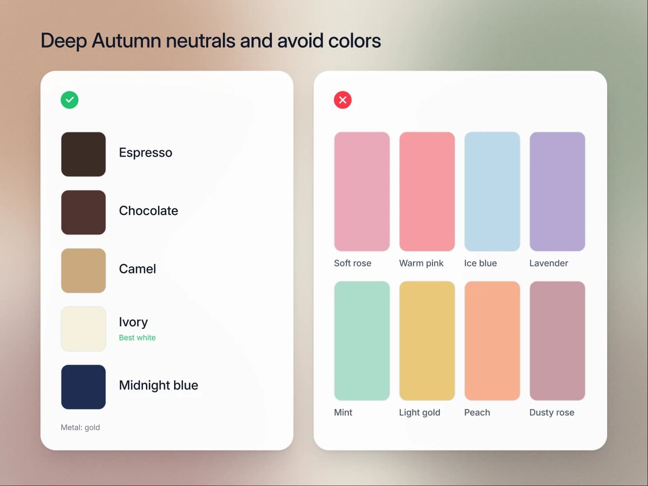
How to combine them
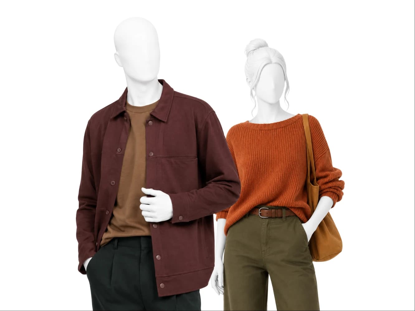
The Deep Autumn formula is a dark base plus a rich accent. Espresso trousers with a rust knit. A chocolate coat over forest green. Olive trousers, an ivory shirt and one mustard scarf.
Two things make it work. Keep the depth high, because a Deep Autumn outfit is not meant to be light. And let ivory be the light in the outfit instead of reaching for a pastel. Two rich colors together will always beat one rich color plus a pale one.
Seasons this one gets confused with
True Autumn. Same warm family, less depth. The tell is where your best colors sit on the value scale. If mid depth warm colors look slightly weak on you and the darkest ones look best, you are on the Deep side.
Deep Winter. Both seasons are deep with high contrast, so the split is undertone, not darkness. The tell is rust. Rust is a Deep Autumn core color and it sits on the Deep Winter list of colors to avoid. Ivory against pure white, and gold against silver, settle the rest of the argument.
FAQ
Yes. Deep Autumn and Dark Autumn are two names for the same season in the 12 season system.
No. Black is on the Deep Autumn avoid list. Espresso, chocolate and midnight blue are the deep neutrals that replace it, and all three go dark enough for a suit, a coat or an evening dress while keeping the warmth in your skin that black flattens.
Yes, on its warm edge: the wine version with brown in it rather than a cool berry. It is one of your two power colors, and it shows best styled the way the palette is built, with espresso, camel and gold hardware.
Ivory. Not optic white, not a bright cool white. This is the highest return swap on the list.
Gold. The warm-neutral undertone, the espresso and chocolate neutrals and the camel all point the same direction.