Bright Spring is the highest chroma season in the Spring family, warm-neutral underneath and high in contrast. The palette runs on bright turquoise, coral, tomato red and golden yellow, worn one bright piece at a time against soft white, camel or espresso. Black is on the palette here, which surprises most people, and it comes with a spec: below the waist and matte.
Am I a Bright Spring?
Bright Spring coloring is vivid rather than deep. The clearest signal is the eyes: saturated and bright, holding an obvious color instead of a soft blend, often with a defined ring at the edge. The second is what happens in photographs. Hair, skin and eyes separate into distinct levels instead of melting together, so pictures look graphic even in ordinary indoor light. If people call your coloring striking, and your photos never come out washed, Bright Spring is the likely read.
What Bright Spring actually means
Four measurements define a season, and one of them does most of the work here.
Undertone: warm-neutral. Warmth leads, with a neutral edge behind it. That neutral edge is why Bright Spring tolerates a few things no other Spring tolerates, black among them.
Value: medium. Not light, not deep, which is why depth is never what makes an outfit work for you.
Chroma: very bright. The defining measurement. Bright Spring needs saturation, and the real enemy is not a dark color, it is a muted one.
Contrast: high. Your coloring already splits into clear steps, so an outfit that splits does what your face does naturally.
Your core colors
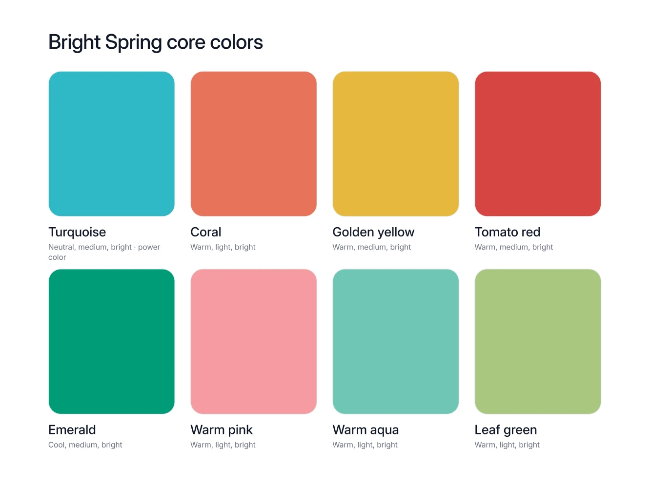
Eight colors carry a Bright Spring wardrobe, and every one of them is meant to be seen.
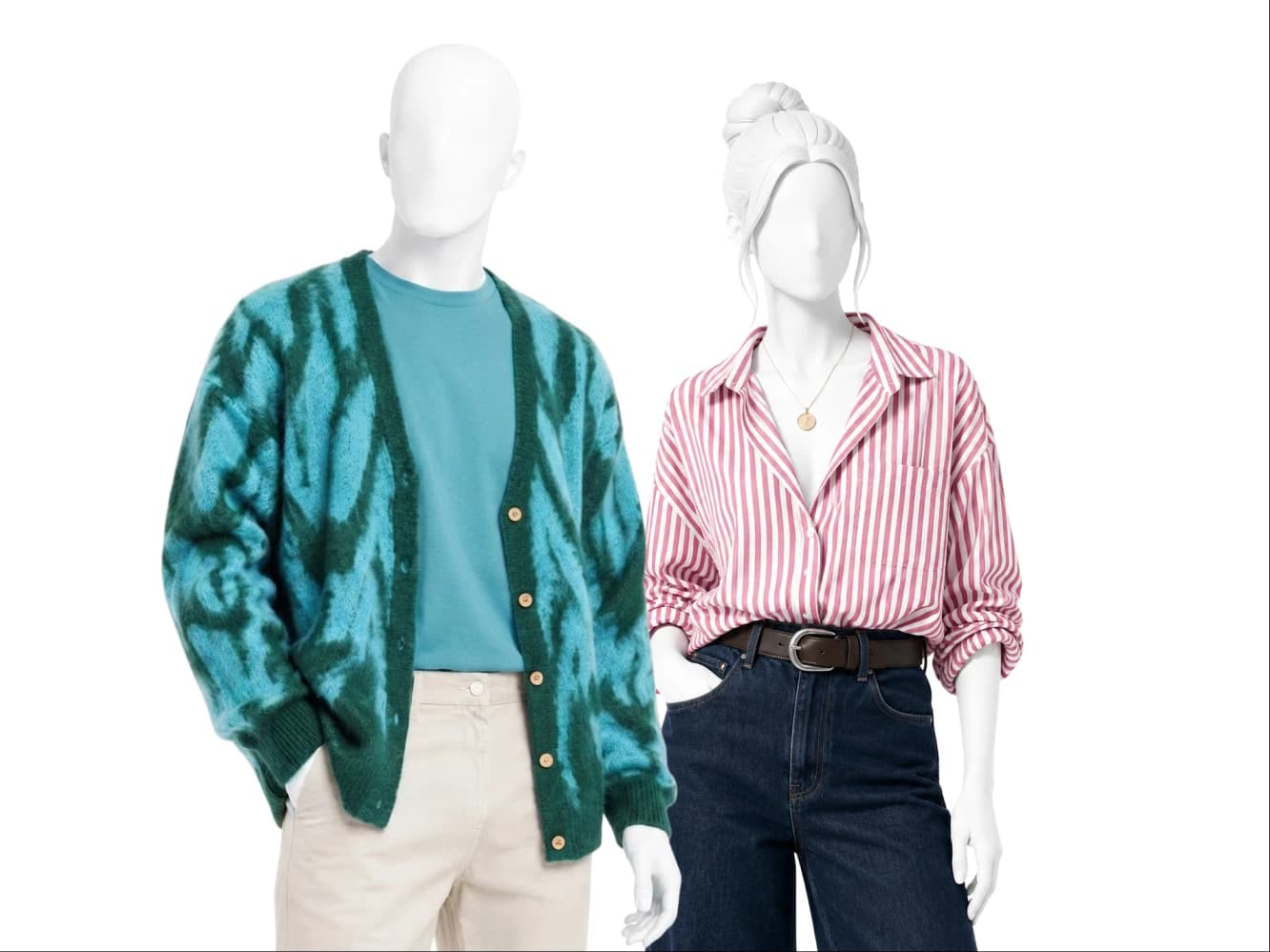
Bright turquoise. The power color and the accent star: one turquoise piece against soft white or camel is the entire Bright Spring formula.
Coral. The everyday brightness, in a shirt, a knit or a lipstick when turquoise feels like too much for a Tuesday.
Golden yellow. A full garment color here, so use it for a shirt, a dress or a knit rather than a hint at the wrist.
Tomato red. The occasion bright, and the right call for a coat or a dress that has to carry a room.
Emerald. On the palette in its clear bright form: buy the emerald that still looks lit from inside, not forest green, which is a different color and sits on the avoid list.
Warm pink. The gentler bright, easiest as a shirt under a camel or soft navy jacket.
Warm aqua. Turquoise with the volume down, best in shirts, swimwear and lighter summer layers.
Leaf green. The fresh green that holds up next to mid denim, in a jacket or a knit.
Your neutrals, your white, your metal
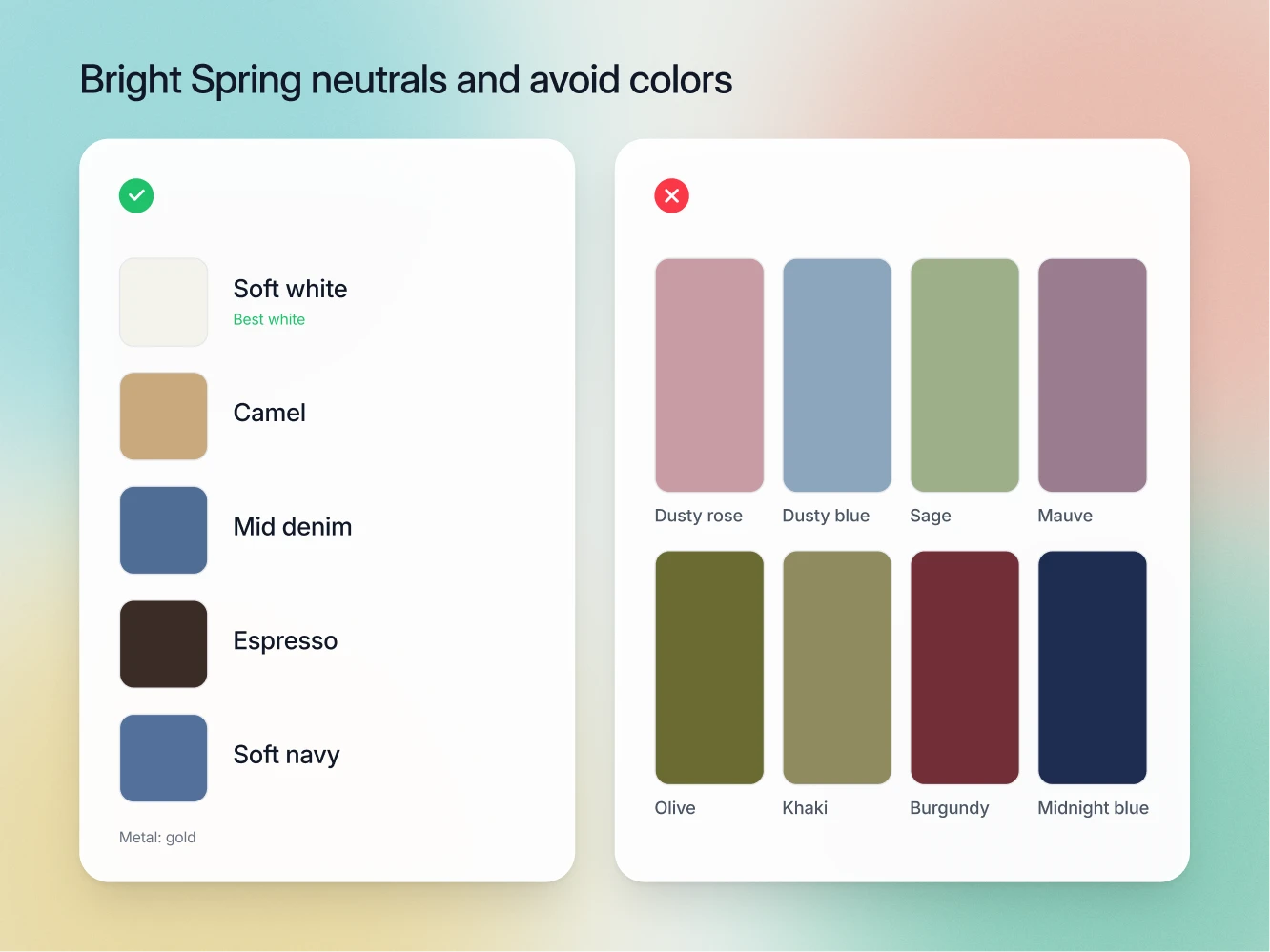
The neutrals: soft white, camel, mid denim, espresso and soft navy. Espresso is a bottoms color, so put it in trousers, boots and belts rather than in a shirt at the collar. Mid denim counts as a genuine neutral for Bright Spring, not a weekend compromise, and it pairs with every bright in the core eight.
The white: soft white. Soft white is the Bright Spring white, and ivory is the white that fails. Ivory is creamy and slightly dulled, and next to very bright coloring that cream lies over the face like a film, so the eyes lose their snap and the picture reads a half step out of focus. Ivory is the right answer for Light Spring and True Spring, so plenty of Bright Springs end up in it by accident. Soft white stays clean without going chalky, so it holds its own under bright turquoise instead of muddying it.
The metal: gold, and mixing is allowed. Gold leads, in the watch, the buckle and the buttons. Unlike most seasons, Bright Spring tolerates mixed metals, so a two-tone watch will not break an outfit.
The colors that fight you
The Bright Spring avoid list is long, and almost every entry fails for one reason: it is muted.
Dusty and muted colors: dusty rose, dusty blue, sage, mauve, olive, khaki. All of these have gray or mud built into them. Next to very bright coloring they do not read as subtle, they read as a layer of glass in front of your face.
Muted darks: burgundy, plum, forest green, midnight blue, charcoal. These are deep and muted at the same time. Bright Spring builds its effect out of brightness, never out of depth, so these shades bring heaviness in and take clarity out in one move.
Lavender. Cool and dusty at once, which is two strikes in a palette that wants warm and clean.
And now black, which is the part other articles get wrong. Most writing about Spring seasons says flatly that Springs cannot wear black. For Bright Spring that is not true: black is on the palette, and the spec is below the waist and matte. Buy it as trousers, a skirt, boots or black denim, in a flat finish. Your contrast comes from brightness rather than darkness, so matte black sits quietly under bright turquoise or coral instead of competing with it, while high shine turns black into a fifth bright color and takes the outfit for itself. Under the chin the palette has better answers anyway, and espresso or soft navy is the one to reach for.
Worth noticing: charcoal is out while black is in. That sounds backwards until you remember which measurement is doing the work. Charcoal is a muted dark. Black is not muted at all.
How to combine them
One neutral base, one bright accent. Soft white shirt, camel trousers, bright turquoise knit. That is the formula, and it works in an office, at a wedding and in an airport.
Let the contrast happen. Espresso trousers under a soft white shirt, or mid denim under coral, is a strong Bright Spring outfit rather than a risky one. Lower contrast seasons have to soften those pairings. You do not.
Never wear a fully muted outfit. Camel head to toe with nothing bright in it is the one genuine Bright Spring failure, and it is the outfit that makes people ask whether you are tired.
If a second bright gets in, keep it small. A tomato red shoe alongside turquoise is fine. Two bright garments compete, and your face finishes third.
Seasons Bright Spring gets confused with
True Spring. The closest call, since both are warm-leaning and both are bright. Start with undertone and contrast: True Spring is fully warm and lands at medium contrast, while Bright Spring keeps a neutral edge and photographs in distinct steps. Then put on black trousers in daylight and look at the mirror from across the room. On a True Spring they read as a dark block with the face floating loose above them. On a Bright Spring they go quiet and let the color near the face do the talking.
Light Spring. Same warm-neutral undertone, opposite chroma and contrast. The tells are the white and the turquoise. Light Spring wants ivory and wears turquoise only as a small accent. Bright Spring wants soft white and wears bright turquoise as the point of the outfit.
Light Summer. These two get mixed up on screens more than in person, because both palettes use soft white and soft navy. The tell is metal plus chroma. Light Summer is soft, cool-neutral and silver. Bright Spring is very bright, warm-neutral and gold.
FAQ
Yes. Black is on the Bright Spring palette, and the spec is below the waist and matte. Black trousers, a black skirt and black boots all work. For a top under the chin, espresso or soft navy is the stronger buy.
Because the measurement that matters here is chroma, not darkness. Charcoal is a muted dark and mutes you with it. Black is not muted at all.
Yes. Clear, bright emerald is on the palette. Forest green is a separate color and sits on the avoid list, so the check in the shop is brightness: if the green has gone deep and dulled, it is forest green and you put it back.
Soft white. Ivory belongs to Light Spring and True Spring, and on Bright Spring it softens the one quality your coloring runs on.
Yes. Gold leads, but Bright Spring is the season that tolerates mixing, so a two-tone watch is a legitimate choice rather than a compromise.