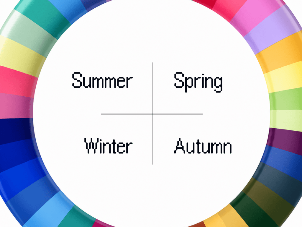
True Spring, also written Warm Spring, is the fully warm center of the Spring family. The palette runs on tomato red, golden yellow, coral and orange, clean and bright at medium depth. Ivory stands in for white, chocolate anchors the bottom half, gold is the only metal, and nothing dusty belongs anywhere near the face.
Am I a True Spring?
True Spring coloring is warm the whole way through, with no cool edge anywhere in it. The signals: veins that read green at the wrist, golden freckles that come out readily in sunlight, eyes that are amber or warm green, and eyes that look clear and defined rather than hazy at the rim. Depth sits in the middle, so a True Spring is neither pale nor dark, and photographs show a medium separation between hair, skin and eyes. Gold jewelry looks like part of the person wearing it. Silver looks like it was picked up by mistake.
What True Spring actually means
Four measurements define a season, and True Spring is the cleanest, warmest reading of the four.
Undertone: fully warm. Not warm-neutral, warm. Every color in the palette has gold or orange in it somewhere, which is why the season is also called Warm Spring.
Value: medium. Neither light nor deep. True Spring can wear a real color at full strength without being swallowed by it, and can wear chocolate on the bottom without going heavy.
Chroma: bright and clean. Colors need to be pure. Anything with gray mixed into it reads as dirty against True Spring coloring, and reads as dirty fast.
Contrast: medium. There is real separation between your hair, skin and eyes, so an outfit can hold two strong colors at once without looking like a costume.
Your core colors
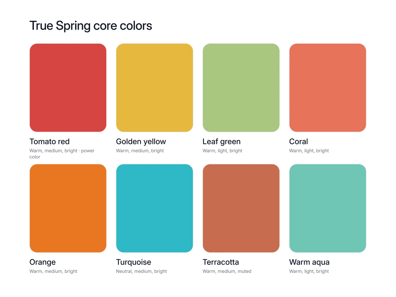
Eight colors carry a True Spring wardrobe, and they are all colors people notice.
Tomato red. The power color, and worth buying deliberately once a year: a knit, a coat, a dress, a lipstick.
Golden yellow. A real garment color rather than an accent, so use it for a shirt, a knit or a summer dress.
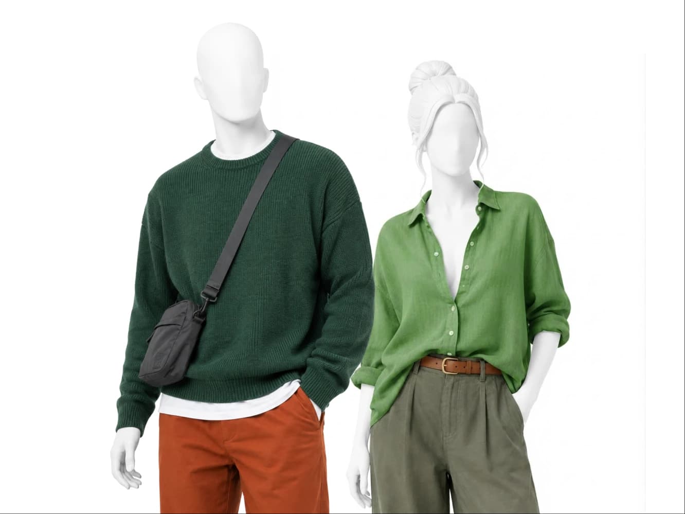
Leaf green. The green that stays fresh instead of turning heavy, and it sits beautifully next to camel and khaki.
Coral. Tomato red with the volume down, and the easiest everyday top or scarf in the palette.
Orange. Most people flinch at orange, but True Spring is the season that owns it, in a knit, a bag or a shoe.
Turquoise. The counterweight to all that warmth, best in a scarf, a shirt or jewelry when an outfit needs cooling down.
Terracotta. The one earthy color here, and the right answer for autumn trousers, a suede jacket or heavy knitwear.
Warm aqua. Quieter than turquoise and just as warm underneath, ideal for shirts, swimwear and a light spring coat.
Your neutrals, your white, your metal
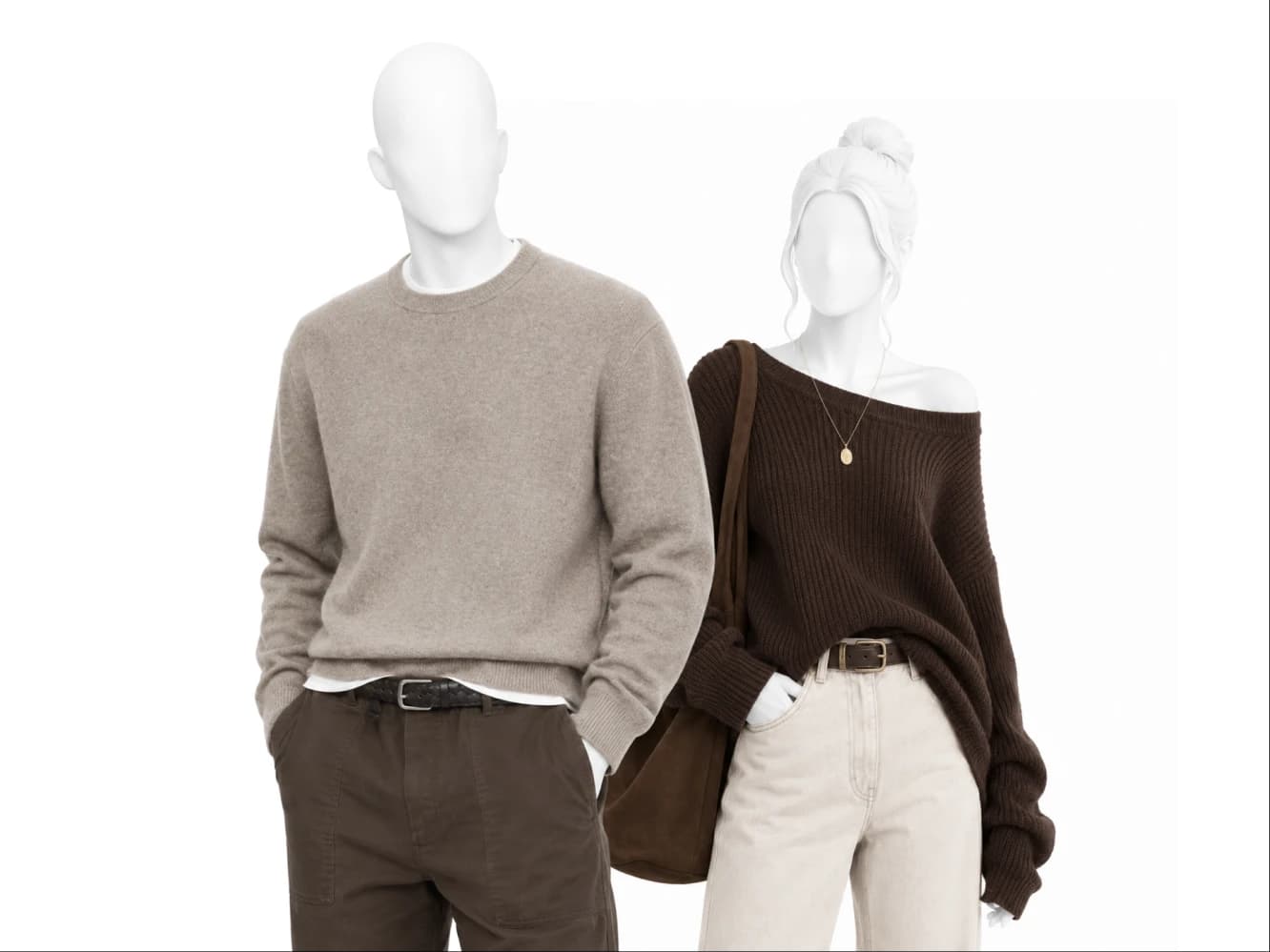
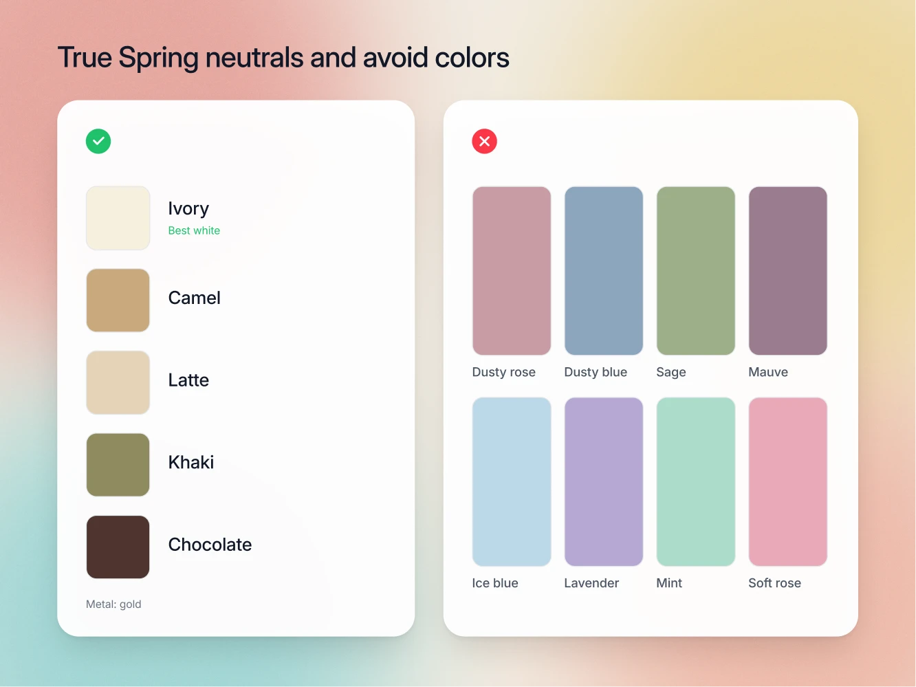
The neutrals: ivory, camel, latte, khaki and chocolate. Chocolate is a bottoms color, so use it for trousers, boots, belts and bags rather than for a shirt at the collar. Camel, latte and khaki carry the middle of the wardrobe, and all five agree with each other because all five are warm.
The white: ivory. Ivory is the True Spring white and optic white is the one that fails. A fully warm complexion carries gold just under the surface, and a hard cool white cancels that gold, so the skin turns pink and slightly raw while the shirt keeps all the cleanness for itself. Ivory is warm on the same side as you, so the light coming off it flatters instead of correcting. One shirt swap, visible immediately.
The metal: gold. Gold and brass, in the watch, the buckle, the buttons and the frames. Silver goes cold against fully warm skin, and metals that disagree with each other make an outfit look assembled by committee.
The colors that fight you
True Spring has an unusual avoid list, because it is not about darkness. It is about anything cloudy and anything cold.
Dusty colors: dusty rose, dusty blue, sage, mauve. All of these have gray mixed into them. True Spring's entire quality is clean color, so a grayed color next to that face does not look soft, it looks soiled, and it takes the skin with it.
Icy colors: ice blue and everything glassy. Icy colors are cool and pale at the same time, which is the exact opposite reading of a warm medium season. The face goes sallow and the garment looks like it belongs to somebody else.
Cool pastels: lavender, mint, soft rose. These are the ones that slip into a wardrobe unnoticed, usually in summer. They do not make you look bad so much as they make you look absent, which is worse, because nobody can tell you why the photo is flat.
The failure mode across all three groups is the same. Nothing shouts. Your coloring simply stops registering.
How to combine them
Put warm next to warm. Tomato red with camel. Golden yellow with khaki. Terracotta with ivory. Because everything in the palette is warm, two strong colors can share an outfit without arguing.
Use medium contrast freely. Chocolate trousers with an ivory shirt is a good True Spring outfit, not a risky one. The lighter Spring and Summer seasons cannot do that. You can.
Cool it down with turquoise or warm aqua. When an outfit reads too hot, one turquoise piece near the face solves it faster than adding a neutral.
Let nothing dusty and nothing icy in. One dusty cardigan pulls down an otherwise clean outfit, and it will be the piece you blame last.
Seasons True Spring gets confused with
Bright Spring. The closest neighbor and the hardest call, since both are warm-leaning and both are bright. Two tells: Bright Spring is warm-neutral rather than fully warm and photographs at high contrast, and khaki, one of your best neutrals, sits on the Bright Spring avoid list. If khaki flatters you, the read is True Spring.
Light Spring. Same warmth, less depth, lower contrast. The tell is tomato red at full size. True Spring wears it and holds its own. On Light Spring, coral is the ceiling and tomato red takes the picture over.
Light Summer. Opposite undertone, but the two get confused on paper because both use light warm-leaning neutrals. The tell is metal, then white. Light Summer wants silver and soft white, True Spring wants gold and ivory, and the Light Summer core colors of periwinkle, lavender and ice blue all sit on your avoid list.
FAQ
Yes. Two names for one season, and the palette is identical either way.
On the avoid list. The palette runs on chocolate for bottoms, camel and khaki through the middle, and ivory at the top, which grounds an outfit while keeping the warmth intact.
Not the cool ones. Lavender, mint and soft rose all read icy against warm skin. Peachy and coral lights do the same job from the warm side.
No, but you are in the small group of people it actually suits. Start with a bag or a shoe before committing to a knit.
One tomato red piece near the face. It is the color that makes people say you look well without being able to explain why.