Light Spring is the lightest warm season in the 12 season system, sitting between Light Summer and True Spring. The palette runs on coral, peach, warm pink and light gold, held at low contrast and warm underneath. Ivory replaces white, gold replaces silver, and black stays out of the wardrobe entirely.
Am I a Light Spring?
Light Spring coloring is light on the surface and warm underneath. The signals cluster: blond or light golden hair, veins that read green at the wrist, golden freckles across the nose and shoulders, eyes that look soft at the rim rather than sharply outlined, and photographs where hair, skin and eyes sit close together in brightness instead of splitting into light and dark. The quick check is jewelry. Gold settles into Light Spring skin and looks like it belongs. Silver sits on top of it and reads like hardware.
What Light Spring actually means
Four measurements define a season, and Light Spring lands in a specific corner of each.
Undertone: warm-neutral. Warmth leads, but not at full strength. Golden, peachy and coral colors flatter, while colors that lean slightly neutral still hold. That partial warmth is why Light Spring and Light Summer get swapped so often.
Value: light. Your natural coloring is light, so your clothes should be. A Light Spring wardrobe built on dark anchors fights its owner all day.
Chroma: soft to medium-bright. Colors need to stay clear rather than muddy, without shouting. Peach and warm aqua sit right. Fuchsia does not.
Contrast: low. Hair, skin and eyes are close together in brightness. An outfit that splits hard into light and dark draws a line across a face that has none.
Your core colors
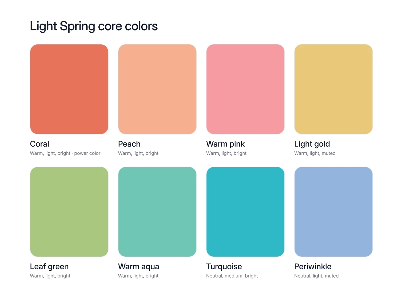
Eight colors carry a Light Spring wardrobe. Learn them by name, because names are what you shop with.
Coral. The power color: put it where people look, in a knit, a shirt, a scarf at the collar, a lipstick.
Peach. The everyday top, and a peach blouse under a camel jacket is the Light Spring uniform.
Warm pink. Coral with the volume down, right for a shirt or a dress when full coral feels loud.
Light gold. Wear it as a whole piece rather than a hint: light gold trousers, a fine knit, a bag.
Leaf green. One of the few mid-strength colors a Light Spring can wear at full size, as a jacket or a knit.
Warm aqua. The cool-feeling color that is still warm underneath, best in shirts, swimwear and a light spring coat.
Turquoise. The accent star and only that: a turquoise scarf, earrings or a bag lifts an outfit, while turquoise head to toe takes the outfit over and leaves your face behind it.
Periwinkle. The soft blue that does denim's job without denim's weight, though it also appears in the Light Summer palette, so it flatters you without proving your season.
Your neutrals, your white, your metal
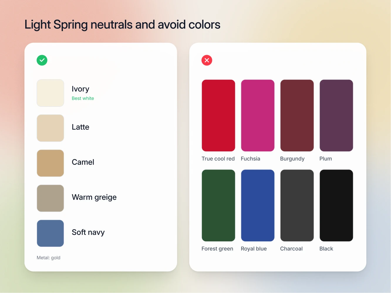
The neutrals: ivory, latte, camel, warm greige and soft navy. These are the repeat purchases, the trousers and coats and knitwear. Every one is warm or warm-leaning, which is what lets a Light Spring wardrobe combine with itself without any thought.
The white: ivory. The wrong white is the fastest visible mistake in this palette, faster than any accent color, because white goes where light bounces up into your face. Optic white is brighter and cooler than Light Spring skin. Next to it a light warm face loses its color and the shirt ends up looking cleaner than the person in it. Ivory sits warm and half a step below your skin in brightness, so your face stays the brightest thing in the frame.
The dark anchor: soft navy. Light Spring gets no hard dark neutral. Soft navy grounds a coat, a blazer or a pair of trousers when an outfit needs weight at the bottom.
The metal: gold. Gold, brass, warm hardware. Watch, buckle, buttons, glasses. Silver reads cold against warm-neutral skin, and once every metal in an outfit agrees, the whole thing looks deliberate.
The colors that fight you
Cool bright reds and pinks: true cool red, raspberry, fuchsia. All three are cool and saturated at once, the opposite of Light Spring on two counts. They pull blue into the skin and out-shout a face built at low volume.
Wine and purple: burgundy, plum, rich purple. Too dark and too cool. The heaviness in these shades settles over a light face instead of lifting it, and they read as somebody else's palette borrowed for the evening.
Lemon. A cool yellow with a sharp edge. Light gold does the same job in a warm register.
Deep greens and blues: forest green, emerald, royal blue, midnight blue. These carry a depth Light Spring does not have. The garment keeps its color and the face flattens out behind it.
Ice blue. Cool and glassy, and against warm-neutral skin it turns the complexion sallow. Warm aqua and periwinkle give the same fresh blue feeling from the correct side.
Charcoal and black. Black next to a light face is the highest value contrast available, and it drops a hard shadow under the jaw. Soft navy is the substitute, every time.
How to combine them
Keep values adjacent. Ivory, latte, camel and warm greige sit within a step of each other, so any two of them can share an outfit. That is the base layer, and it is why a Light Spring wardrobe feels easy.
Work tone on tone. Peach shirt, latte trousers, camel coat. Warm aqua knit, ivory shirt, warm greige trousers. Nothing in that outfit jumps, so your face does.
One saturated accent, maximum. A coral knit or a turquoise scarf, not both. When two brights compete, neither wins and your face comes third.
Skip black and white blocking. That pairing is the most contrast-heavy thing you can put on, and Light Spring is the lowest contrast warm season there is. Ivory with soft navy does the same job at a strength your coloring can carry.
Seasons Light Spring gets confused with
Light Summer. The most common mix-up, because both seasons are light, both are low contrast, and both use periwinkle, warm greige and soft navy. The tell is metal and white together. Light Summer wants silver and soft white, Light Spring wants gold and ivory. Coral settles the rest: it is a Light Spring core color and appears nowhere in the Light Summer palette, where soft rose plays that part.
True Spring. Same warmth, more depth and more clarity. The tell is tomato red, True Spring's power color, against coral, which is yours. If tomato red looks clean and your face holds its own beside it, you are reading True Spring. If it takes the picture over, Light Spring.
Bright Spring. Same warm-neutral undertone, far higher chroma and contrast. The tell is turquoise at full size. Bright Spring wears bright turquoise as the main event and photographs at high contrast. Light Spring wears turquoise as an accent and photographs low and soft.
FAQ
No. Black is on the Light Spring avoid list. Bright Spring keeps black on its palette because that season builds contrast out of brightness, but Light Spring builds nothing out of darkness. Soft navy handles formal, camel handles daytime.
Yes, as an accent star. Turquoise in a scarf, a bag or earrings is one of the palette's best moments. Turquoise as a coat is more color than a low contrast face can stand next to.
An ivory shirt in place of the optic white one. It sits under your face every time you wear it, which is more than any accent color can claim.
No. Gold is on the palette and silver is on the avoid list, with nothing in between. Against warm-neutral skin silver reads cold and slightly gray, and it pulls the same flatness that optic white does. Gold, brass and warm hardware cover every job silver would have done, from a watch to a buckle to glasses frames.
Your undertone stays warm-neutral, so the palette holds. Value and contrast shift, usually downward, which makes ivory, warm greige and soft navy more useful than ever.