Bright Spring and Bright Winter are the two seasons that wear colors at full strength, and undertone, the warm or cool cast under your skin, is what separates them: Bright Spring is warm-neutral, Bright Winter cool-neutral. A turquoise test shows which one is yours, because the green-leaning version lights up a Bright Spring and the blue-leaning one a Bright Winter. Brightness cannot split them, since both are very bright, both need contrast and neither is defined by depth. Read Bright Spring and Bright Winter for each palette in full, or find your undertone at home first.
On this page
Bright Spring vs Bright Winter at a glance
- Undertone: Bright Spring is warm-neutral, Bright Winter cool-neutral, and it is the one axis that settles the pair.
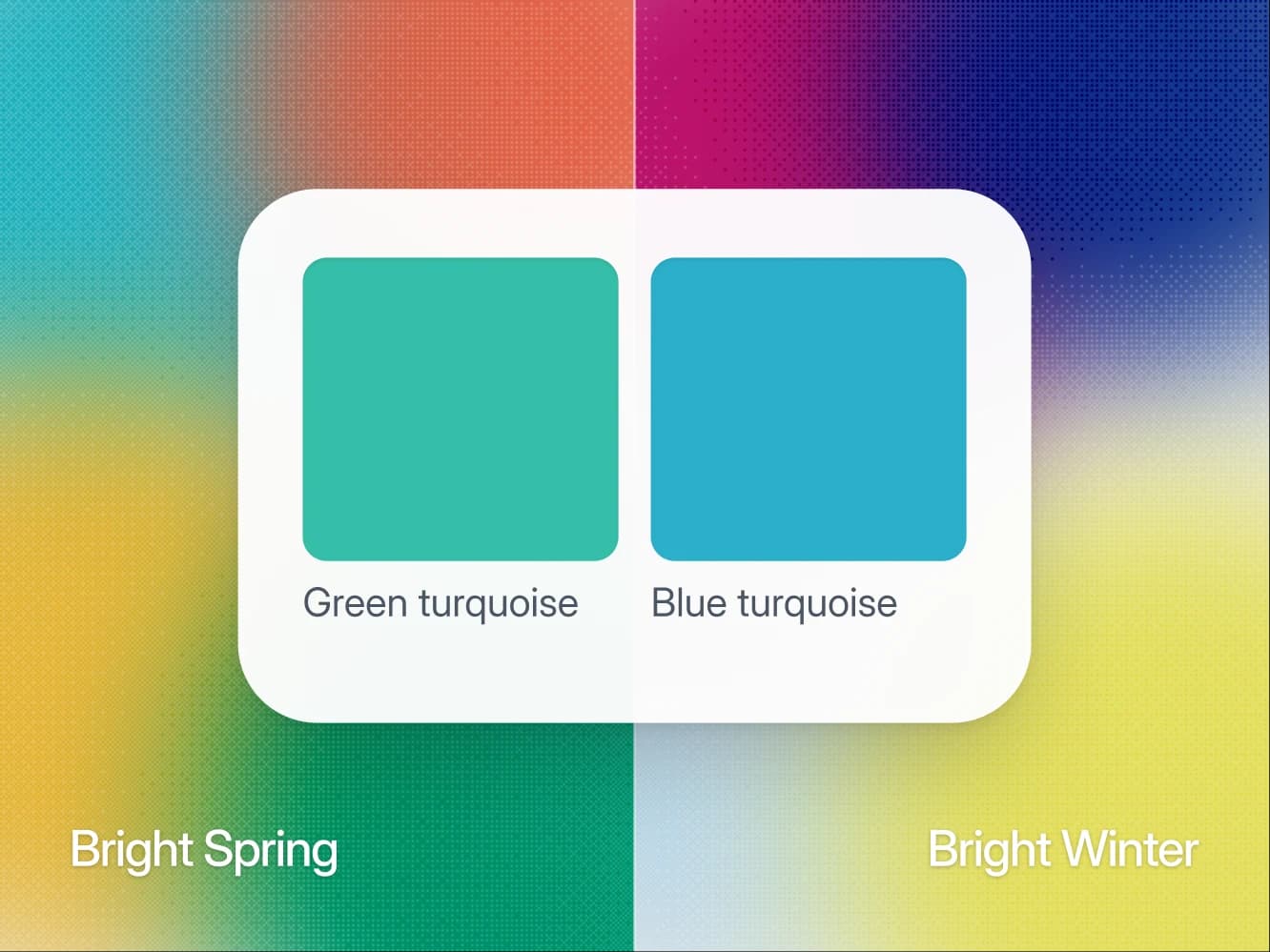
- Turquoise test: If green-leaning turquoise lights you up, you are Bright Spring. If it has to lean blue, you are Bright Winter.
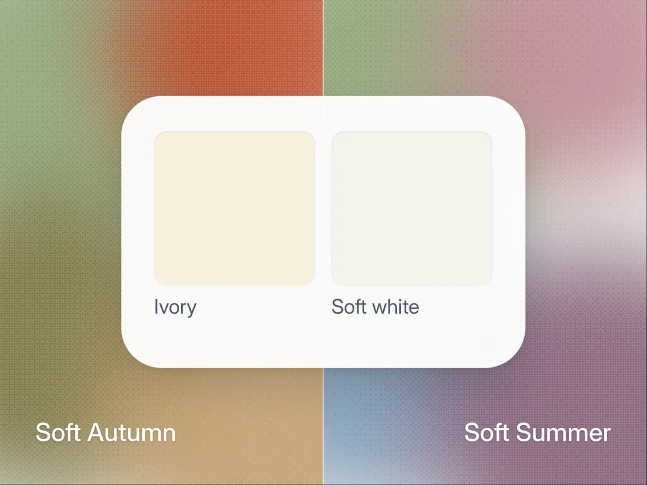
- White and metal: Bright Spring takes soft white and gold, Bright Winter pure white and shiny silver.
- Black: Bright Spring wears it matte and below the waist, Bright Winter anywhere, the collar included.
- Shared ground: Both are very bright, and only turquoise and emerald are a Wear for both.
What Bright Spring and Bright Winter share
Both seasons are bright, which is why brightness cannot tell them apart. Four traits are shared or close:
- Chroma, how saturated a color is. Both sit on the top step of the scale. It is the trait people self-diagnose first, because you notice when a saturated color suddenly works on you.
- Value, how light or dark a color is. Bright Winter sits at medium and Bright Spring a touch lighter, light to medium, so neither season is defined by being especially light or especially deep.
- Contrast. Close but not equal: Bright Spring runs high, Bright Winter very high. Both need a visible jump between the lightest and darkest piece you wear, and both look underpowered in a tonal outfit.
- The Skip list. Nine colors are a Skip for both: dusty pink, terracotta, mustard, light gold, olive, forest green, sage, dusty blue and mauve. Each has gray or earth mixed in, and muted is the one quality neither season can carry.
The palettes also overlap by name in two places. Emerald is a core color on both lists, and so is turquoise, straight for Bright Spring and on its cool edge for Bright Winter. Of the 50 colors in a Wearly Labs analysis, those two are the only ones that come back as a Wear for both seasons. That overlap is why the pair gets confused, and it is also why the turquoise test below works.
Lemon shows what a split looks like. A cool, clean yellow, it is a core color for Bright Winter, while on Bright Spring it stays an accent, because golden yellow does the same job with warmth.
Where they split
Three rows are near-matches: value, chroma and contrast. The other six separate the two seasons.
| Axis | Bright Spring | Bright Winter |
|---|---|---|
| Value | Light to medium | Medium |
| Chroma | Very bright | Very bright |
| Contrast | High | Very high |
| Undertone | Warm-neutral | Cool-neutral |
| Best white | Soft white | Pure white |
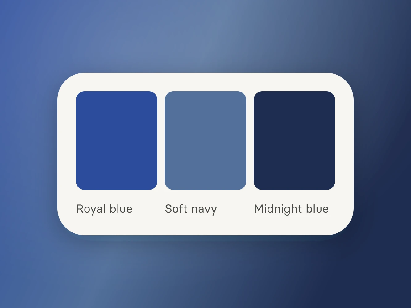
| Navy | Soft navy | Midnight blue |
| Black | Below the waist, matte | Anywhere, the collar included |
| Metal | Gold, mixing allowed | Silver, shiny |
| Power color | Bright turquoise | Electric blue or bright fuchsia |
Read the top three rows as a tie and the bottom six as the decision. The neutrals do not share a single entry: Bright Spring builds on soft white, camel, medium denim, espresso and soft navy, and Bright Winter on black, pure white, charcoal, midnight blue and ice blue. The metal row is unusual too, because in the Wearly Labs palettes Bright Spring is the only one of the 12 seasons that allows mixed metals.
The verdicts, color by color
Every color in a Wearly Labs analysis comes back as Wear, Depends or Skip, with the reason written next to it. Depends means the color works below the waist or as an accent only, never as the shirt at your collar. The table lists the colors this pair argues about, and its last column says what Depends means in that row.
| Color | Bright Spring | Bright Winter | Where Depends applies |
|---|---|---|---|
| Turquoise | Wear | Wear | No Depends |
| Emerald | Wear | Wear | No Depends |
| Coral | Wear | Depends | Below the waist |
| Golden yellow | Wear | Depends | Accent only |
| Tomato red | Wear | Depends | Accent only |
| Sharp red | Depends | Wear | Accent only |
| Fuchsia | Depends | Wear | Accent only |
| Royal blue | Depends | Wear | Accent only |
| Lemon | Depends | Wear | Accent only |
| Soft white | Wear | Depends | Below the waist |
| Pure white | Depends | Wear | Accent only |
| Camel | Wear | Depends | Below the waist |
| Soft navy | Wear | Skip | No Depends |
| Midnight blue | Skip | Wear | No Depends |
| Black | Depends | Wear | Below the waist |
Read it for the pattern. Apart from turquoise and emerald, a color that is a Wear for one season is never a Wear for the other, and it is rarely a Skip either: it moves down to an accent or below the waist. Navy is the exception, with soft navy and midnight blue each a Wear on one side and a Skip on the other.
The reason is the part worth reading. In the sample analysis, the real result of co-founder Filip Poláček, who is a Deep Autumn, emerald comes back as a Skip with the reason "Its undertone runs the opposite way from yours, so it fights your skin." It is the same emerald both bright seasons wear anywhere. On warm, deep coloring the undertone decides against it, and the page says so.
The turquoise test
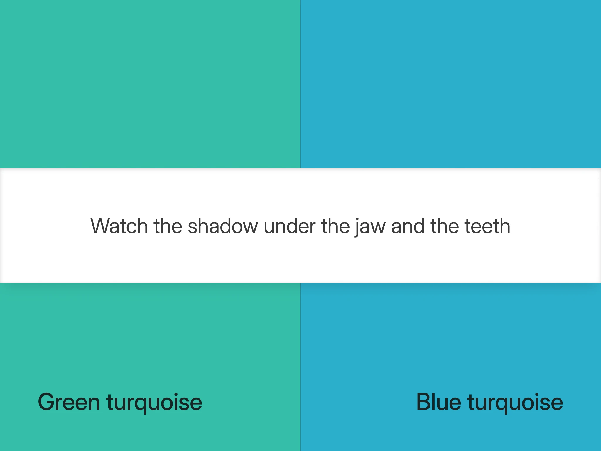
Two turquoises, and you watch your teeth. Both palettes claim turquoise, which leaves the lean, green or blue, as the only variable.
- Pick two tops. Find two turquoise tops in the same fabric, one leaning green and one leaning blue. Both must be genuinely bright, because a dusty version of either looks wrong on both seasons and teaches you nothing.
- Set up the light. Put a mirror about two steps back so your whole head fits, and face a window in daylight with every artificial light off. Check what is behind you, because a colored wall bounces onto your face and ruins a test this sensitive. Hair back, and no lip color.
- Hold each for five seconds. Hold each top under your chin and look at two things in order: the shadow under your jaw, then your teeth.
- Read the result. On the right turquoise the jaw shadow stays clean and your teeth look a shade brighter than a second earlier.
The wrong turquoise shows up in the same two places:
- Green-leaning on a Bright Winter: it puts a yellow-gray into the jaw shadow and pulls the whiteness out of the teeth.
- Blue-leaning on a Bright Spring: it drops a gray-blue into the same shadow, and the face looks cooled down and oddly flat, even though the color itself is still blazing.
Teeth are the giveaway because both seasons are bright enough that the garment always looks good. Only your face tells the truth.
What the wrong season looks like
In the wrong palette, a bright season gets outshouted by its clothes. Two cases show it:
- A Bright Winter in coral and golden yellow. The outfit keeps its energy and the face loses out, so photographs look as if the outfit arrived by itself. A Bright Winter analysis keeps both colors and moves them away from the face: coral below the waist, golden yellow as an accent.
- A Bright Spring in fuchsia and royal blue. The skin cools and the effect turns severe, which people read as too strong when it is really too cool. A Bright Spring analysis keeps both as accents only, a scarf or a bag rather than the shirt.
One rule is worth carrying out of this article, and it is about black. On a Bright Spring black is a Depends: a matte color for below the waist, in trousers, a skirt, a bag or a shoe, and never for the collar. On a Bright Winter black is a Wear anywhere, the collar included. If you wear a black crew neck and call it your best color, go back to the turquoise test.
If the turquoise test splits: two more checks
Bright coloring is easy to read on chroma and hard to read on season, because brightness swamps the undertone question underneath it. If the turquoise test gave different answers on two attempts, two checks help.
- The white shirt. Hold a soft white and a pure white shirt under your chin in the same daylight. Soft white is a Wear for Bright Spring and a below-the-waist color for Bright Winter. Pure white is the reverse: a Wear for Bright Winter and an accent for Bright Spring. Judge your face, not the shirt, because the white that makes your skin look clearer is your season's white.
- The contrast photo. Photograph yourself in black beside pure white, because contrast is the one row in the table you can read without reading undertone. A Bright Winter still looks like the sharpest thing in that frame, and a Bright Spring starts to look overpowered by the pairing.
A full color analysis measures contrast and undertone together instead of asking brightness to answer for both.
Bright Spring vs Bright Winter: common questions
Emerald cannot tell you, because it is a core color for both seasons. It still says something: if emerald is the only saturated color you feel confident in, that points at brightness you have not been using rather than at a season. Take the actual reading off turquoise, where the two palettes disagree about the lean rather than about the color.
Close, but contrast and the neutrals differ too. Bright Winter runs very high where Bright Spring runs high, so Bright Winter tolerates a harder jump between light and dark in a single outfit. The two seasons also build on different neutrals entirely: black, pure white and midnight blue for Bright Winter, soft white, camel and soft navy for Bright Spring.
Yes, and this is the group where it matters most. Brightness at this level magnifies whatever the undertone is doing, so a warm-neutral in a cool bright is more obvious than the same mistake in a muted season. In the analysis it shows as a list: apart from turquoise and emerald, every Wear on one of these palettes is an accent, a below-the-waist color or a Skip on the other.
A Bright Spring can wear silver next to gold, but a Bright Winter should keep gold away from the face. Gold leads for Bright Spring, and it is the one season in the Wearly Labs palettes that allows mixed metals, so a two-tone watch is fine. Bright Winter wants silver, and shiny, because gold brings a golden cast to cool coloring. That makes the jewelry test a weaker tiebreaker for this pair than for most.
Yes. Clear Spring and Clear Winter are other names for Bright Spring and Bright Winter: some systems call the trait clear, others bright. The palettes and the tests here are the same under either name.
Not reliably on its own. Indoor light has a color of its own, and a warm bulb adds exactly the yellow that reads as warmth, which is the axis this pair turns on. An analysis gets around it with more than one photo and a reference: AI reads your five photos, with a white sheet of paper in frame to correct the light, fixed rules make the call. When a photo contradicts a clear answer, the answer decides. Photos fill in what the questionnaire doesn't ask.