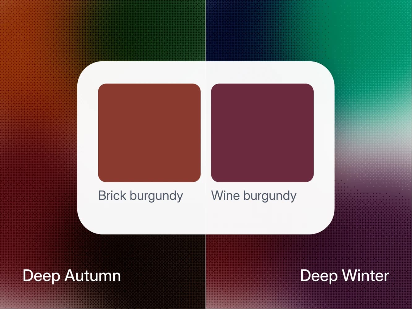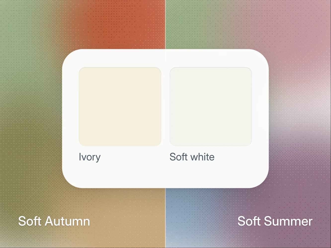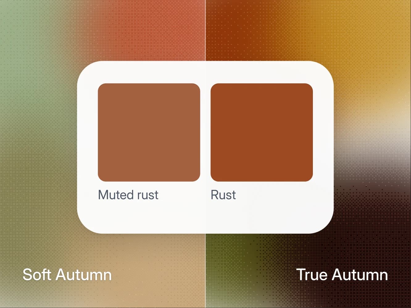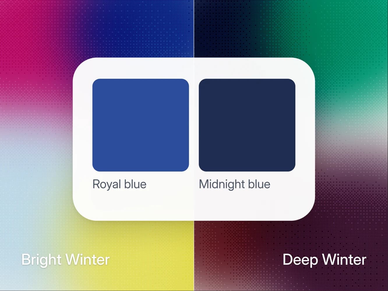
Bright Winter and Deep Winter, which Wearly Labs calls Dark Winter, are both cool, share pure white and silver, and differ in which quality leads: brightness in Bright Winter, depth in Dark Winter. To find out which one is yours, hold a clean lemon and then a cool burgundy at your collar in daylight. Lemon belongs to Bright Winter and cool burgundy to Dark Winter, and the one that keeps your face the most interesting thing in the mirror is your season.
On this page
- Bright Winter vs Dark Winter at a glance
- Why lemon and cool burgundy tell the two apart
- Where Bright Winter and Dark Winter agree
- Where Bright Winter and Dark Winter split
- The colors that change verdict
- The glance test: lemon, then cool burgundy
- If you pick the wrong season
- If lemon and cool burgundy do not settle it
- FAQ
Bright Winter vs Dark Winter at a glance
- What they share: a cool undertone, pure white, silver and high contrast, and the same verdict on 35 of the 50 colors.
- What leads: Bright Winter leads with brightness at a medium depth, Dark Winter with depth, and True Winter sits between them.
- The colors that split them: lemon, Wear on Bright Winter but accent only on Dark Winter, and cool burgundy, the reverse.
- Verdicts that change: 15 of the 50 colors, seven of them at the collar, such as turquoise and forest green.
- The test: hold lemon, then cool burgundy, at your collar in daylight, and look away before you compare.
Why lemon and cool burgundy tell the two apart
Lemon is a Bright Winter core color, and a Dark Winter wears it as an accent only. Cool burgundy is the Dark Winter power color, and a Bright Winter wears it below the waist only. Each is a color the other season has to keep away from the face, which is what makes the pair a clean test.
Pick a clean, cool lemon rather than golden yellow, and a burgundy closer to black cherry than to brick. Golden yellow and rust are wrong at the collar for both seasons, so they prove nothing. The full palettes are on the Bright Winter and Dark Winter pages.
Where Bright Winter and Dark Winter agree
In the rules behind a Wearly Labs analysis, the two seasons get the same verdict on 35 of the 50 colors, black and pure white among them. That is why people who have already worked out, correctly, that they are a Winter still land on the wrong one of these two. Three things are shared:
- Undertone: the warm or cool cast under your skin is cool in both, fully cool in Dark Winter and leaning cool in Bright Winter, and each still carries one color on its cool edge, turquoise for Bright Winter and forest green for Dark Winter.
- White and metal: both take pure white rather than soft white or ivory, and both take silver.
- Contrast: both run high contrast, the gap in depth between your hair, your skin and your eyes, and Bright Winter runs very high.
The Concept Wardrobe's Bright Winter guide also puts the pair on the cool side, at "the same neutral-cool temperature", and calls Bright Winter's palette "lighter and brighter".
Both are also comfortable with black, which is a large part of why the two get confused. Black is a Dark Winter core color, and black worn with white is specifically welcome on a Bright Winter. A black-and-white wardrobe therefore tells you almost nothing about which of the two you are.
Most of the clean cool colors tell you nothing either:
- Wear for both: fuchsia, sharp red, raspberry, deep purple, emerald, royal blue, midnight blue and charcoal, near the face included, on top of black and pure white.
- Skip for both: rust, terracotta, mustard, light gold, olive, sage, dusty pink, dusty blue, soft navy and mauve, every one of them earthy or dusty.
Where Bright Winter and Dark Winter split
Only two of their eight core colors overlap, emerald and royal blue, which in the Wearly Labs palettes is the fewest of any two seasons in the same family. The two sit at opposite ends of the Winters, with True Winter between them: True Winter shares six core colors with Bright Winter and four with Dark Winter.
The 12-season system describes each season by the quality that leads, and two sources put it the same way:
- Bright Winter: The Concept Wardrobe's guide puts brightness first and coolness second, and calls it the season "with the highest contrast between skin, hair and eyes".
- Dark Winter: The Concept Wardrobe's guide puts darkness first and coolness second, with contrast that is high but "not as extreme as that of a Bright Winter". Curate Your Style says it in one line: Dark Winter "takes depth first and brightness second".
Some systems call Bright Winter Clear Winter; the palette is the same. The two axes that do the splitting are Albert Munsell's: value is "the quality by which we distinguish a light color from a dark one", and chroma is "the quality by which we distinguish a strong color from a weak one".
| Axis | Bright Winter | Dark Winter |
|---|---|---|
| Leads with | Brightness | Depth |
| Undertone | Cool-neutral | Fully cool |
| Value | Medium | Deep |
| Chroma | Very bright | Rich |
| Contrast | Very high | High |
| Best white | Pure white | Pure white |
| Metal | Silver, shiny | Silver |
| Power color | Electric blue or bright fuchsia | Cool burgundy |
| Neighbor seasons | True Winter, Bright Spring | True Winter, Dark Autumn |
Read it from the top: both undertones are cool and the best white matches, so value and chroma carry the difference between the two.
The colors that change verdict
Every color in a Wearly Labs analysis gets Wear, Depends or Skip, with its reason, and Depends means below the waist or as an accent only. Run the 50 colors against both seasons and 15 come out differently. Seven of them change at the collar, which is where a season shows:
| Color | Bright Winter | Dark Winter |
|---|---|---|
| Lemon | Wear | Depends, accent only |
| Turquoise | Wear | Depends, accent only |
| Ice blue | Wear | Depends, accent only |
| Wine (cool burgundy) | Depends, below the waist | Wear |
| Plum | Depends, below the waist | Wear |
| Forest green | Skip | Wear |
| Medium gray | Depends, accent only | Wear |
Read it by the axis. The three that move toward Bright Winter are light or clear, and the four that move toward Dark Winter are deep or a step quieter. Forest green is the sharpest case: Wear on a Dark Winter, and on a Bright Winter page it is Skip with the reason "too dark for your light".
The other eight are warm brights. Coral, peach, warm pink, leaf green and warm aquamarine are Depends below the waist on a Bright Winter page, and tomato red, orange and golden yellow are Depends as an accent. A Dark Winter page marks all eight Skip, "too warm beside your cool". None of them belongs at a Bright Winter collar either, so they will not help you choose.
Wine is the cleanest test of depth on the list, and the sample analysis shows why. It is the real result of co-founder Filip Poláček, a Dark Autumn, the warm season next to Dark Winter, and his page marks wine Wear: "Lead with it: knit or coat." A warm Dark season and a cool Dark season both wear it, so wine answers the depth question and leaves undertone out of it. A Bright Winter, at medium depth, keeps it to trousers and shoes.
The glance test: lemon, then cool burgundy
Most color tests ask you to stare. This one asks you to look away, because your first look is the honest one: hold a color in front of your face long enough and your eye adjusts to it.
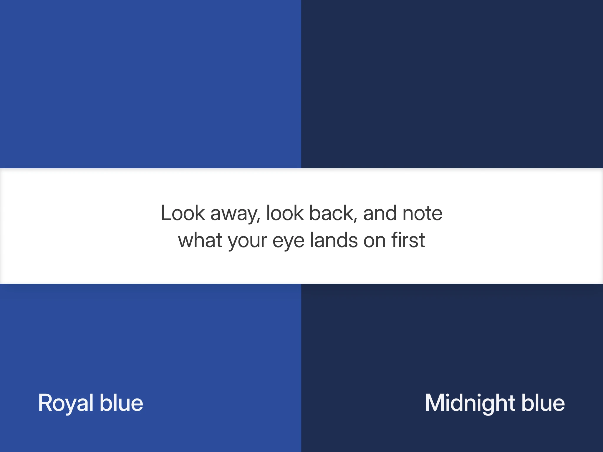
You need two garments, a clean lemon (Bright Winter core) and a cool burgundy (the Dark Winter power color). You also need a window with no direct sun on your face, north-facing if you live in the northern hemisphere, and a mirror far enough back that your head and shoulders both fit.
- Lemon. Hold it at your collar, turn your head down and look at the floor for a slow five count. Look up at the mirror and note what your eye lands on first, before you have time to decide anything, then check the shadow under your jaw.
- Cool burgundy. Repeat the same steps with the burgundy: floor, five count, mirror, first look, jaw shadow.
- Look away every time. The moment you start comparing, you start deciding, and your preference beats your eye.
| What you see | Bright Winter | Dark Winter |
|---|---|---|
| Lemon: where the eye lands | Your face | The lemon |
| Lemon: jaw shadow | Crisp, cool, edged | Pale, slightly gray |
| Burgundy: your face | Flattens | Comes forward |
| Burgundy: jaw shadow | Thick, blurred edges | Clean, deep line |
Read it by rows. On a Dark Winter, lemon outruns the depth the face normally supplies, so the jaw shadow goes pale. On a Bright Winter, burgundy is deeper than a medium value face needs, so the face flattens and the outfit stops snapping into place.
If you pick the wrong season
A Dark Winter in a bright, medium value palette gets outrun. Lemon, turquoise and ice blue as whole garments give a deep face nothing to sit against, so the color arrives before the person does. You also give up wine, plum and forest green, three of Dark Winter's eight core colors, which a Bright Winter palette keeps below the waist or skips.
A Bright Winter in Dark Winter depth gets weighed down instead. Cool burgundy and plum are deeper than a medium value face needs, so the very high contrast that carries this season goes quiet, and you read as serious rather than sharp. The clothes are not wrong, they sit a half step below what your coloring can carry, and they cost you lemon, turquoise and ice blue, three of your own core colors, which a Dark Winter palette keeps to accents.
If lemon and cool burgundy do not settle it
Undertone tests will not settle it. Both seasons give the same answer to any warm against cool test, the three undertone tests you can do at home included, so depth and brightness are the real questions.
Depth is also the axis your hair and your skin can move. Dyed hair changes the darkest thing next to your face, and the Wearly Labs method page notes that a strong tan shifts your value for weeks. If you have colored your hair in the last year, or come back from a beach holiday, run the glance test a second time against a photograph of yourself from before the change. A Wearly Labs analysis asks for your natural hair color for the same reason, and if you dye it, it asks you to go by your roots.
If neither lemon nor cool burgundy looks clearly right, test the season between them. Bright Winter and Dark Winter are not neighbors: True Winter sits in the middle, cool first rather than bright first or deep first, and it wears lemon only as an accent and skips cool burgundy. Dark Winter vs True Winter runs the test for that border, with forest green.
A full color analysis reads your value against your undertone and contrast at the same time, rather than asking your eye to hold a memory of a shade from ten minutes ago. In a Wearly Labs analysis, AI reads your five photos, with a white sheet of paper in frame to correct the light, fixed rules make the call, and your answers weigh the most. Your page then marks lemon, wine and the other 48 colors Wear, Depends or Skip, each with its reason.
FAQ
Black is shared, so the difference is what you build from it. Dark Winter builds downward out of black into cool burgundy, plum and forest green, which a Bright Winter keeps below the waist or skips. Bright Winter builds outward from it into clear, light color such as lemon, turquoise and ice blue, and black with white together is specifically welcome there.
Yes, lemon is a Bright Winter core color. It qualifies on brightness rather than on warmth, which is what a bright, medium value season allows. On a Dark Winter it is Depends, an accent only: a scarf or a bag, not the shirt. Pick the clean, cool lemon, because golden yellow is an accent at most for Bright Winter and Skip for Dark Winter.
Yes, the cool brights. Fuchsia, sharp red, raspberry, deep purple, emerald and royal blue are Wear for both seasons, near the face included. What a Dark Winter keeps to accents is lemon, ice blue and turquoise: a scarf against midnight blue, not a whole shirt.
Each season wears one color that leans slightly outside the strict cool zone, at its own end of the Winters. Bright Winter spends that allowance at the light and bright end, and Dark Winter spends it at the deep end, with forest green taken on its cool edge. Neither crosses over: turquoise is an accent only for Dark Winter, and forest green is Skip for Bright Winter, too dark for a medium value face.
Yes, for Bright Winter the shine is specified, so treat it as part of the palette. Shine behaves like brightness, and a bright season can carry it. The Concept Wardrobe's Bright Winter guide makes the same call: shiny rather than antiqued, matte or brushed. Dark Winter's metal is silver without that qualifier.
Often, which is half the problem: both usually have dark hair, high contrast, and skin anywhere from fair to deep. The eyes are where descriptions part. The Concept Wardrobe's Bright Winter guide describes "strikingly bright, sparkling eyes", from blue through cyan to dark brown and black, always cool, and its Dark Winter guide names dark brown and black as the most common Dark Winter eyes. Treat that as a tendency rather than a test: a Bright Winter can have dark brown eyes too, which is why the garment test above beats a look at your own eyes.