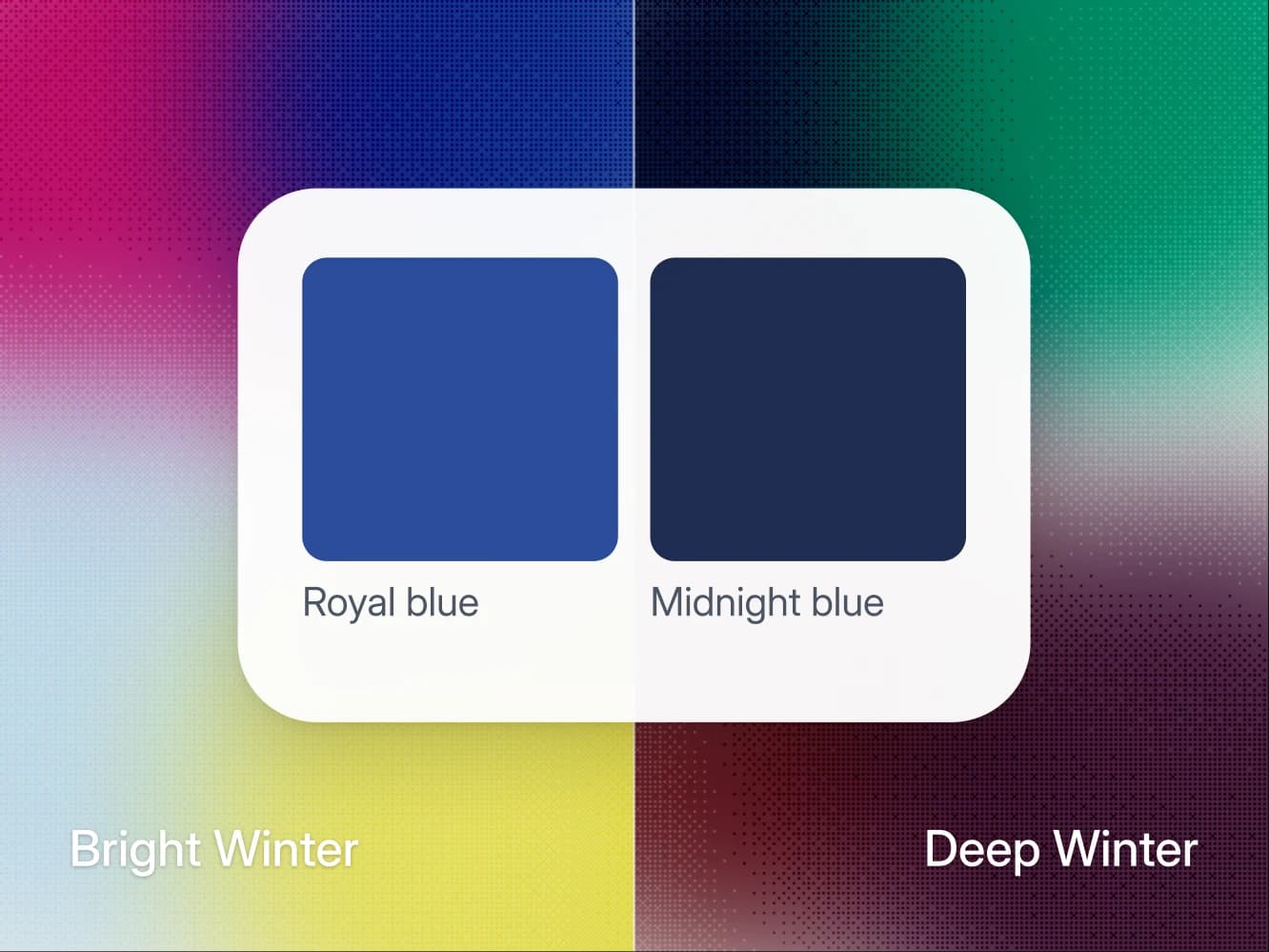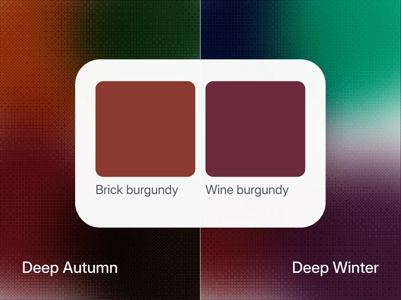
Deep Autumn and Deep Winter share their depth and their contrast, and undertone splits them: Deep Autumn is warm-neutral, Deep Winter is fully cool. To see which one is yours, hold two burgundy knits under your chin, one with brown in it and one with blue in it. The brown one belongs to Deep Autumn and the blue one to Deep Winter, because both seasons wear burgundy in a different version.
On this page
- Deep Autumn vs Deep Winter at a glance
- The short answer: your best burgundy
- Where the two seasons agree
- Where they split: the palettes side by side
- The colors that change verdict between the two
- The tell: two burgundy knits under your chin
- What happens if you pick the wrong season
- Still not sure? Use black as the tiebreaker
- Deep Autumn vs Deep Winter: common questions
Deep Autumn vs Deep Winter at a glance
- What they share: deep value and high contrast, so both can wear a dark color right under the chin.
- What splits them: undertone. Deep Autumn is warm-neutral, Deep Winter is fully cool.
- Colors that swap: rust and olive are Wear for Deep Autumn and Skip for Deep Winter. Emerald and royal blue run the other way.
- Neutrals, white, metal: Deep Autumn takes espresso, ivory and gold. Deep Winter takes black, pure white and silver.
- Most often mistaken for: each other, and each one's second neighbor, True Autumn or True Winter.
The short answer: your best burgundy
Look at the burgundy that flatters you most. If it leans brick, with brown in it, and sits comfortably next to rust, you are Deep Autumn. If it leans wine, with blue in it, and sits comfortably next to plum, you are Deep Winter, and your metal is silver rather than gold. If the burgundies leave you unsure, black is the tiebreaker: Deep Winter wears it at the face, Deep Autumn keeps it below the waist.
Where the two seasons agree
Depth is the loud shared trait. Both palettes are built on dark colors, and both faces can carry one right up under the chin without disappearing behind it. That is unusual, and it is why the two seasons are so often mixed up.
In 12-season terms both lead with depth and part on what comes second. The Concept Wardrobe's Dark Autumn guide describes that season as dark first and warm second, on skin that is neutral or neutral-warm, and its Dark Winter guide describes Deep Winter as dark first and cool second, on skin that is neutral-cool.
Contrast is shared too. Both run high, which means the gap between your hair, your skin and your eyes is wide, and clothes that sit at your own depth will always look more deliberate than mid-toned ones.
The palettes overlap by name as well. Forest green and burgundy appear on both lists, each in its own version: Deep Autumn on the warm edge, Deep Winter on the cool edge. Midnight blue is the third. In the rules behind a Wearly Labs analysis those three are the only colors of the 50 that both seasons wear anywhere, the face included, and two seasons naming the same colors is how people end up in the wrong one.
Where they split: the palettes side by side
Value and contrast match, and the other rows are where the two seasons part.
| Axis | Deep Autumn | Deep Winter |
|---|---|---|
| Leads with | Depth, then warmth | Depth, then coolness |
| Undertone | Warm-neutral | Fully cool |
| Value | Deep | Deep |
| Chroma | Medium to rich | Rich |
| Contrast | High | High |
| Best white | Ivory | Pure white |
| Darkest neutral at the face | Espresso | Black |
| Metal | Gold | Silver |
| Power color | Wine, on its warm edge | Wine, on its cool edge |
Read each row across: the same word in both columns is something they share, a different word is something that separates them. Value is how light or deep your coloring sits overall, across skin, hair and eyes. Chroma is how much saturation you can carry before a color starts wearing you, and it is the second place these seasons part: Deep Winter takes clear, saturated color, while Deep Autumn's strongest colors are rich but slightly softened, like rust, olive and mustard. The full palettes, with a verdict for every color, are on the Deep Autumn palette and Deep Winter palette pages.
The colors that change verdict between the two
Every color in a Wearly Labs analysis gets Wear, Depends or Skip, with its reason, and Depends means below the waist or as an accent only. Run the 50 colors against both seasons and 34 of them come out differently. Ten swap between Wear and Skip, and the neutrals trade places.
| Color | Deep Autumn | Deep Winter |
|---|---|---|
| Rust, terracotta, mustard, olive | Wear | Skip |
| Emerald, royal blue, fuchsia | Skip | Wear |
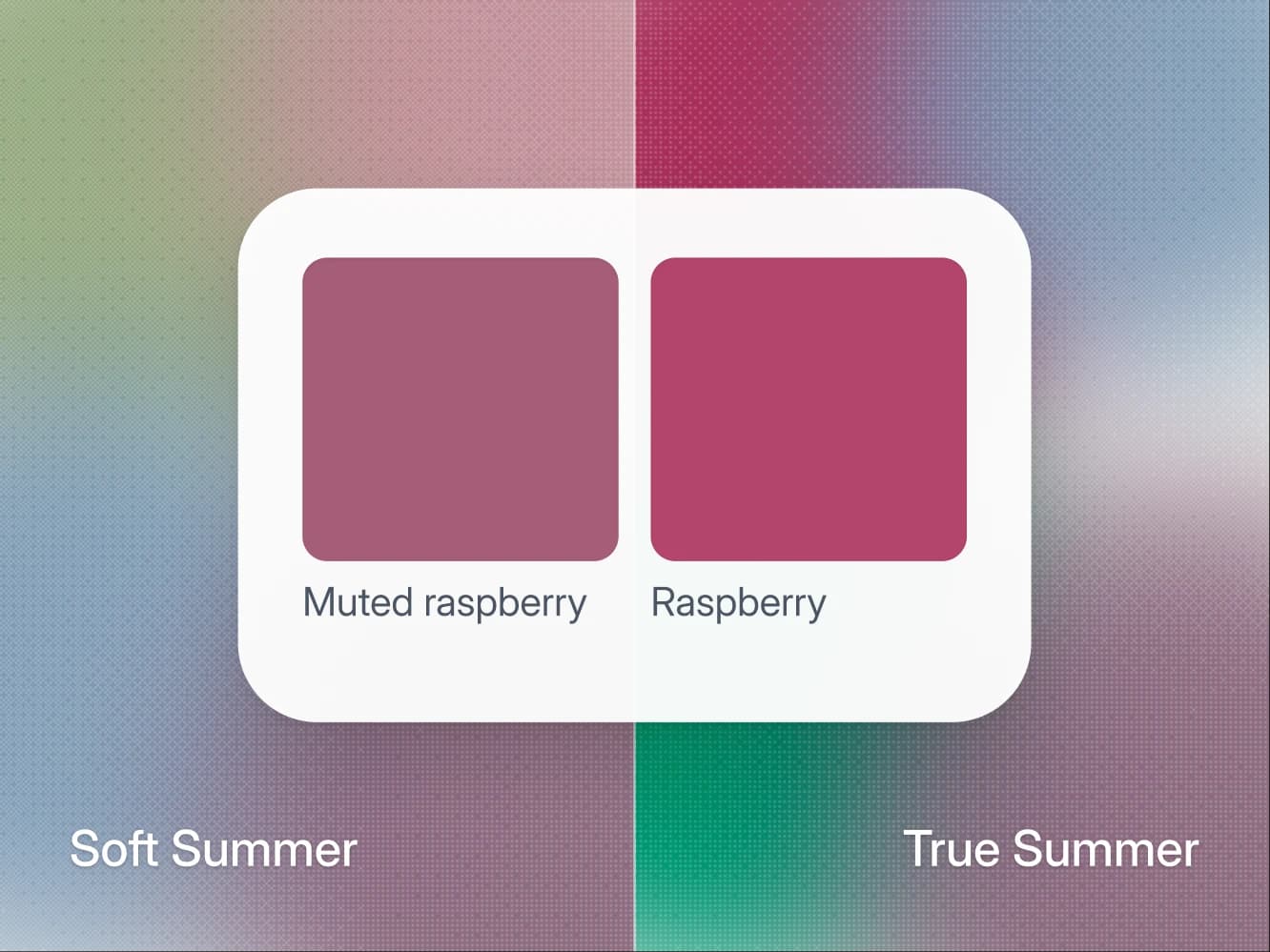
| Raspberry, sharp red, deep purple | Skip | Wear |
| Plum | Depends | Wear |
| Espresso, chocolate, camel, ivory | Wear | Depends |
| Black, charcoal, medium gray, pure white | Depends | Wear |
| Wine, forest green, midnight blue | Wear | Wear |
Read each row as one group of colors that gets the same verdict in a season. The reasons are the useful part:
- Rust, terracotta, mustard, olive: warm and softened, which is Deep Autumn's own coloring and too warm beside a cool face.
- Emerald, royal blue, fuchsia, raspberry, sharp red, deep purple: cool at the root, so they fight a warm undertone.
- Plum: cool but dark, so it is deep enough for Deep Autumn as an accent, just not in volume.
- Espresso, chocolate, camel, ivory: warm neutrals, at the collar for Deep Autumn and in trousers and shoes for Deep Winter.
- Black, charcoal, medium gray, pure white: cool neutrals, the same swap the other way, so Deep Autumn keeps them below the waist.
- Wine, forest green, midnight blue: deep enough for both, with wine and forest green on each season's own edge.
The sample analysis, the real result of co-founder Filip Poláček, is a Deep Autumn, and it reads exactly this way:
- Wine is a Wear: "Lead with it: knit or coat."
- Royal blue is a Skip: "It cools your skin down."
- Black is a Depends, kept below the waist: "Clear and deep, but its coolness sits wrong close to your skin."
His page names espresso as his black, the darkest neutral to lean on for trousers, belts and coats.
The tell: two burgundy knits under your chin
Both seasons claim burgundy, so it is the one color where the warm and cool versions compare directly with nothing else changing. Go by the dye rather than the name on the tag, because color names are loose: in a Wearly Labs analysis the Deep Autumn burgundy is called wine too, on its warm edge. You will watch your eyes as much as your jaw.
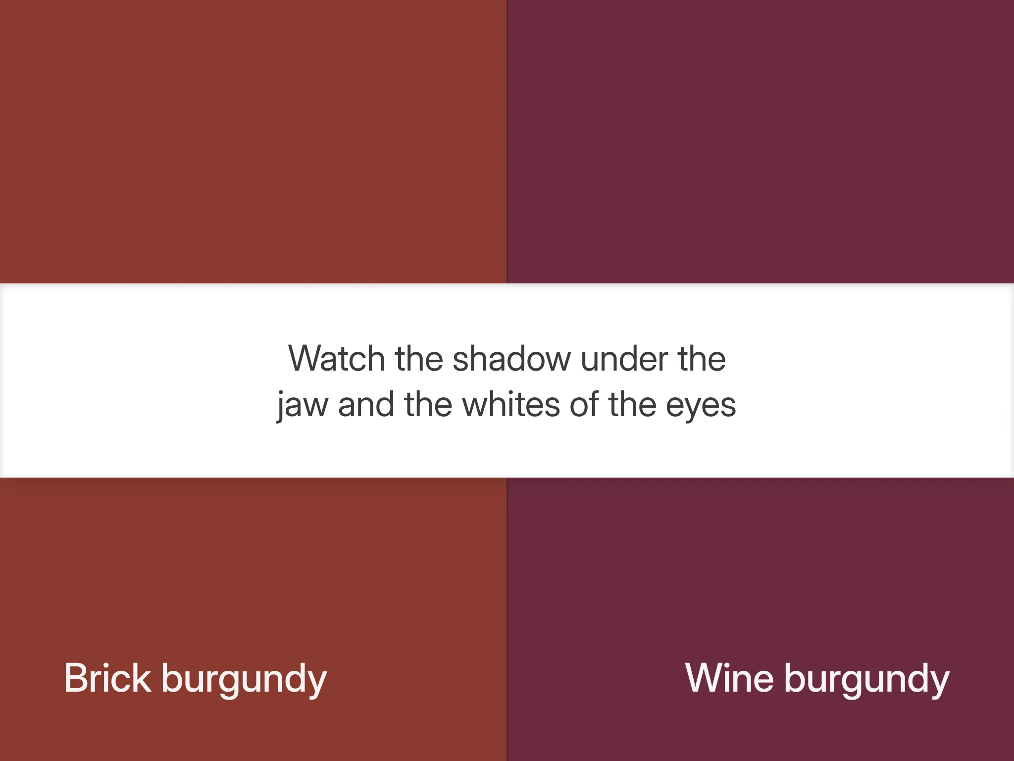
- Set up two knits and the light. Get two burgundy knits in the same weight and finish: a brick burgundy, with brown and red in it, and a wine burgundy, with blue and purple in it. Sit about an arm's length from a bright window with your back to the room, every overhead light off and any eye makeup removed.
- Hold each one under your chin for a slow count of five.
- Check the shadow under your jaw. On the burgundy that belongs to you it stays a clean gray and reads as shadow, nothing more. On the wrong one it picks up a cast: brick burgundy under a Deep Winter turns it muddy and faintly yellow, and wine burgundy under a Deep Autumn turns it gray-purple.
- Check the whites of your eyes. The right burgundy makes them look clearer and the iris darker against them. The wrong one dulls the whites and the area under the eye gets heavier.
What happens if you pick the wrong season
Both of these seasons are strong enough to survive a bad choice, which is the trap. Nothing collapses, so nobody corrects you.
What happens is a slow flattening. A Deep Winter in Deep Autumn's rust and olive looks dusty, as if the outfit had been left in a window too long. A Deep Autumn in Deep Winter's royal blue and raspberry gets the opposite problem: the color stays sharp and the face turns gray behind it, so people read the garment before they read you.
There is one clean data point available. Black is one of Deep Winter's eight core colors, worn right up to the face. For Deep Autumn it belongs in trousers and shoes, with espresso doing its job at the collar, and Curate Your Style gives the same advice: near the face, true black reads harsh on warm coloring because it carries no warmth. If black under your chin has always felt like the easiest thing you own, that is a vote for Deep Winter, though a vote and not proof.
Still not sure? Use black as the tiebreaker
Deep seasons are the hardest group to eyeball, because sheer depth flatters almost anyone and masks the undertone question underneath it. If the burgundy test came back ambiguous twice, do not run the burgundies a third time. Black is the darkest neutral the two seasons disagree on at the face: Wear for Deep Winter and below the waist only for Deep Autumn.
- Hold black under your chin where you held the knits, and watch the same two places: the jaw shadow, then the whites of your eyes.
- Check from the other side with rust, which is Wear for Deep Autumn and Skip for Deep Winter.
- Read the pair. Black easy and rust muddy points to Deep Winter. Black hollow and rust looking like your own coloring points to Deep Autumn.
If neither one moves, you may be testing the wrong pair. Deep Autumn sits next to True Autumn, which shares its warmth at less depth, and Deep Winter sits next to True Winter, which the Deep Winter and True Winter comparison separates with one green. If warm against cool is still open, start with the three undertone tests you can do at home.
If you would rather not run that experiment on your own wardrobe, a Wearly Labs color analysis does it from five photos and your answers. AI reads the photos, with a white sheet of paper in frame to correct the light, and fixed rules make the call. When a photo contradicts a clear answer, the answer decides. Photos fill in what the questionnaire doesn't ask. Your page marks all 50 colors Wear, Depends or Skip, each with its reason, and the key to it arrives by email, usually within 10 minutes.
Deep Autumn vs Deep Winter: common questions
Yes. Deep and Dark are two names for the same two seasons, and both are in use: Curate Your Style uses them side by side, and The Concept Wardrobe says Dark. Wearly Labs uses Deep. The name changes nothing about the test: both seasons are dark first, and undertone splits them.
No. Dark hair sets your value and pushes your contrast up, which is why both of these seasons usually have it. Undertone is a separate axis and it is the one deciding this question. If hair helps at all, it is through its highlights in daylight rather than its depth: Curate Your Style describes Deep Autumn hair as dark, sometimes near-black, with a hint of warmth or red, and Deep Winter hair as cool brown to blue-black, ashy or neutral rather than red or gold.
Yes, on its warm edge: it is the season's power color, which a Wearly Labs analysis calls wine, with forest green the close second. The version to leave alone is the cool one with blue in it.
No. In a Wearly Labs analysis emerald is Skip for Deep Autumn and Wear for Deep Winter, because it is cool at the root. The sample analysis gives the reason as "Its undertone runs the opposite way from yours, so it fights your skin." Forest green is the green a Deep Autumn wears at the face.
Below the waist. Chocolate, espresso and camel are Depends for Deep Winter: trousers, shoes, a bag. Their warmth works against a fully cool face, so black, charcoal or midnight blue do the grounding job near the collar.
Compare whites instead, because both metals looking fine is expected here: The Concept Wardrobe describes each season as skin that both metals suit, one suiting it better. Ivory against pure white is a blunter instrument than jewelry, and in a Wearly Labs analysis it is a straight swap: ivory is Wear for Deep Autumn and Depends below the waist for Deep Winter, pure white the reverse. It reads temperature here only because ivory is the warm white, so do not generalize it: the choice between soft white and pure white tracks chroma and value rather than undertone.
Not quite. Deep Winter also carries more chroma, rich where Deep Autumn runs medium to rich, so the two part at both ends of the saturation scale. Deep Winter skips the softened colors Deep Autumn can still use low down or as accents, such as sage, dusty blue and soft navy, because they read too dusty for its clarity. Deep Autumn keeps its brightest warm colors small: in the sample analysis tomato red is an accent only, because "A small dose carries real saturation, a whole garment would shout."