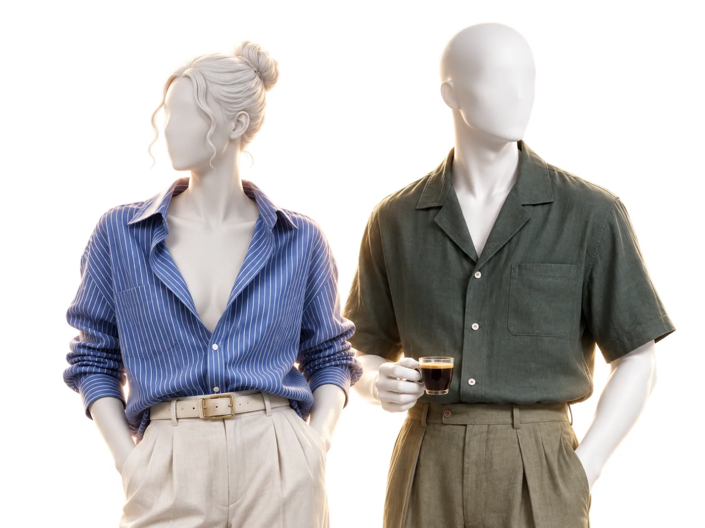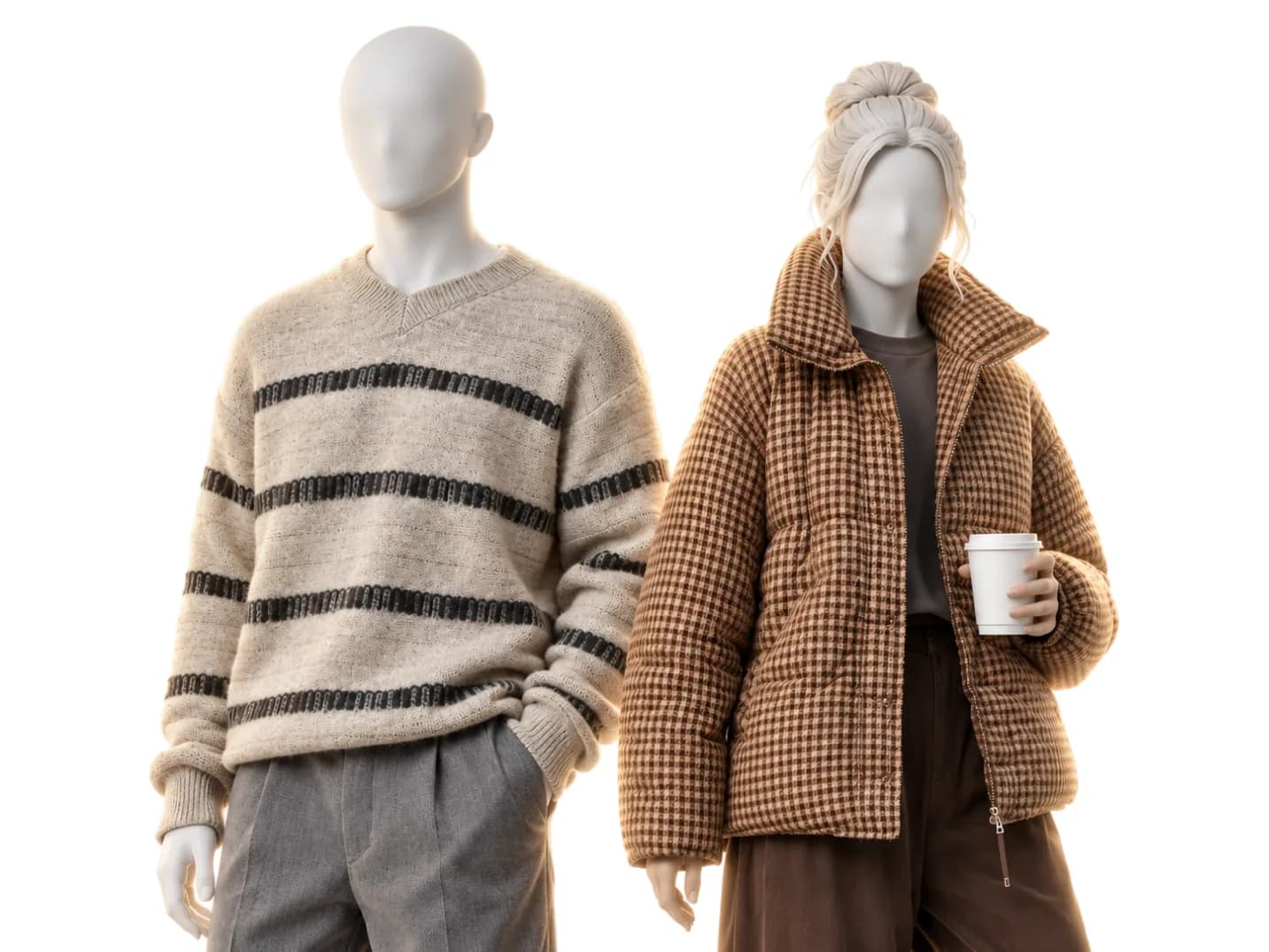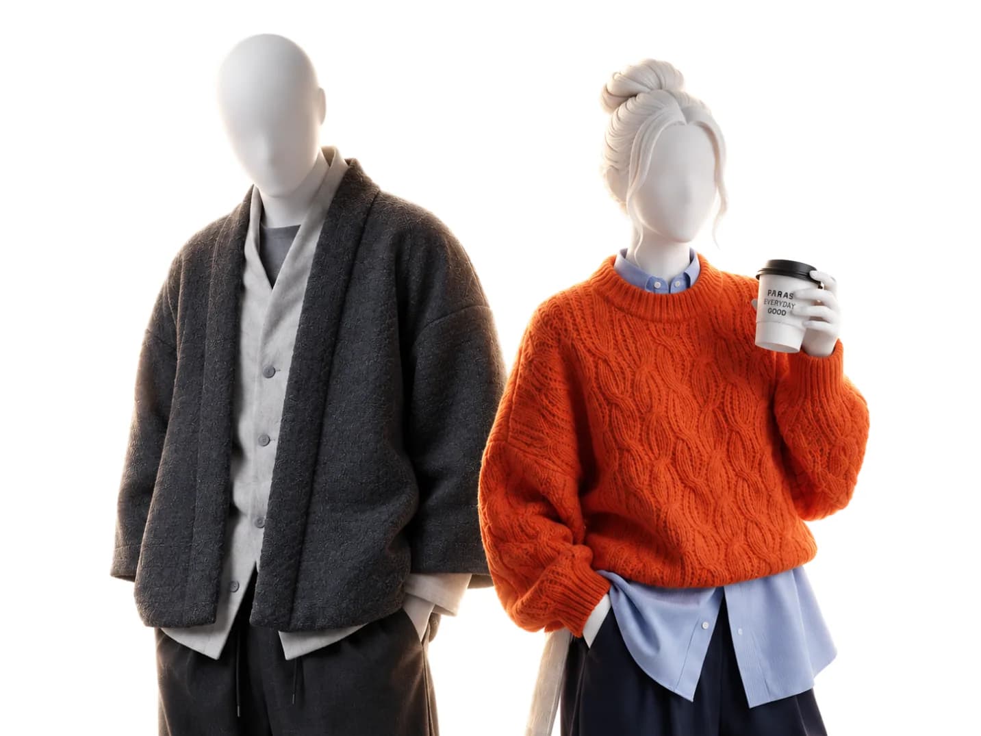
Japanese fashion style comes down to three ideas: make the cloth first, design the space between cloth and body, and let restraint do the talking. Each one turns into a rule you can use on the wardrobe you already own, and a test you can run in a mirror or a shop.
On this page
The reputation is not about one hot brand. Comme des Garçons showed at Paris Fashion Week in 1981, and the V&A describes its designer Rei Kawakubo as one of the "wave" of Japanese designers reshaping the global fashion landscape. Yohji Yamamoto made his Paris debut the same year. What they shared is a different operating system: proportion, fabric, and restraint instead of logos, trends, and volume.
That system is worth studying even if you never buy a single Japanese piece.
Craft as the starting point
Japan treats clothing as a thing to be made well before it is a thing to be marketed. Denim shows it best. Kojima, a district of Kurashiki in Okayama Prefecture, has been a textile town since the Meiji era, and when Japan fell for American style in the 1950s, local artisans applied their own traditions of craftsmanship to it. The first Japanese jeans were made in Kojima in the 1960s, and while many of the American brands that inspired them outsourced production overseas, Kojima's jean makers kept theirs local. Many Kojima brands still produce denim on vintage shuttle looms, which make rolls about half the width of newer machines, with a durable finished edge, the "self edge" that selvedge is named for.
Kapital, from the same district, began as a denim factory in 1984 after its founder, Toshikiyo Hirata, discovered American denim while teaching karate in the United States, and it now works boro and sashiko into its collections. Visvim says it connects the market with craftsmen who work with dignity, "while protecting the culture and technique that has been passed down from old times."
The takeaway is not "buy expensive." It is that fabric and construction are the product. A logo is just a sticker on it.
Proportion as the design language
Western fashion mostly designs bodies: clothes that trace and reveal. Japanese designers, Yohji Yamamoto and Rei Kawakubo of Comme des Garçons above all, design the space between cloth and body. The Japanese word for that space is ma. Reviewing Yamamoto's 2011 retrospective at the V&A, the critic Peter Campbell wrote in the London Review of Books: "On the whole these garments offer women's bodies refuges, not ways of displaying themselves."
Volume is deliberate. A wide trouser balances a compact jacket. A long coat sets a vertical line and everything else obeys it. This is why oversized Japanese tailoring looks intentional while a too-big Western suit just looks borrowed: the proportions are engineered, not accidental.
Volume has to match your frame
Copying Japanese proportion goes wrong in one place: volume is not a style, it is a decision about where the width goes. The same wide trouser is a Wear on some shapes and a Skip on others. Every cut and color gets one of three verdicts: Wear, Skip, or Depends when it works only under a condition, such as below the waist. Here is that one cut across five shapes, from each shape's page and from the sample analysis, the real result of Wearly Labs co-founder Filip Poláček, published with his consent. The first four are each shape's opening position. Filip's is a finished verdict, with his line read in.
| Shape | Wide trousers | Reason on the page |
|---|---|---|
| Pear | Wear, high-rise wide | "Sits at the waist and drops straight from the widest point, so the whole leg reads as one line." |
| Inverted triangle, women | Wear, high-rise wide | "Gives the lower half a width that can match the top." |
| Inverted triangle, men | Wear, wide-leg | "The one shape in the men's set where a genuinely wide leg earns its place, because it answers the shoulder." |
| Rectangle, men | Skip, wide-leg under a loose top | "A column over a column, and nothing anywhere marks where you end and the trousers begin." |
| Trapezoid, men (sample analysis) | Skip, high-rise wide-leg | "The wide leg starts from a waistband set at the wrong rise for you." |
A shape says how much room a cut can take. A line says how the cloth should behave. A sharp line asks for structure and crisp fabric, and fabric that pools and drapes softens the edge that frame is built on. A soft line asks for drape and give, and rigid construction is something that frame sits inside rather than fills. A medium line wants neither extreme: a rigidly architectural piece reads as costume, a fully fluid one as unmade.
Coats show it. In the sample analysis, which has a medium line, the long coat splits in two. The knee-length straight coat is a Wear: "The shoulder is drawn along the line your own shoulder actually runs." The long unstructured wool overcoat is a Skip: "Unstructured wool this loose hangs past your own shoulder line and hides it."
Restraint as strength
There is a Japanese aesthetic term, shibui: simple, subtle, unobtrusive beauty. The word first meant astringent, and in Edo it came to describe anything from song to fashion to craftsmanship that was beautiful by being understated. A shibui thing is quiet on first glance and rewarding on the tenth, because you do not tire of it. It shows up as muted palettes, matte textures, and detail you notice only up close. The strength is in what is left out. Compare that with logo-driven dressing, which asks the brand to do the talking. Shibui asks the cut and cloth to do it, and they are more persuasive.
Auralee says it in its own words: the aim is "a wardrobe defined by continuity rather than change," and each collection "begins with the pursuit of quality."
A quiet palette still has to be yours. One styling guide recommends a monotone of white, black or gray. Filip's coloring is Deep Autumn, which Wearly Labs calls Dark Autumn: warm, dark and saturated. On it, pure white, black and every gray are Depends, below the waist only. His quiet palette sits in other colors:
| Color | Verdict | Reason in the sample analysis |
|---|---|---|
| Olive | Wear | "Muted and warm, it never fights the depth in your skin." |
| Chocolate | Wear | "Its warm, understated depth sits comfortably alongside your own." |
| Charcoal | Depends, below the waist | "A steady neutral that anchors the lower half rather than the face." |
| Medium gray | Depends, below the waist | "A cool, faded gray that reads thin against your depth." |
| Black | Depends, below the waist | "Clear and deep, but its coolness sits wrong close to your skin." |
The shibui version of his wardrobe is olive, chocolate, espresso, camel and ivory at the collar, with black and gray lower down.
Test: hold the garment at your collar in daylight and watch your face, not the garment. If your face looks clearer, the color works at the collar. If it looks flatter or tired, it belongs below the waist.
What to steal
- Buy fabric first. Read the label before the logo. Wool, cotton, linen, leather, and blends that serve a purpose. If the material is cheap, the design cannot save it.
- Pick one silhouette statement per outfit. Wide trousers or a voluminous coat, not both at maximum. Japanese proportion play works because the rest of the outfit holds still. It is basic 5 in the 8 basics of dressing well.
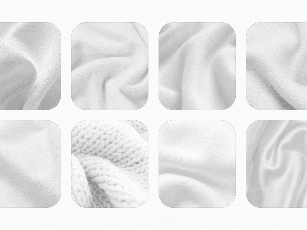
- Let texture carry the interest. A muted palette is not boring when it mixes ribbed knit, brushed flannel, and crisp cotton. Texture is pattern for adults.
- Care for what you own. The Japanese relationship with clothes extends past the purchase: repair, maintain, rewear. Boro, a method of repeated hand-sewn repairs that uses sashiko, a running stitch, comes from rural Japan, where cloth was scarce and mended garments were handed down for generations. A five-year wardrobe beats a five-week one.
A one-minute test for each rule
| Rule | One-minute test | You pass when |
|---|---|---|
| Buy fabric first | Read the label, crush the cloth in your fist for five seconds, turn the garment inside out | The first fiber listed is one you chose, the creases fall out and the seams are finished |
| One silhouette statement | In the mirror, point at the piece that carries the volume, then at the piece next to it that holds still | You can point at both |
| Texture carries the interest | Lay the outfit on the bed and run a hand over each piece | One piece has a strong surface and the rest are smooth or fine |
| Care for what you own | Check the five pieces you wear most for a loose button, an open hem or a pilled cuff | You can fix every one this week, before buying anything new |
Rule 3 has verdicts behind it in the sample analysis. Fine knit goes with everything and never competes with the cut. The heavy, textured cloths are Depends, one piece per outfit, and chunky knit is a Skip:
| Cloth | Verdict | Reason in the sample analysis |
|---|---|---|
| Fine knit (merino, cashmere) | Wear | "A soft, plain cloth that drapes cleanly for everyday basics." |
| Flannel | Depends, one piece per outfit | "Soft-falling and textured, warm cloth with real surface interest." |
| Corduroy | Depends, one piece per outfit | "Heavy, ridged surface that holds a shape rather than falling loose." |
| Chunky knit | Skip | "Heavy and textured, it collapses into folds rather than holding a line." |
The connection to knowing yourself
Here is the quiet link to what we do: Japanese dressing works because it is considered. Every choice is made against a standard instead of a trend. Your palette and your proportions are exactly such a standard, personal and slow to change. Once you know them, restraint stops being sacrifice and starts being precision.
A color analysis gives you the palette half of that standard and a body type analysis the proportion half. Wearly Labs does both in one analysis and gives every color and cut one verdict with its reason, like the tables above, which come from the sample analysis and the shape pages. Depends is always conditional, and the analysis names the condition: below the waist for a color, a hip-length top for a cut. To hold trends against the same standard, use the two questions in Trends are temporary, your colors aren't.
FAQ
Three ideas: the cloth comes first, volume is designed in the space between cloth and body, and restraint does the talking instead of a logo. In practice that means denim woven on vintage looms in Kojima, the clothes of Yohji Yamamoto and Rei Kawakubo cut away from the body, and shibui palettes of muted color, matte texture and detail you see only up close. Each idea gives you a rule, listed under What to steal.
Shibui means simple, subtle, unobtrusive beauty, the kind you do not tire of. In clothes it shows up as muted color, matte cloth and detail you notice only up close. The word first meant astringent, and in Edo it came to describe anything from song to fashion to craftsmanship that was beautiful by being understated.
Start with the idea, then Uniqlo U. You can try Japanese proportion with clothes you already own: take one piece with room in it and pair it with something narrow. When you buy, Uniqlo U is the high-street entry. Christophe Lemaire and Sarah-Linh Tran have designed it since 2016, their last collection became available on September 11, 2026, and Uniqlo says the line will continue. Beyond it are Auralee, whose own words are "a wardrobe defined by continuity rather than change," and Studio Nicholson, a London label whose founder, Nick Wakeman, names Japan as one of her reference points. The deep end is Yohji Yamamoto and Comme des Garçons.
No. Japanese volume does not need a slim build, it needs the volume placed where your frame can carry it. How much room a cut can take follows your shape, and how the cloth should behave, crisp or draped, follows your line. The table above shows the same wide trouser as a Wear on a pear and an inverted triangle and a Skip on a men's rectangle and a men's trapezoid. Size is not the test.
No, it is one valid uniform, and color analysis says for whom. Black is a Wear at the collar in three of the 12 seasons, True Winter, Dark Winter and Bright Winter, where it matches the coloring. In the other nine it is a Depends, below the waist only. In the sample analysis black is a Depends for Dark Autumn coloring: "Clear and deep, but its coolness sits wrong close to your skin." So keep the idea and change the tone: one dark color head to toe, in espresso or chocolate for Dark Autumn and True Autumn, in soft navy for the Summers.