Winter · color season
True Winter: your palette, and what to leave on the rail.
True Winter is fully cool and clear. Here is the palette that follows from that, the neutrals to build on, and how to wear them together.
- 8 core colors
- silver at the wrist
- 10 minutes to get yours
Last updated
At a glance
Where True Winter sits, and what follows from it.
- Light Summer
- True Summer
- Soft Summer
- Soft Autumn
- True Autumn
- Deep Autumn
- Deep Winter
- True Winter
- Bright Winter
- Bright Spring
- True Spring
- Light Spring
Each season sits between the two it shades into. The two Light seasons meet at the top, the two Deep ones at the bottom, the two Bright ones on the clear side and the two Soft ones on the muted side. Spring and Autumn are warm, Summer and Winter are cool.
- Undertone
- cool
- Value
- medium
- Chroma
- saturated
- Buy first
- Fuchsia
- Metal
- Silver
- Keep from the face
- Tomato red
- Dusty blue
- Plum
- Warm aquamarine
- Mistaken for
- Deep WinterBright WinterHow they differ
Am I a True Winter?
True Winter is coloring that is cool above all: a fully cool undertone (the cast under the skin, never golden), clear rather than grayed color, a medium to deep value (how light or dark you read) and high contrast.
Fuchsia, royal blue and pure white match that coolness and keep the eyes sharp, while warm rust puts a flush in the cheeks and grayed soft navy makes the skin look tired.
The Concept Wardrobe ranks the traits the same way: cool first, bright second. Hair usually runs from dark ash brown to black with no natural golden highlights. If you dye it, a cool dark shade keeps the contrast, where caramel or copper puts warmth right at your face. The eyes read cool, blue, gray or a cool brown, often a dark one, with clear definition rather than a soft golden blur.
Skin can be any depth, very fair or very deep. What marks it is that the whites of the eyes and the teeth stand out sharply against everything else. Wrist veins look blue or purple, the weakest of these signals on its own (three undertone tests to do at home).
For the shop test, hold a fuchsia top under your chin in daylight, then a coral one. Both are bright, so what you are really comparing is temperature. On True Winter coloring fuchsia makes the face look clearer, and coral makes it look flushed and slightly tired. Coral is no near miss either: your page marks it a Skip, too warm beside your cool.
An analysis gives a verdict on all 50 colors instead of two. AI does the reading, from your five photos and your answers, fixed rules make the call, and the answers weigh the most. Each one comes back as Wear, Depends or Skip with the reason beside it, and a Depends color goes below the waist or into an accent.
The sample analysis is the real result of co-founder Filip Poláček, a Deep Autumn: warm where True Winter is cool, softer where it is clear. Seven of the eight True Winter core colors are a Skip on his page, and for fuchsia the reason reads: "Its icy pink base clashes with the warmth under your skin." The eight below are the colors a True Winter page builds on, the two strongest first.
Check the direction first.
Four questions from the questionnaire, scored by the rules the analysis uses. They show a direction, not a season: the analysis also reads your photos.
Question 1 of 4
Your natural hair color?
Pick the closest match. If you dye it, go by your roots.
The palette
The eight colors True Winter is built on.
- Anywhere, the face included
The strongest color after fuchsia, and the easier of the two to wear every day. A royal blue knit, shirt or coat brings full saturation without the attention a bright pink draws.
- Anywhere, the face included
Your power color. A fuchsia top or scarf puts the strongest cool color of the palette right next to your skin, where its clarity has the most to do.
- Anywhere, the face included
Green with the blue turned up. Emerald is cool where olive and leaf green are warm, so it is the one green your page marks Wear. Buy the dress, the shirt or the knit in it.
- Anywhere, the face included
Red with blue in it rather than orange, for a coat, a lipstick or anything meant to be seen across a room. Tomato red, the orange version, is a Skip.
- Anywhere, the face included
The light end of the palette, and the one pastel your page marks Wear. A whole ice blue shirt suits you; on a Deep Winter page the same color shrinks to an accent.
- Anywhere, the face included
Purple with nothing gray in it, strong enough to carry an outfit alone against black. Lavender, its pale cousin, goes below the waist, and plum, its muted one, is a Skip.
- Anywhere, the face included
The cool pink of the season, redder than fuchsia and just as clean. Keep it bright: the same pink softened into dusty pink or mauve is a Skip.
- Anywhere, the face included
A neutral as much as a color, and the one core color here that a warm Deep Autumn wears too. Midnight blue tailoring, a suit or a coat, is the backbone of a True Winter wardrobe.
Neutrals and metal
Your neutrals, your white, your metal
Your five neutrals are all cool: black, pure white, charcoal, medium gray and midnight blue. There is no brown, no beige and no camel among them, and the gap is the point. Black, charcoal and pure white are the rare part, a Wear at the collar for the three Winters and for no other season. True Summer, the other season led by coolness, keeps all three below the waist, because its coloring is muted where yours is clear.
Pure white is your white, and the reason is temperature. With no warm register anywhere in your palette, ivory is the one warm thing in the outfit. It reads less like a shade of white than like a mark on the fabric.
On fully cool skin its cream cast settles as dullness and deeper shadow under the eyes, and it takes the snap out of any fuchsia or royal blue beside it. Your page gives ivory and soft white Depends, below the waist only: an ivory chino is fine, an ivory shirt is not.
Your metal is silver, with steel, white gold and platinum counted in. Gold is the one warm metal, and on a palette with no warmth anywhere else it always looks borrowed.
Your power color is fuchsia, with royal blue as the second strong color for the days when pink is too much. Both work for the same reason, cool and clear at full strength, and every color in the next section fails by breaking one half of that.
At the face
Wear this, skip that
- Sharp redTomato red
Too warm beside your cool.
- Medium grayDusty blue
Too dusty for your clarity.
- Midnight bluePlum
Too dusty for your clarity.
- EmeraldWarm aquamarine
Too warm beside your cool.
The colors that fight you
A True Winter page gives Skip to 21 of the 50 colors, the longest Skip list of the twelve seasons, shared with True Spring and Soft Summer. Two reasons cover all 21. Thirteen are marked "too warm beside your cool" and eight "too dusty for your clarity"; of the rest, 17 are Depends and 12 are Wear.
Too warm: the reds, oranges and warm pinks. Tomato red, coral, rust, orange, terracotta, peach and warm pink all carry an orange cast. Next to a fully cool undertone that cast reads as a flush in one light and as sallowness in the next. Sharp red, in the first pair above, is the red to buy instead of tomato red.
Too warm: the yellows and the warm greens. Golden yellow, mustard, light gold, leaf green, olive and warm aquamarine have gold in them where the first group has orange, and the result on your skin is the same. Emerald replaces the greens, as the pair above shows, and lemon is the one yellow left to you, as an accent.
Too dusty: the grayed colors. Soft navy, dusty blue, dusty pink, mauve and sage all have gray mixed in. Albert Munsell wrote in A Color Notation (1905) that "loss of chroma is loosely called fading." A grayed color does exactly that to a True Winter: the garment goes quiet, and your face goes quiet with it. Medium gray against dusty blue, above, is the difference between a clean neutral and a faded color.
Deep is not the same as clear: wine, plum and forest green. These three look like Winter colors, and all three are Deep Winter core colors, but each sits a step below bright. Your page marks all three too dusty for your clarity. The pair above, midnight blue against plum, is the swap: the same depth, and a Wear.
The neutrals bought by accident: ivory, latte, khaki, warm greige and soft white. Nobody examines a neutral, because a neutral feels like the safe purchase. Each of these is warm or softened, and it does its damage in the biggest pieces near your face, the shirt and the coat. Below the waist they pass: Depends for all five, trousers and shoes for four of them, a belt or a shoe for warm greige.
The fitting-room test that works best for this season is a black sleeve. Hold the candidate against black in daylight. A True Winter color keeps its own edge, the way fuchsia, royal blue and emerald plainly do. A warm or dusty color sinks into the black and turns into a smudge at the seam. Wine and plum sink first, and those two are most of what separates you from a Deep Winter.
Every color
All 50 colors, judged for True Winter.
Choose a color to see where it goes, the reason, and what the two seasons True Winter is mistaken for do with it. 21 of the 50 are a Skip.
Use the arrow keys to move from color to color.
Anywhere, the face included
A shirt, a coat, anywhere.
The same color in the seasons True Winter is mistaken for
- Deep WinterAnywhere, the face included
- Bright WinterAnywhere, the face included
Anywhere, the face included
A shirt, a coat, anywhere.
The same color in the seasons True Winter is mistaken for
- Deep WinterAnywhere, the face included
- Bright WinterAnywhere, the face included
How to combine True Winter colors
True Winter combining comes down to one line: clean blocks, maximum contrast allowed, nothing warm or muted.
Clean blocks means each piece is one undiluted color with a hard edge where it meets the next, rather than a blend. Maximum contrast is allowed, which is rarer than it sounds. Most seasons have to narrow the gap between their lightest and darkest piece; a True Winter looks best with black against pure white at full distance.
- Office: a midnight blue suit, a pure white shirt, a sharp red tie and black oxfords.
- Evening: black wide-leg trousers, a fuchsia silk top and silver earrings.
- Weekend: a charcoal coat over an ice blue shirt, with black jeans.
- Summer: an ice blue linen shirt, light gray trousers and lemon espadrilles.
What you cannot do is dilute. One warm accessory or one dusty knit undoes the whole outfit, because this palette has no muted register to absorb it. Each of your two neighbors relaxes one of these rules, the dusty one or the warm one, and that is exactly where they get mistaken for you.
Mistaken for
Seasons True Winter gets confused with
 This pageTrue Winterfully cool and clear | 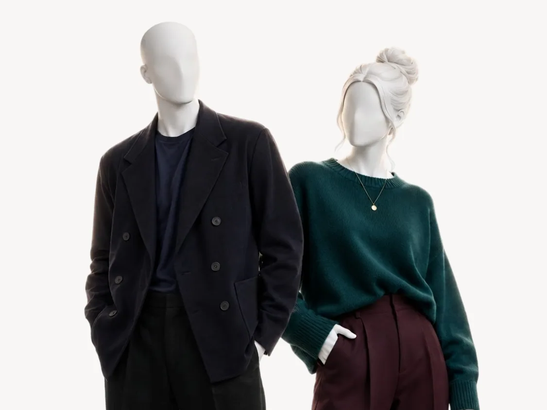 Mistaken forDeep Wintercool and deep with high contrast | 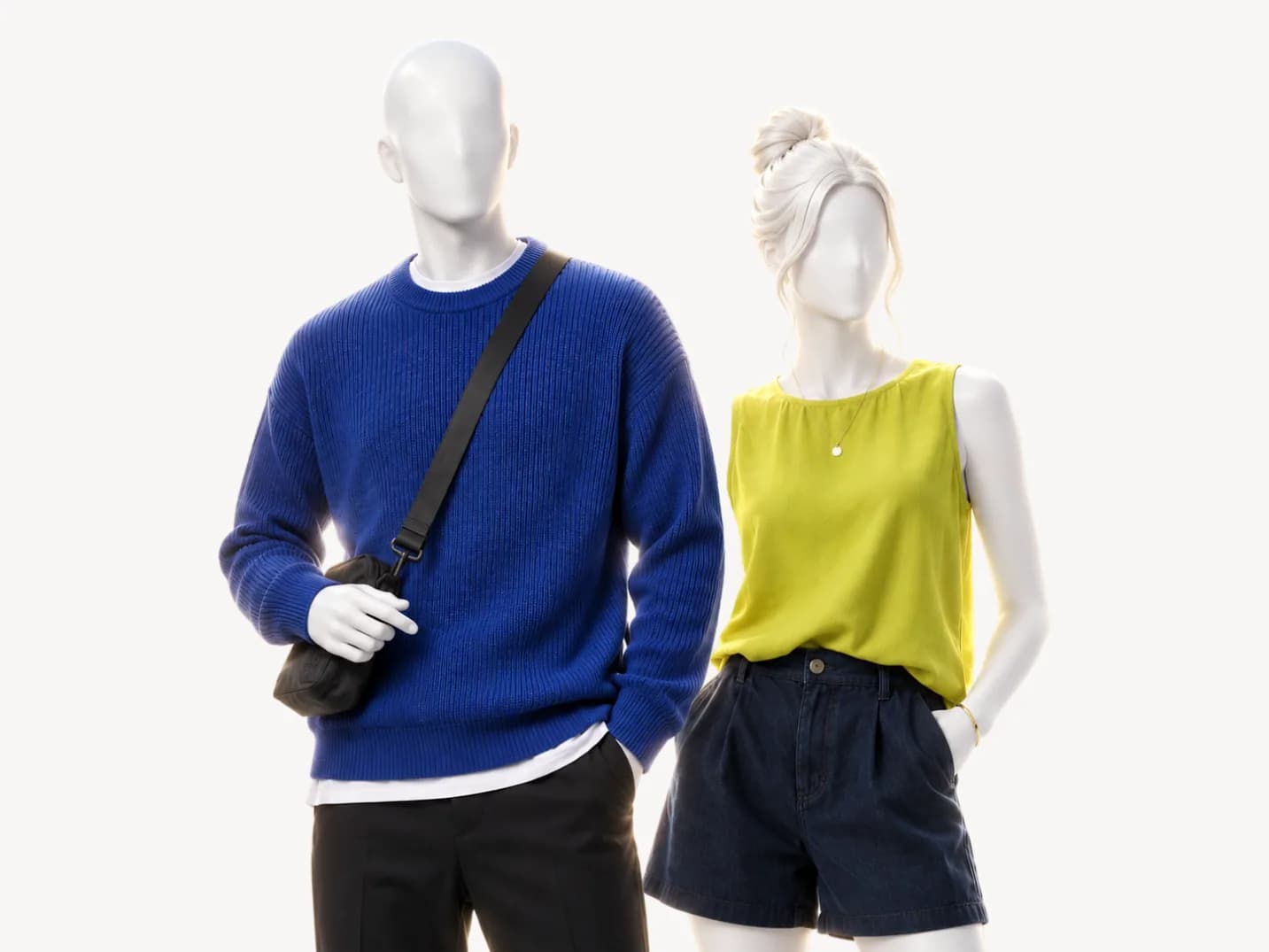 Mistaken forBright Wintercool and vivid with high contrast | |
|---|---|---|---|
| Undertone | cool | cool | cool |
| Value | medium | dark | medium |
| Chroma | saturated | saturated | saturated |
| Metal | silver | silver | polished silver |
| Wine | |||
| Plum | |||
| Forest green | |||
| Lemon | |||
| Ice blue | |||
| Medium gray |
Deep Winter. No two seasons in the system are closer: 46 of the 50 colors get the same verdict from both. You share the undertone, the contrast, silver, and black and pure white at the collar.
Four colors split you: wine, plum and forest green are a Wear on a Deep Winter page and a Skip on yours, and ice blue goes the other way. Hold deep purple, which you both wear, under your chin, then plum. If the plum looks as rich, read Deep Winter; if it looks heavy and dulls the skin, you are the True one.
Bright Winter. Further apart: the two seasons give the same verdict to 37 of the 50 colors. Bright Winter leads with brightness where you lead with coolness, sits less deep, and its undertone carries a little neutral, so most of your warm Skips are a Depends there, below the waist or as an accent.
The tell is lemon, a Bright Winter core color and an accent only on your page. Medium gray runs the other way: a Wear for you, a belt or a shoe for a Bright Winter. If a clean lemon shirt lights you up at the collar, read Bright Winter.
If you are still between Deep Winter and True Winter, the side-by-side comparison runs a green swap against a control color and says what to watch at the jaw. If the question is warm against cool at all, start with the undertone tests linked above. The method lists what every season is read from: undertone, value, chroma, and the contrast between your skin, hair and eyes.
Where to go from True Winter
How the color analysis works Color seasonDeep Wintercool and deep with high contrast
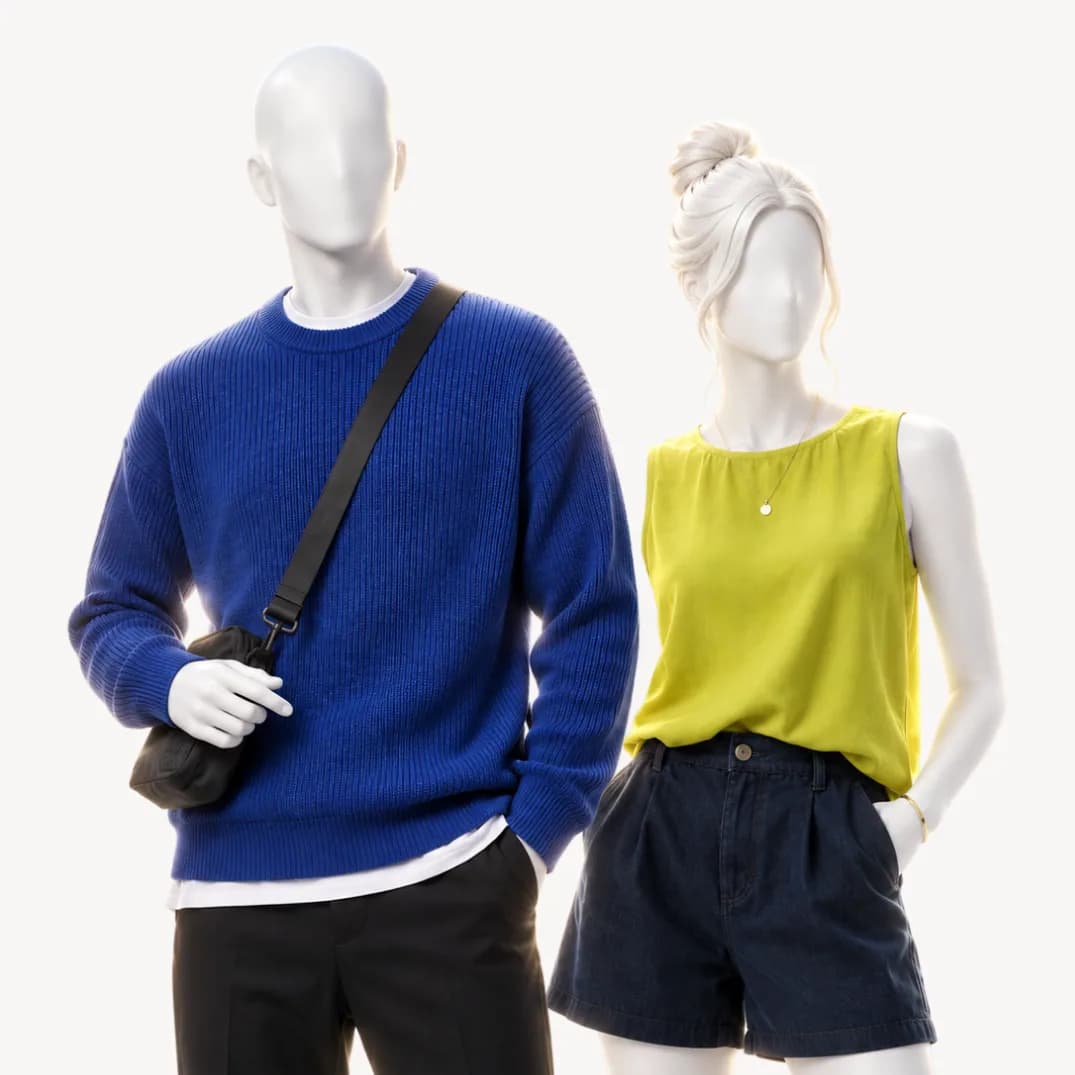 Color seasonBright Wintercool and vivid with high contrast
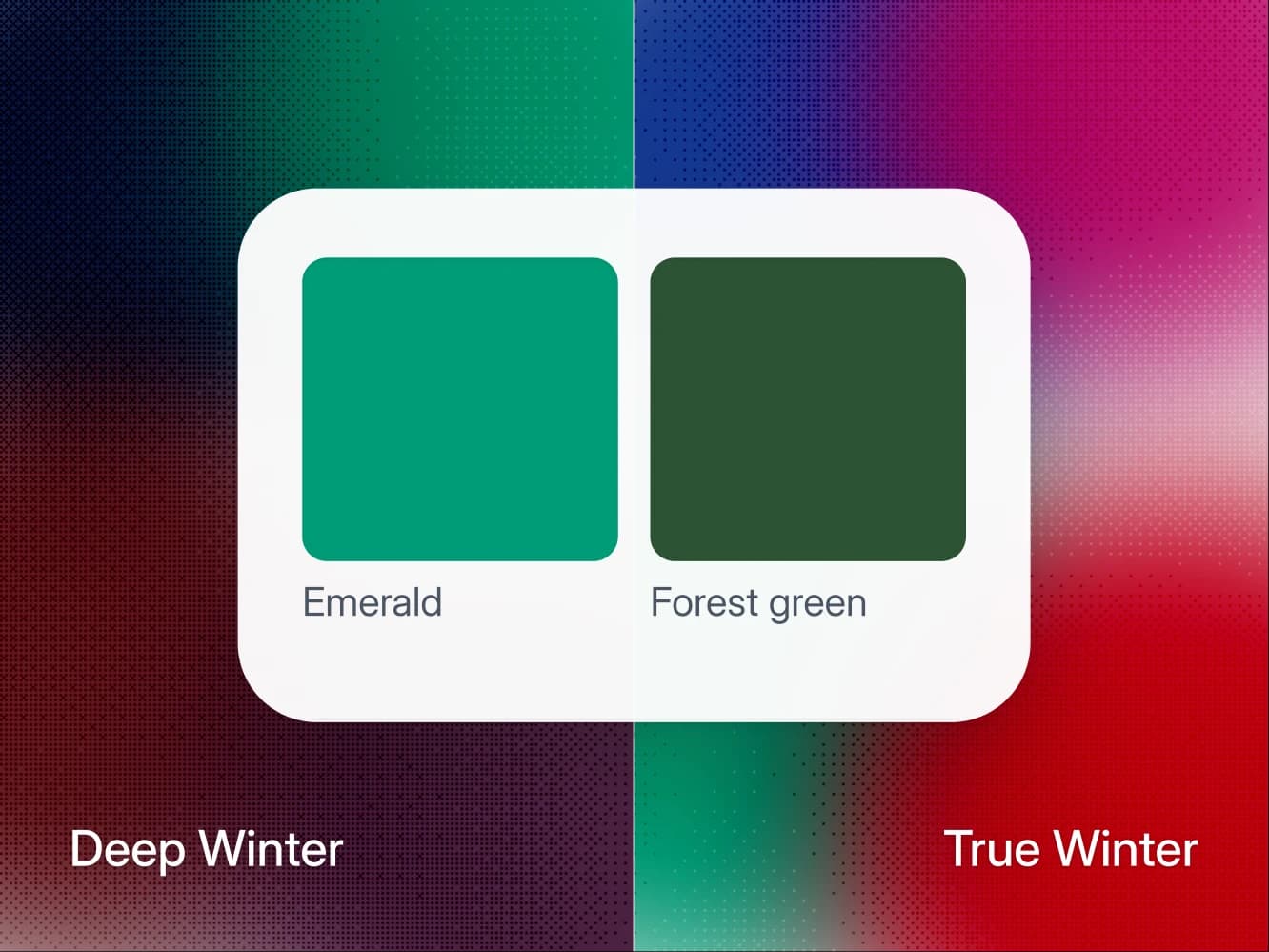
Seasons · 11 min
Deep Winter vs True Winter: how to tell which one you are
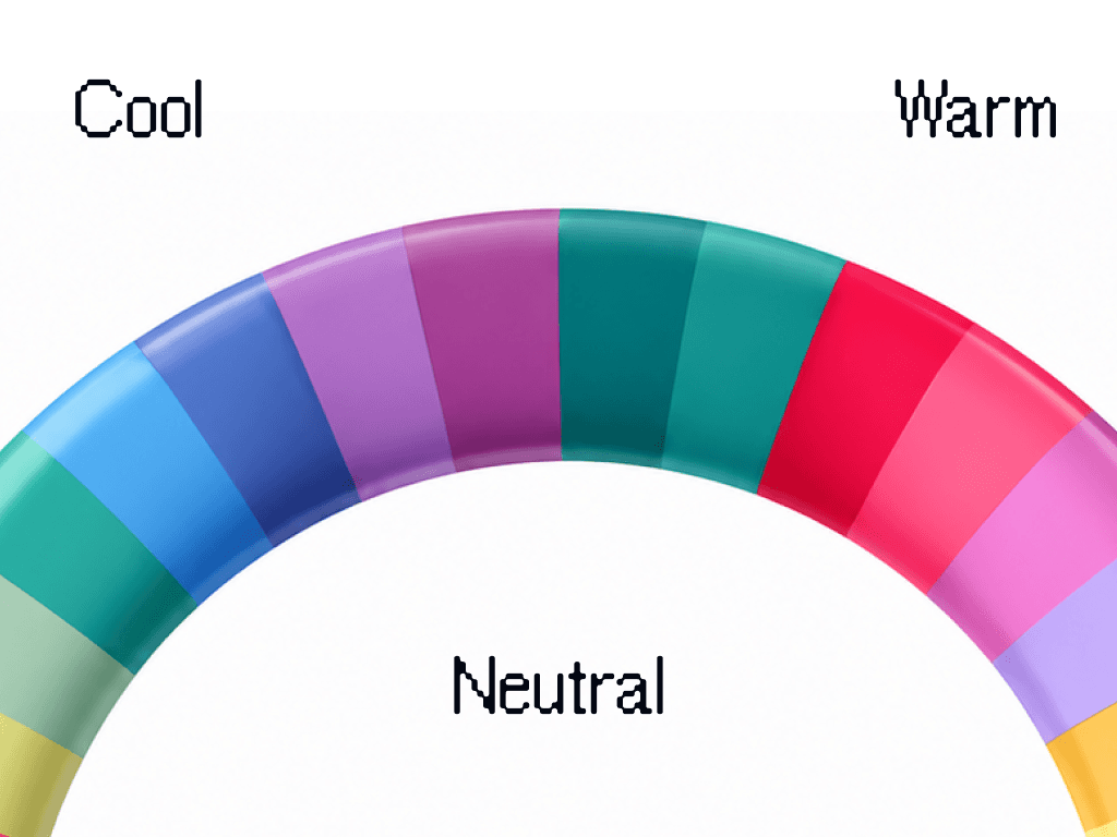
Deep Winter and True Winter both wear pure white, black and silver. Four colors split them, and one forest green test shows which one you are.
Seasons · 9 min
Find your undertone at home (warm, cool, or neutral)
Three daylight tests to find your undertone at home: wrist veins, gold vs silver, white paper. Plus how to read a neutral or olive result.

Method · 8 min
How to take photos for an accurate color analysis
The light, the angles, and the white paper trick. How to take five photos that give a color analysis something real to work with.
- All 12 color seasons
FAQ
True Winter questions.
True Winter is fully cool and clear. The quick check is whether cool colors at a medium value look better on you than their opposite, and whether silver suits you better than the other metal. That gets you close. The reason people land between two seasons is that the eye compares badly under mixed light, which is what a measured analysis is for.
Nothing dramatic. The colors furthest from your palette pull attention to shadows and to any unevenness in your skin, so you look tired rather than the color looking wrong. It shows most in the piece nearest your face and barely at all below the waist, which is why the palette matters more for a shirt than for trousers.
Yes, anywhere. Black is as cool and as clear as your coloring, so it belongs right next to your face. Black with pure white is your easiest pairing.
No. True Winter is cool at its root, and that is the axis the whole system turns on. Two seasons can share a value and a chroma and still want opposite colors, because the undertone decides which version of a color suits you.
That is what the analysis does, but not from one photo and not from the photo alone. It reads five photos against your own answers about how you burn, what your veins look like and which metal suits you, and your answers outrank the photos where the two disagree. Your photos are used for your analysis and nothing else. They are never used to train AI models.
Yes. True Winter and Cool Winter are two names for the same season, the Winter whose leading trait is coolness. Curate Your Style lists Cool Winter as the other name and calls True Winter the coolest of the three Winters.
Not near your face. Chocolate, espresso and camel all get Depends on a True Winter page, below the waist only, because all three are warm and this season has no warm register at all. Keep them to trousers, shoes and bags, and near the face swap them for charcoal, midnight blue or medium gray.
No. Wine, the cool burgundy, is a Skip: its temperature is right, but it sits a step below bright, and your page marks it too dusty for your clarity. For a deep red take sharp red, and for a berry take raspberry; both are Wear.
No. Ice blue is a core color, Wear anywhere, the face included. The rest get Depends: lavender and soft pink as trousers or shoes, mint as a scarf or a strap. What fails at the face is a pastel gone dusty or warm, and peach, the warm one, is a Skip.
Silver, with white gold and platinum counting as silver. Gold brings the only warmth into an outfit that has none anywhere else, so keep it away from your face.
Another question about the method or your result? Write to us
Find out what suits you, and why.
A short questionnaire and five photos. Your key arrives by email, usually within 10 minutes.