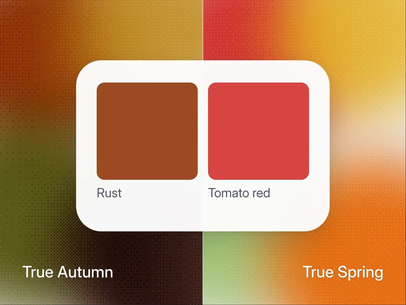
True Autumn and True Spring are the two fully warm seasons, so the undertone test cannot tell them apart. Rust can: if rust looks cut for you, you are True Autumn, and if tomato red does more for your face, you are True Spring. What the test reads is chroma, how clean and bright a color is. True Spring wears warm color at full clarity, like coral and leaf green, and True Autumn wears it with depth and some gray in it, like rust and olive.
On this page
- True Autumn vs True Spring at a glance
- The short answer: rust against tomato red
- Where the two seasons agree
- Where True Autumn and True Spring split
- The tell: rust against tomato red
- What the wrong season looks like
- If two runs of the test disagree
- If neither season fits
- True Autumn vs True Spring: common questions
True Autumn vs True Spring at a glance
- The split: chroma. True Spring wears warm color at full clarity, True Autumn wears it with depth and some gray in it.
- The test: hold rust and tomato red under your chin. Rust cut for you means True Autumn, tomato red doing more for your face means True Spring.
- What they share: fully warm, medium contrast, gold, ivory, camel, and the same verdict on 36 of the 50 colors.
- Where the verdicts part: 14 of the 50 colors, among them rust, mustard, olive, coral and leaf green.
- If neither fits: a neighbor, Soft Autumn or Deep Autumn on one side, Light Spring or Bright Spring on the other.
The short answer: rust against tomato red
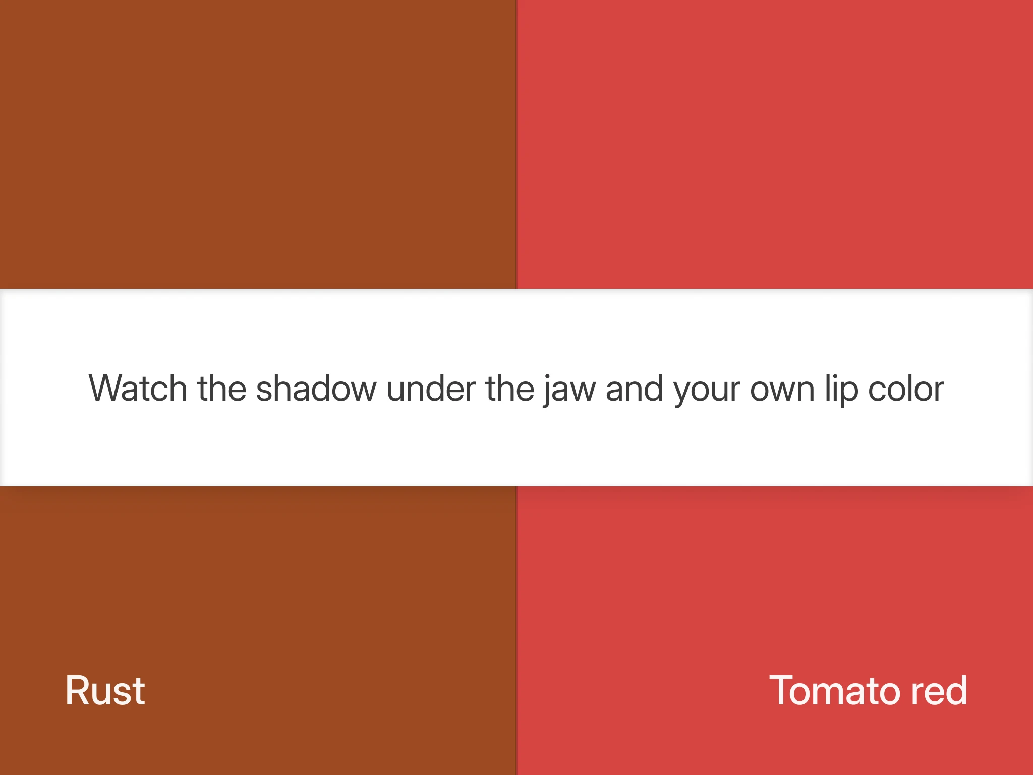
Put a tomato red next to a rust and see which one your face prefers.
- True Spring: the tomato red brings your face forward, and the rust looks dusty on you.
- True Autumn: the rust looks cut for you, and the tomato red holds up beside it.
Both palettes wear tomato red, so rust is the color on trial: a True Spring cannot carry it at the collar, a True Autumn can. Gold and ivory will not decide this, so stop checking them. If rust looks cut for you and tomato red shouts over the top of you, that is a third result, and it points past both seasons. The section on neighbors below covers it.
Where the two seasons agree
They agree on four points, and that is the whole reason this pair keeps getting mixed up.
- Undertone. Both are fully warm, with no cool-neutral hedge in either direction, so the wrist vein trick and the gold against silver trick from finding your undertone at home come back positive for both and settle nothing.
- Contrast. Both run medium, the comfortable middle where neither stark pairings nor tonal ones look wrong.
- Metal and neutrals. Gold, ivory and camel in both palettes, with pure white kept below the waist in both.
- Core colors. Two appear on both lists by name, golden yellow and terracotta.
The verdicts agree as well. A Wearly Labs analysis gives each of its 50 colors a verdict, Wear, Depends or Skip, and these two seasons get the same verdict on 36 of them. Eight are a Wear for both: tomato red, orange, golden yellow, terracotta, khaki, chocolate, camel and ivory. Sixteen are a Skip for both, and every one of those is cool, from sharp red and wine to ice blue and lavender.
Where True Autumn and True Spring split
Read this table by looking for the row that is not a repeat.
| Axis | True Autumn | True Spring |
|---|---|---|
| Undertone | Fully warm | Fully warm |
| Value | Medium to deep | Medium |
| Chroma | Muted to rich | Bright |
| Contrast | Medium | Medium |
| Best white | Ivory | Ivory |
| Metal | Gold | Gold |
| Power color | Rust | Tomato red |
| Black | Below the waist only | Below the waist only |
Value and chroma are the two axes that differ, and both are Albert Munsell's terms from A Color Notation, first published in 1905. Value is "the quality by which we distinguish a light color from a dark one", and chroma is "the quality by which we distinguish a strong color from a weak one." In 12-season terms both seasons lead with warmth and the second trait decides, which The Concept Wardrobe puts plainly: "True Spring is bright, whereas True Autumn is muted."
Chroma is doing the work. Value helps a little, since True Autumn extends deeper, but chroma is the axis you can actually see. In a True Spring analysis, olive, mustard, sage and soft navy are turned down for being grayed, with notes like "too dusty for your clarity", and only forest green is refused for depth, with a note like "too dark for your light".
The 14 colors where the verdicts part
In the palette a Wearly Labs analysis gives each season, Depends always comes with its place: below the waist, or as an accent only. These are the 14 colors of the 50 that the two seasons get differently.
| Color | True Autumn | True Spring |
|---|---|---|
| Rust | Wear | Depends, below the waist |
| Espresso | Wear | Depends, below the waist |
| Warm greige | Wear | Depends, accent only |
| Medium denim | Wear | Depends, accent only |
| Mustard | Wear | Skip |
| Olive | Wear | Skip |
| Forest green | Wear | Skip |
| Sage | Depends, accent only | Skip |
| Soft navy | Depends, accent only | Skip |
| Coral | Depends, accent only | Wear |
| Leaf green | Depends, accent only | Wear |
| Turquoise | Depends, accent only | Wear |
| Warm aquamarine | Depends, accent only | Wear |
| Latte | Depends, below the waist | Wear |
Read the True Spring column and the rule is plain: what it refuses is grayed or deep, and what it gains is light and clean. The trade is uneven, though. Nothing True Spring wears is a Skip for True Autumn, so the clean brights stay open to a True Autumn at accent size, in a scarf, a strap or a shoe, while mustard, olive and forest green do not cross the other way at any size. Both full palettes are on the True Autumn and True Spring pages.
The tell: rust against tomato red
Take two tops in the same fabric, one rust and one tomato red. These are the power colors of the two seasons and they share an undertone, so what is left between them is mostly clarity, with a step of depth behind it. Rust also splits the two families as a whole in these palettes: it is a Wear for all three Autumns and a Depends, below the waist, for all three Springs.
- Set the light. Stand at a window in daylight, out of direct sun, and skip the first and last hour of sunlight, when the light itself runs warm and tints both tops alike. Keep a mirror about an arm's length away and every lamp switched off.
- Clear your face. Wipe your lips completely clean and tie your hair back, since this test reads your mouth as well as your jaw.
- Tomato red first. Hold it under your chin and watch the shadow under your jaw and your own mouth. On a True Spring the shadow resolves into a clean, soft edge and your lips find their own color again instead of blending into the skin around them.
- Then rust. Hold it in the same place. On a True Autumn it settles the shadow into a warm gray that belongs to your face, and the mouth holds its color, while on a True Spring it drops a gray film over everything and the mouth goes flat.
Tomato red holds on a True Autumn too, because it is a Wear in that palette as well, so expect a close result on this side. A draw is a pass for rust, and a pass for rust is the True Autumn answer. If the mouth signal and the jaw signal disagree, trust the jaw and run it again tomorrow.
For a second reading, swap the reds for two greens, olive and leaf green. They split in both directions: olive is a Wear for True Autumn and a Skip for True Spring, leaf green a Wear for True Spring and an accent only for True Autumn. The green your jaw shadow settles under names your side.
What the wrong season looks like
Warm on warm means nothing looks obviously broken, so this error can run for years.
- A True Autumn in True Spring's clearest colors. In a coral shirt or a leaf green knit, the garment arrives before the face does and skin texture comes forward. The same colors in a scarf or a shoe are fine, and that is the size the True Autumn palette gives them.
- A True Spring in True Autumn's olive, mustard and forest green. The face can look tired, because the color absorbs light it needed, and the eyes lose their liveliness first. Rust and espresso are the milder version of the same mistake: fine as trousers, wrong as a shirt.
Black does not belong at the collar in either palette. Both give it Depends, below the waist only, so if you have been forcing black to work with warm coloring, the fix is a different dark, not a different black. A True Autumn gets the same grounding job from chocolate, espresso or forest green at the collar. A True Spring gets it from chocolate, keeps espresso low and puts camel or ivory up top.
If two runs of the test disagree
Chroma is harder to judge in a mirror than undertone, because vision adjusts to the light it is working in, and a warm face beside a warm garment gives it nothing to reset against. A 1995 study by Mark Fairchild and Lisa Reniff in the Journal of the Optical Society of America tracked that adjustment after a change in the color of the light: it ran in two stages, a fast one over a few seconds and a slower one over about a minute. Your first glance is the most honest one, so hold each color up, decide, and put it down before the next.
If two runs of the red test came back split, photograph both reds in the same frame at the same exposure, with a white sheet of paper in the shot so you can see whether the camera shifted the light, and look at the pictures an hour later, once your eye has forgotten which answer it wanted.
If neither season fits
Some results point past both seasons, each to a neighbor.
- Rust looks cut for you and tomato red shouts. Both seasons here wear tomato red, so this result sits one step further into Autumn. Soft Autumn skips tomato red outright, and Deep Autumn keeps it to an accent. Espresso at the collar tells those two apart, since Deep Autumn wears it there and Soft Autumn keeps it below the waist. Soft Autumn vs True Autumn has the full test for the softer side.
- Rust looks dusty and tomato red is too much as well. That is the Light Spring pattern: coral is its ceiling, and tomato red, orange and golden yellow are accents only.
- The True Spring result, but khaki looks flat at the collar. Check Bright Spring, which keeps khaki below the waist where True Spring wears it anywhere. The True Spring page compares the two.
- Rust and tomato red both look wrong, and so does gold. Go back a step to undertone, with finding your undertone at home.
The sample analysis, the real result of co-founder Filip Poláček, shows the first of those in writing. Filip is a Deep Autumn, and his page names True Autumn as his sister season. His photos alone pointed to True Autumn, and his answers settled Deep Autumn.
- Rust is a Wear: "Warm, dark and softened just like your own natural coloring."
- Tomato red is a Depends, as an accent only: "A small dose carries real saturation, a whole garment would shout."
In a Wearly Labs color analysis, AI does the reading from five photos, with a white sheet of paper in frame to correct the light, fixed rules make the call. When a photo contradicts a clear answer, the answer decides. Photos fill in what the questionnaire doesn't ask.
True Autumn vs True Spring: common questions
Either one, because gold and ivory only show that you are warm, which is the shared half. They do not tell you which of the two you are. Take the rust test next.
No. True Spring is clearer as well as lighter, and clarity is the difference you can see. When the True Spring palette turns down olive and mustard, the reason is dust, not depth: a note like "too dusty for your clarity". Value does part them a little, since True Autumn extends deeper, and forest green is the one color True Spring loses to it.
Yes, the warm, saturated ones. Tomato red, orange and golden yellow are all a Wear in the True Autumn palette, the collar included. The lighter, cleaner brights that belong to True Spring, coral, leaf green, turquoise and warm aquamarine, stay at accent size.
Not near the face. Olive and mustard are a Skip for True Spring, and rust is a Depends: trousers and shoes rather than a shirt. The autumn-looking colors True Spring keeps at full size are terracotta, golden yellow, orange, khaki and camel.
In the 12-season system these palettes follow, yes: Warm Spring and Warm Autumn are other names for True Spring and True Autumn, the fully warm center of each family. A few palette sellers split them. Kettlewell, for one, lists a Warm Autumn and a True Autumn side by side, so check whose system a palette comes from.
Only as a hint: both seasons tend to show green-reading veins and golden freckles. A True Spring eye is usually amber or warm green and looks clear and defined at the rim. A True Autumn eye is more often warm brown or green, with gold flecks around the pupil. A tan, dyed hair or a lamp shifts those cues, so let rust at the jaw have the last word.
The eight both palettes wear: tomato red, orange, golden yellow, terracotta, khaki, chocolate, camel and ivory, with gold at the wrist and black kept to trousers and shoes. Anything from that list is right whichever way the test comes out.