Autumn · color season
True Autumn: your palette, and what to leave on the rail.
True Autumn is fully warm and rich. Here is the palette that follows from that, the neutrals to build on, and how to wear them together.
- 8 core colors
- gold at the wrist
- 10 minutes to get yours
Last updated
At a glance
Where True Autumn sits, and what follows from it.
- Light Summer
- True Summer
- Soft Summer
- Soft Autumn
- True Autumn
- Deep Autumn
- Deep Winter
- True Winter
- Bright Winter
- Bright Spring
- True Spring
- Light Spring
Each season sits between the two it shades into. The two Light seasons meet at the top, the two Deep ones at the bottom, the two Bright ones on the clear side and the two Soft ones on the muted side. Spring and Autumn are warm, Summer and Winter are cool.
- Undertone
- warm
- Value
- medium
- Chroma
- saturated
- Buy first
- Rust
- Metal
- Gold
- Keep from the face
- Sharp red
- Wine
- Dusty pink
- Lemon
- Mistaken for
- Soft AutumnDeep AutumnHow they differ
Am I a True Autumn?
True Autumn is coloring where warmth leads: a fully golden undertone, the cast under the skin, at a medium value, neither light nor dark, with a chroma, the strength of a color, that is rich and earthy rather than clear or grayed.
Rust, olive and mustard repeat the gold already in the skin, so the face looks lit and even, while cool colors such as wine and ice blue draw that gold out and leave the skin gray and flat.
True Autumn, also called Warm Autumn, is the center of the Autumn family in the 12-season system. Soft Autumn sits on its muted side, Deep Autumn on its deep side, and True Spring is the other fully warm season, clear where True Autumn is earthy. Contrast between hair, skin and eyes sits in the middle as well.
Check yourself in daylight, without makeup. The eyes are warm brown, hazel, amber or olive green, often with a ring of gold around the pupil. Freckles, if you have them, are golden rather than rosy, and hair runs from golden brown to auburn; if you dye it, the roots are what counts, which is why the questionnaire asks for your natural color. A tan deepens the skin without changing the gold under it.
Wrist veins that read green and gold that beats silver both say warm (the undertone tests in full), but they say it for every Spring and every Autumn, so they get you into the family and no further. The shop test goes to the trait you lead with.
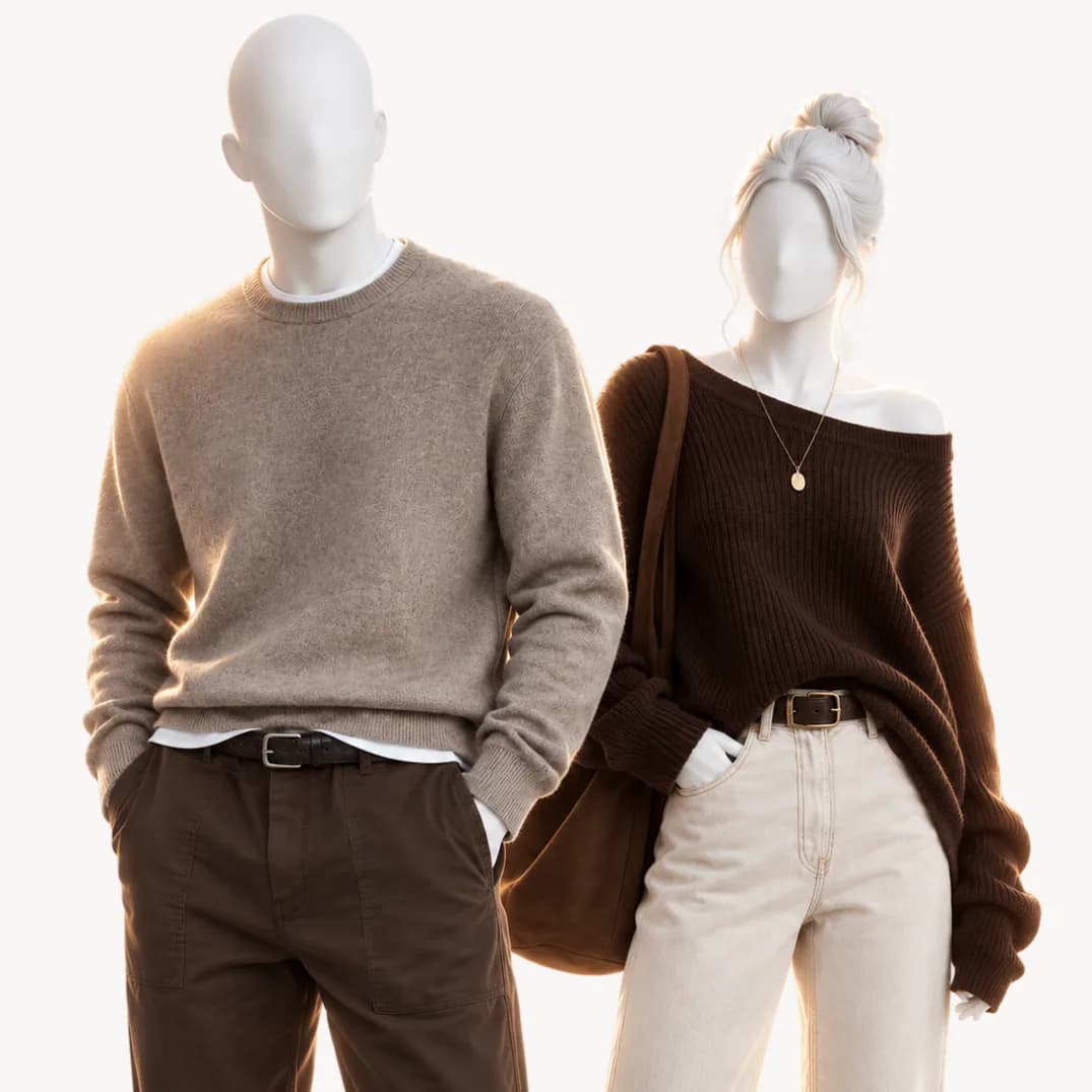
Hold a rust knit under your chin, then a wine one: both look autumnal on the hanger. On a True Autumn, rust warms the skin and brings up the gold in the eyes, while wine, a red with blue at its base, grays the face and deepens the shadows under the eyes.
A Wearly Labs analysis gives that pair the same verdicts, rust a Wear and wine a Skip, "too cool beside your warmth," and it gives one, with its reason, for all 50 colors. For True Autumn that is 15 Wear, 19 Depends and 16 Skip, where Depends means below the waist or as an accent. The eight below carry your warmth at the collar.
Check the direction first.
Four questions from the questionnaire, scored by the rules the analysis uses. They show a direction, not a season: the analysis also reads your photos.
Question 1 of 4
Your natural hair color?
Pick the closest match. If you dye it, go by your roots.
The palette
The eight colors True Autumn is built on.
- Anywhere, the face included
Your power color and the first thing to buy: orange-brown at full warmth, the gold in your skin turned up. A rust knit or a rust suede jacket, worn where it reaches the face.
- Anywhere, the face included
A yellow with enough brown in it to sit beside olive or khaki and look planned. It is at its best right at the collar, in a cardigan or a silk blouse.
- Anywhere, the face included
Green on a yellow base, the same base as your skin, so nothing else in the palette clashes with it. Olive chinos, an olive field jacket or an olive knit work as the color or as the neutral.
- Anywhere, the face included
Rust with clay and a little more light in it, which suits warm months and lighter cloth: a linen shirt, a summer dress, a cotton scarf.
- Anywhere, the face included
Black's job, done warm. A chocolate coat, boots or roll-neck grounds an outfit without drawing the gold out of your face the way black does at the collar.
- Anywhere, the face included
Your brightest yellow, and a Skip for Soft Autumn, so if it suits you at the collar, count that as a point for True Autumn. A golden yellow knit against earth tones is enough.
- Anywhere, the face included
Your deep green, yellow at its base where emerald is blue. A forest green coat or heavy cable knit with camel beside it is a pairing you never need to think about.
- Anywhere, the face included
Quieter than olive and just as easy. Khaki trousers, a khaki trench or a khaki shirt sit under rust and mustard without asking for attention.
Neutrals and metal
Your neutrals, your white, your metal
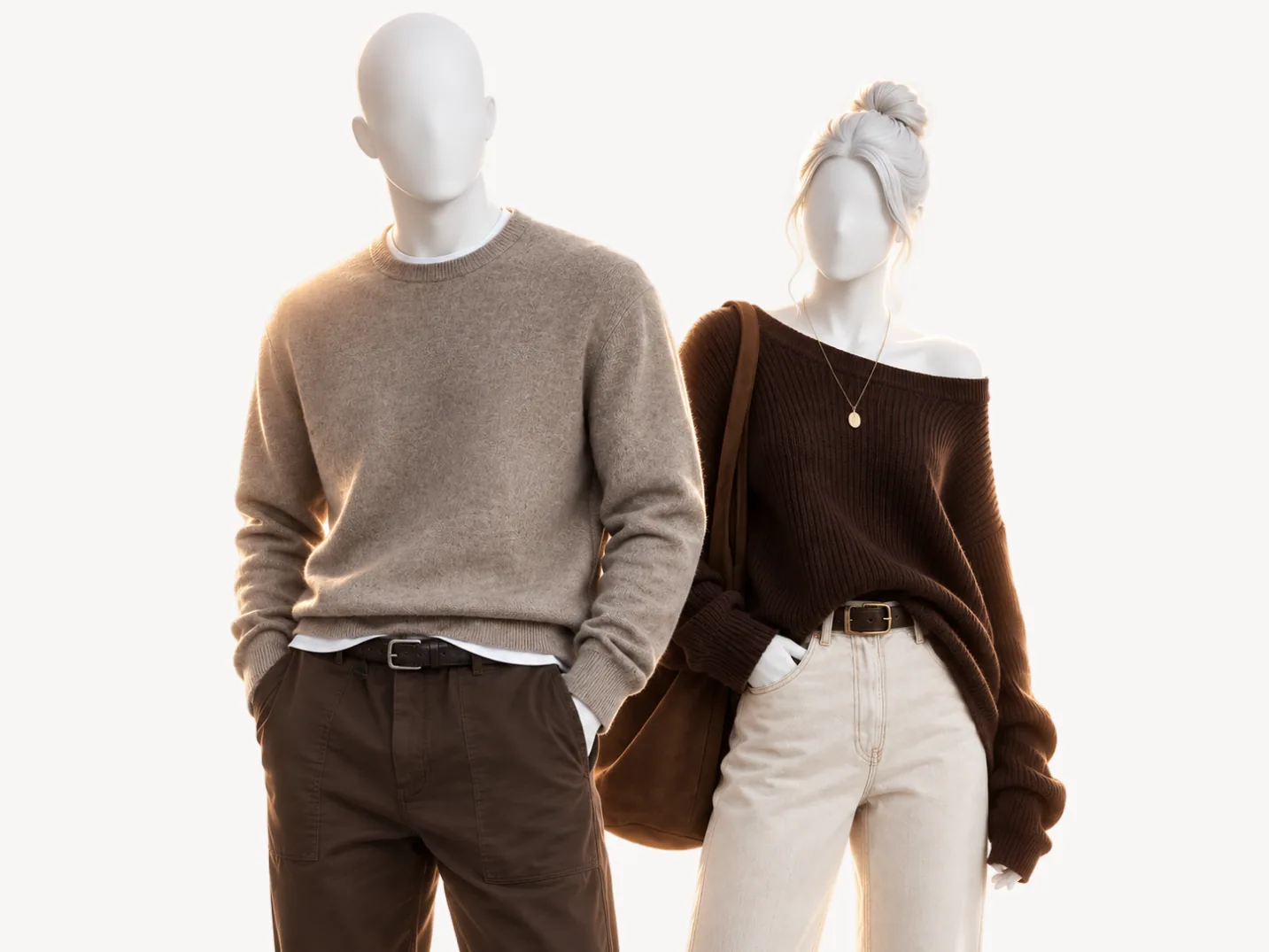
True Autumn neutrals are ivory, camel, chocolate, espresso and olive: a full set of anchors from light to dark, every one warm and every one a Wear at the face. Warm greige and medium denim are Wear colors too, so a greige knit and a denim shirt belong in the base.
What is missing matters as much: no gray, no black, no navy, and no latte, the pale brown Soft Autumn wears at the face. Tailoring feels it most, because navy and charcoal are its defaults; a True Autumn suit comes in chocolate, espresso, olive, camel or khaki.
Your white is ivory. Pure white sits far brighter than medium warm coloring, so the eye lands on the collar instead of the face, and the warm brown and green in your eyes go muddy behind it. Ivory carries the warmth your skin already has, so it recedes and the face comes forward. Pure white and soft white are both a Depends on a True Autumn page, for trousers and shoes.
Your metal is gold, and polished is fine. True Autumn has the depth and strength to carry shiny yellow gold, brass, bronze and copper at the throat and the wrist, which is one quick way to tell it from Soft Autumn, whose metal is matte gold. Silver at the face brings in the cool cast your palette leaves out, and it flattens the warmth in your skin.
Your power color is rust, and it is strong enough that everything around it can stay in khaki, camel and olive. Strong warm color is easy for you; the colors that fight you are the ones that lean cool.
At the face
Wear this, skip that
- Tomato redSharp red
Too cool beside your warmth.
- ChocolateWine
Too cool beside your warmth.
- Warm greigeDusty pink
Too cool beside your warmth.
- Golden yellowLemon
Too cool beside your warmth.
The colors that fight you
Sixteen of the 50 colors are a Skip for True Autumn, and every one carries the same reason on your page: too cool beside your warmth. A season led by warmth loses colors to undertone alone, so the list reads like the cool twin of a palette you already wear. Another 19 colors are a Depends, which sends a color below the waist or keeps it to an accent.
Cool reds and pinks. Sharp red, wine, raspberry, fuchsia, soft pink, dusty pink and mauve. Each one puts blue against warm skin. Wine is the trap: it looks autumnal on the hanger and turns your face gray once it is on, which is why the pairs above set it against chocolate. Your reds are tomato red and rust, both a Wear at the face, and your pinks are coral, warm pink and peach, as accents.
Cool blues. Dusty blue, royal blue, midnight blue and ice blue. Ice blue is the lightest and coolest of the four, and midnight blue is the one people buy by mistake, since it passes for a softer black. Your blue for a shirt or a jacket is medium denim, a Wear anywhere, while turquoise, warm aquamarine and soft navy stay accents.
Cool purples. Lavender, plum and deep purple. Purple is red mixed with blue, and the blue is what your undertone refuses, so all three are a Skip at the face and below it.
Emerald and lemon. The two that feel safe, because greens and yellows read autumnal. Emerald is blue at its base and lemon is a cold, greenish yellow, while forest green, olive, golden yellow and mustard share the gold base your skin has. The pairs above set lemon beside golden yellow for exactly that reason.
Black, navy and gray at the collar. Of the neutrals most wardrobes start with, only midnight blue is a Skip. None of the rest belongs near your face either: black and all three grays are a Depends for trousers and shoes, and soft navy is an accent. Chocolate and espresso do black's job at the collar and keep your face lit.
On the rail, hold a candidate beside something rust. A color that belongs shares its gold base and sits next to it as a pair; a cool one looks as if it came from a different shop.
Every color
All 50 colors, judged for True Autumn.
Choose a color to see where it goes, the reason, and what the two seasons True Autumn is mistaken for do with it. 16 of the 50 are a Skip.
Use the arrow keys to move from color to color.
Anywhere, the face included
A shirt, a coat, anywhere.
The same color in the seasons True Autumn is mistaken for
- Soft AutumnAnywhere, the face included
- Deep AutumnAnywhere, the face included
Anywhere, the face included
A shirt, a coat, anywhere.
The same color in the seasons True Autumn is mistaken for
- Soft AutumnAnywhere, the face included
- Deep AutumnAnywhere, the face included
How to combine True Autumn colors
Your rule is rich earth tones side by side, at medium contrast, with no cool pastels.
Side by side is the part people miss: most palettes want one color against neutrals, while yours can put two or three strong earth tones in one outfit, because they share a gold base and read as one family. Medium contrast means a clear step from light to dark, ivory with chocolate, without the jump of a high-contrast season.
- Office, men's: a chocolate suit, an ivory shirt, a forest green knit tie and a rust pocket square.
- Weekend, women's: a rust cable knit, olive wide-leg trousers, camel suede loafers and gold hoops.
- Cold days: a forest green coat over a mustard roll-neck and khaki trousers.
- Evening, women's: a golden yellow silk blouse, espresso trousers and a turquoise silk scarf.
Deep Autumn pushes the same outfits darker and adds wine, which is where the confusion with it starts.
Mistaken for
Seasons True Autumn gets confused with
 This pageTrue Autumnfully warm and rich | 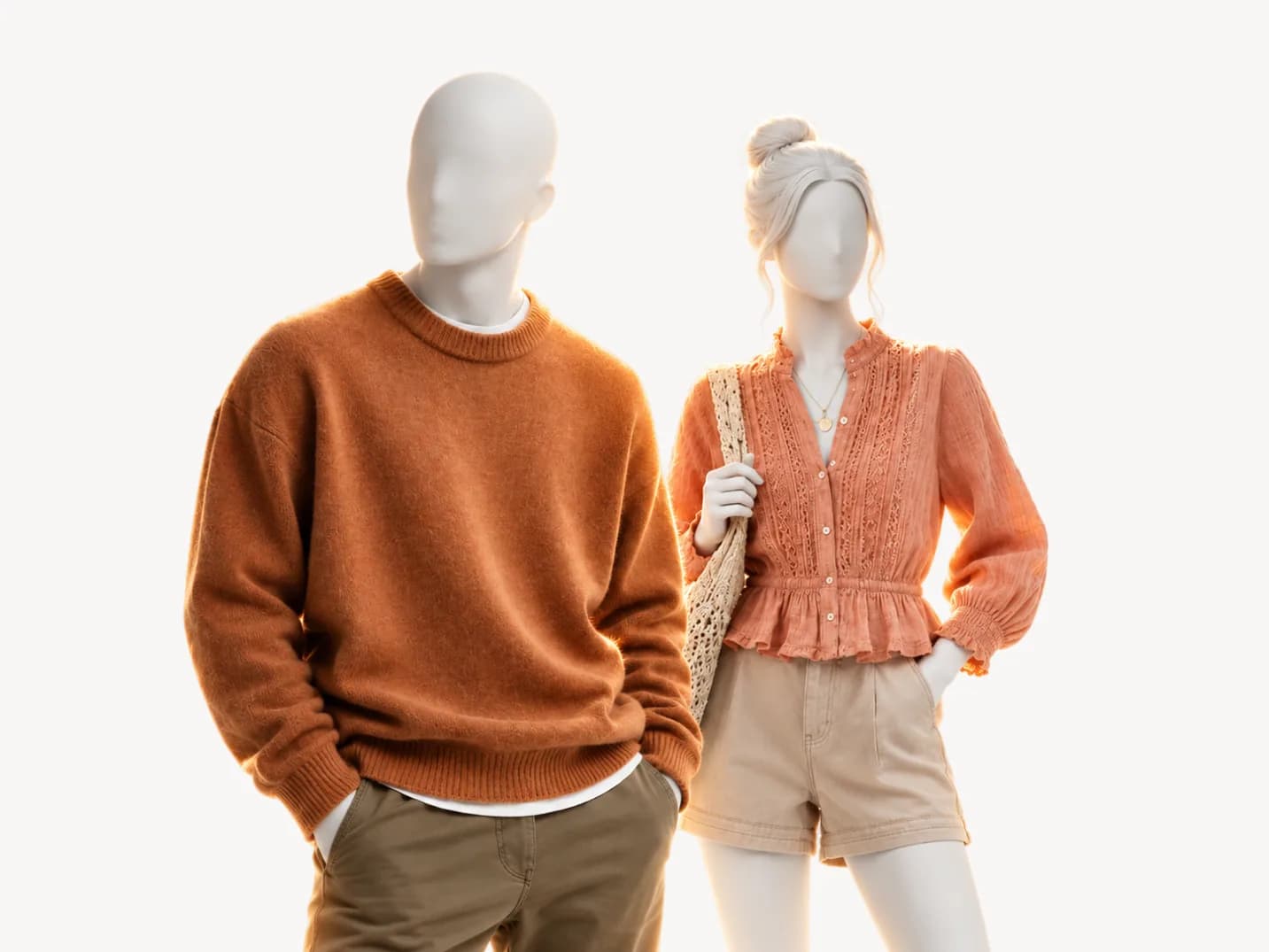 Mistaken forSoft Autumnwarm and muted with low contrast | 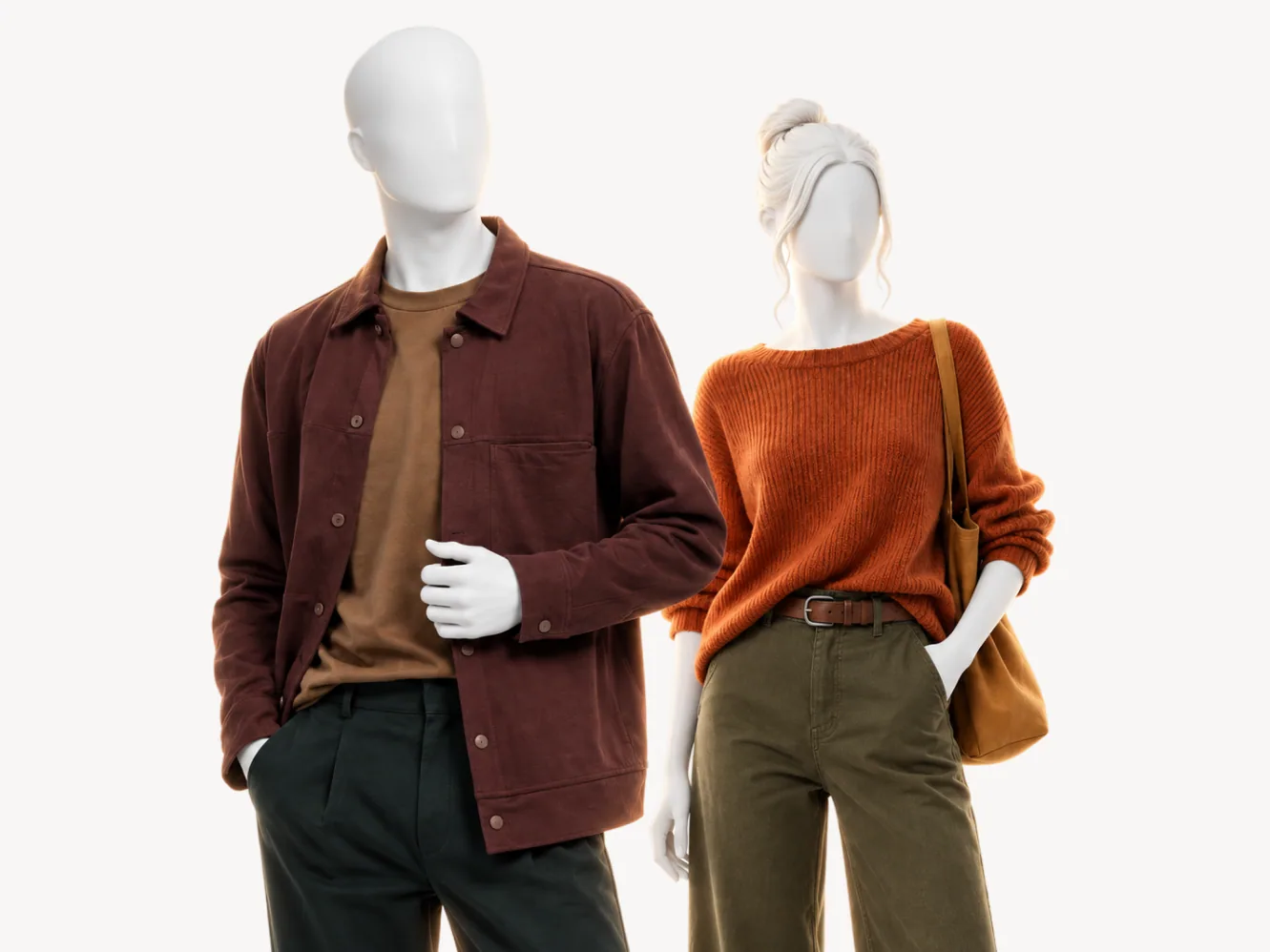 Mistaken forDeep Autumnwarm and deep with high contrast | |
|---|---|---|---|
| Undertone | warm | warm | warm |
| Value | medium | medium | dark |
| Chroma | saturated | muted | saturated |
| Metal | gold | matte gold | gold |
| Wine | |||
| Golden yellow | |||
| Midnight blue | |||
| Forest green | |||
| Khaki | |||
| Espresso |
Soft Autumn. The same warmth and the same medium value, so undertone settles nothing, and the table above marks both seasons warm and medium, with two rows apart: chroma, saturated against muted, and the metal, gold against matte gold. The split is strength: yours stays rich, while Soft Autumn colors are softer, slightly lighter and less warm, as The Concept Wardrobe describes them.
The two agree on 32 of the 50 colors. Golden yellow and forest green are a Wear for you and a Skip for Soft Autumn, and espresso, a collar color for you, goes below the waist on a Soft Autumn. Hold golden yellow at your jaw in daylight: on a True Autumn it reads as warmth in the face, on a Soft Autumn it takes the face over.
Deep Autumn. Both are warm and both wear chocolate at the face, so the family test fails again. The split is depth: Deep Autumn runs darker and at higher contrast, and the two give the same verdict on 31 of the 50 colors. Wine and midnight blue are a Wear anywhere for Deep Autumn and a Skip for you; golden yellow is a Wear for you and an accent there, and khaki drops to the trousers.
The sample analysis, co-founder Filip Poláček's real result, shows how close the two sit: a Deep Autumn page that names True Autumn as the closest season, because his photos pointed there on their own before his answers decided. Hold wine at your collar in daylight. If it deepens your face, read the Deep Autumn palette; if it grays you, you are on the True Autumn side.
If you are still between two, Soft Autumn vs True Autumn walks through a defocus test at a window. If the other candidate is the fully warm Spring, read True Autumn vs True Spring: the two agree on 36 of the 50 colors, more than True Autumn shares with either Autumn neighbor, so strength has to split them. A color analysis settles it from five photos and your answers, with fixed rules making the call and your answers weighing the most.
Where to go from True Autumn
How the color analysis works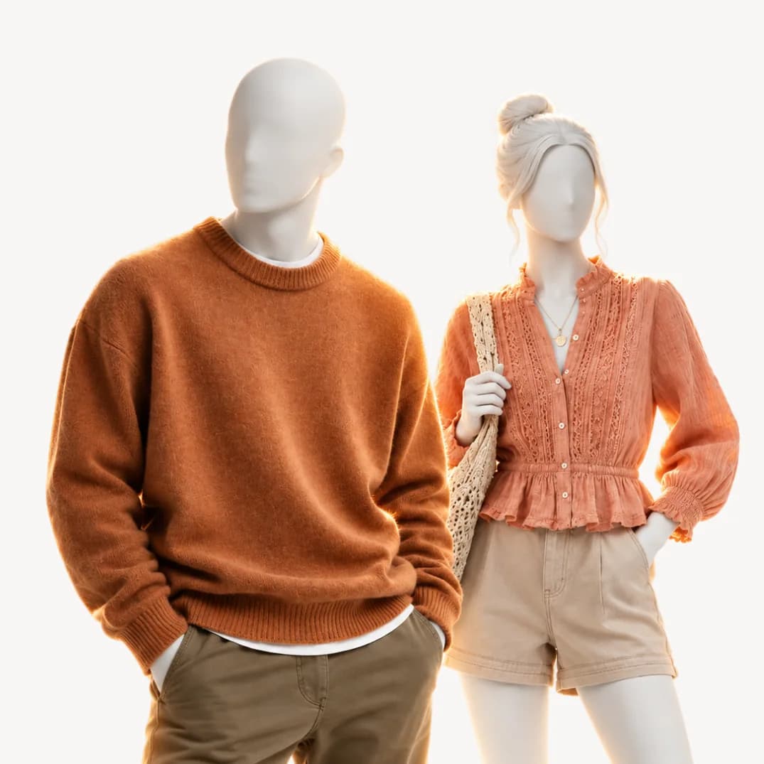 Color seasonSoft Autumnwarm and muted with low contrast
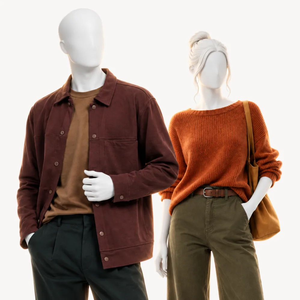 Color seasonDeep Autumnwarm and deep with high contrast
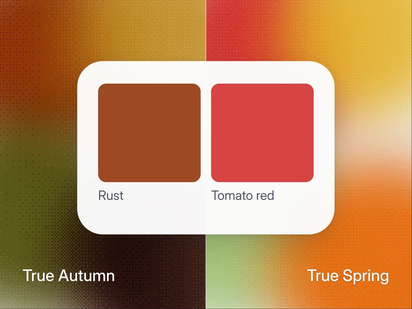
Seasons · 12 min
True Autumn vs True Spring: how to tell which one you are
Both are fully warm, so undertone cannot split them. Chroma does: True Autumn wears rust and olive at the face, True Spring wears coral and leaf green.
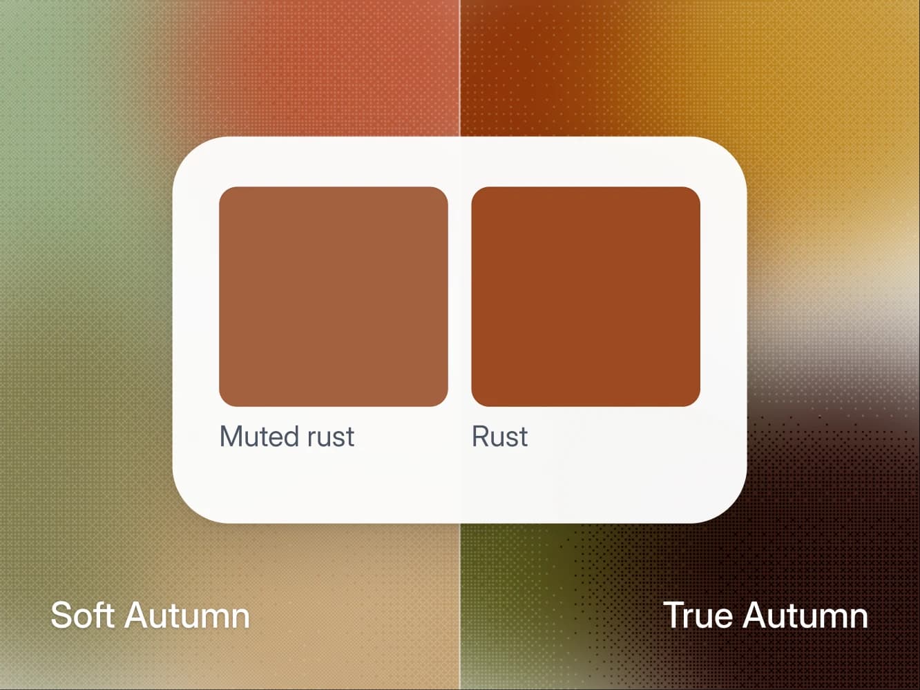
Seasons · 11 min
Soft Autumn vs True Autumn: how to tell which one you are
Both are warm. True Autumn wears rust and golden yellow at full strength, Soft Autumn grayed down, and one defocus test at a window shows which you are.
Seasons · 9 min
Find your undertone at home (warm, cool, or neutral)
Three daylight tests to find your undertone at home: wrist veins, gold vs silver, white paper. Plus how to read a neutral or olive result.

Method · 8 min
How to take photos for an accurate color analysis
The light, the angles, and the white paper trick. How to take five photos that give a color analysis something real to work with.
- All 12 color seasons
FAQ
True Autumn questions.
True Autumn is fully warm and rich. The quick check is whether warm colors at a medium value look better on you than their opposite, and whether gold suits you better than the other metal. That gets you close. The reason people land between two seasons is that the eye compares badly under mixed light, which is what a measured analysis is for.
Nothing dramatic. The colors furthest from your palette pull attention to shadows and to any unevenness in your skin, so you look tired rather than the color looking wrong. It shows most in the piece nearest your face and barely at all below the waist, which is why the palette matters more for a shirt than for trousers.
Not near your face. Black is too hard for your medium contrast, so keep it below the waist and put chocolate or espresso at the collar.
No. True Autumn is warm at its root, and that is the axis the whole system turns on. Two seasons can share a value and a chroma and still want opposite colors, because the undertone decides which version of a color suits you.
That is what the analysis does, but not from one photo and not from the photo alone. It reads five photos against your own answers about how you burn, what your veins look like and which metal suits you, and your answers outrank the photos where the two disagree. Your photos are used for your analysis and nothing else. They are never used to train AI models.
Yes, in the 12-season system this page follows: True Autumn and Warm Autumn are two names for the same season, the fully warm center of the Autumn family, and some systems write it True / Warm Autumn. One exception is worth knowing before you mix palettes from two sources. Kettlewell lists four Autumn sub-types, with True Autumn and Warm Autumn as two separate ones: its True Autumn is an even mix of warm, soft and deep, and its Warm Autumn, which it also calls Vibrant Autumn, leans toward Spring.
A rust knit. Rust is the True Autumn power color and it pairs with all five of your neutrals. It is also a Wear for Soft Autumn and Deep Autumn, so it is a safe buy before you are sure which Autumn you are.
Only as an accent, and only soft navy. Midnight blue, the deep navy of most suits and coats, is a Skip on a True Autumn page because it is cool, and soft navy is a Depends: a scarf, a strap, a shoe. For the jobs navy does in other wardrobes, a suit, a coat, a pair of trousers, take chocolate, espresso, olive or camel.
For True Autumn, yes. Wine, the burgundy, is a Skip on a True Autumn page, because it is a cool red wearing autumn clothing. It is not off limits for every Autumn: Deep Autumn wears it anywhere and Soft Autumn below the waist. Some True Autumn palettes online do include burgundy (Curate Your Style lists burgundies), which is why the question comes up. Rust, terracotta and chocolate give you the same depth with the warmth intact.
A few, and only small. Peach, mint and periwinkle are a Depends for you, kept to a scarf, a strap or a shoe, because they are far lighter than your medium coloring. Soft pink, lavender and ice blue are a Skip, for the reason every True Autumn Skip shares: they lean cool.
Another question about the method or your result? Write to us
Find out what suits you, and why.
A short questionnaire and five photos. Your key arrives by email, usually within 10 minutes.