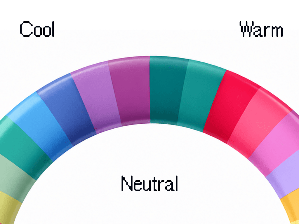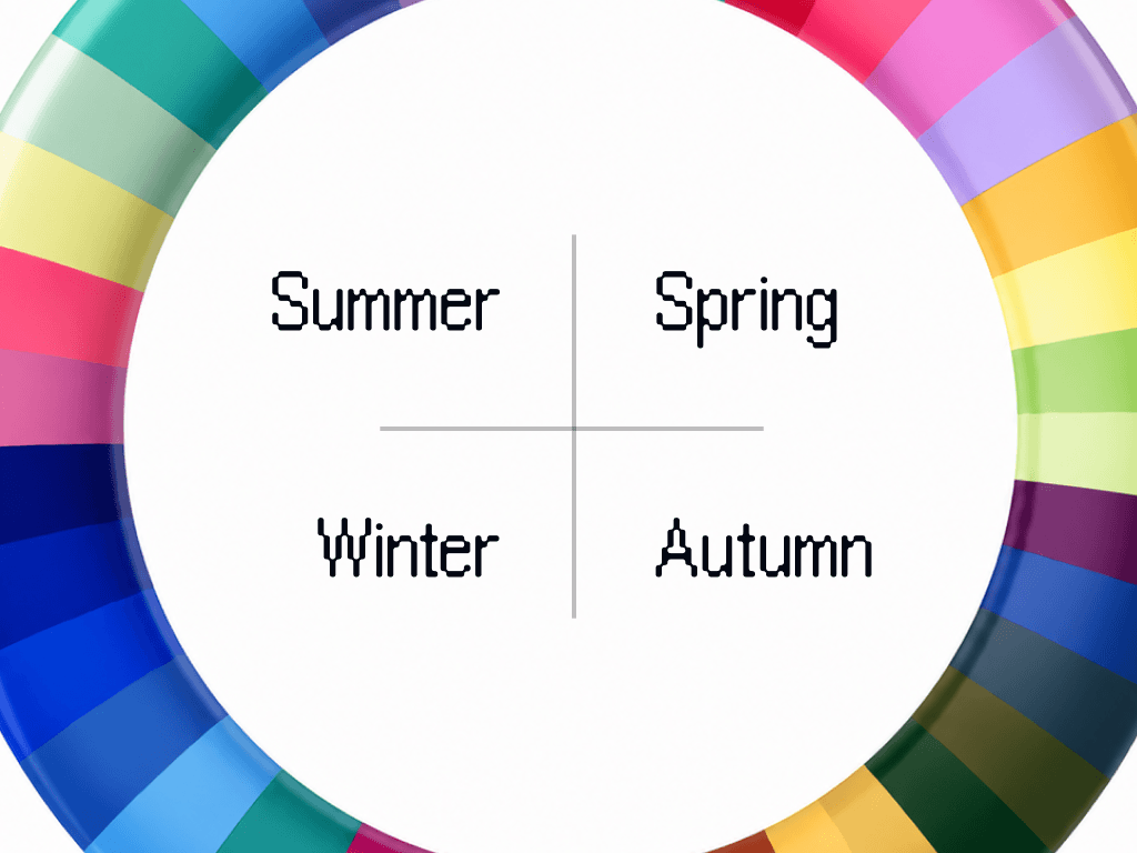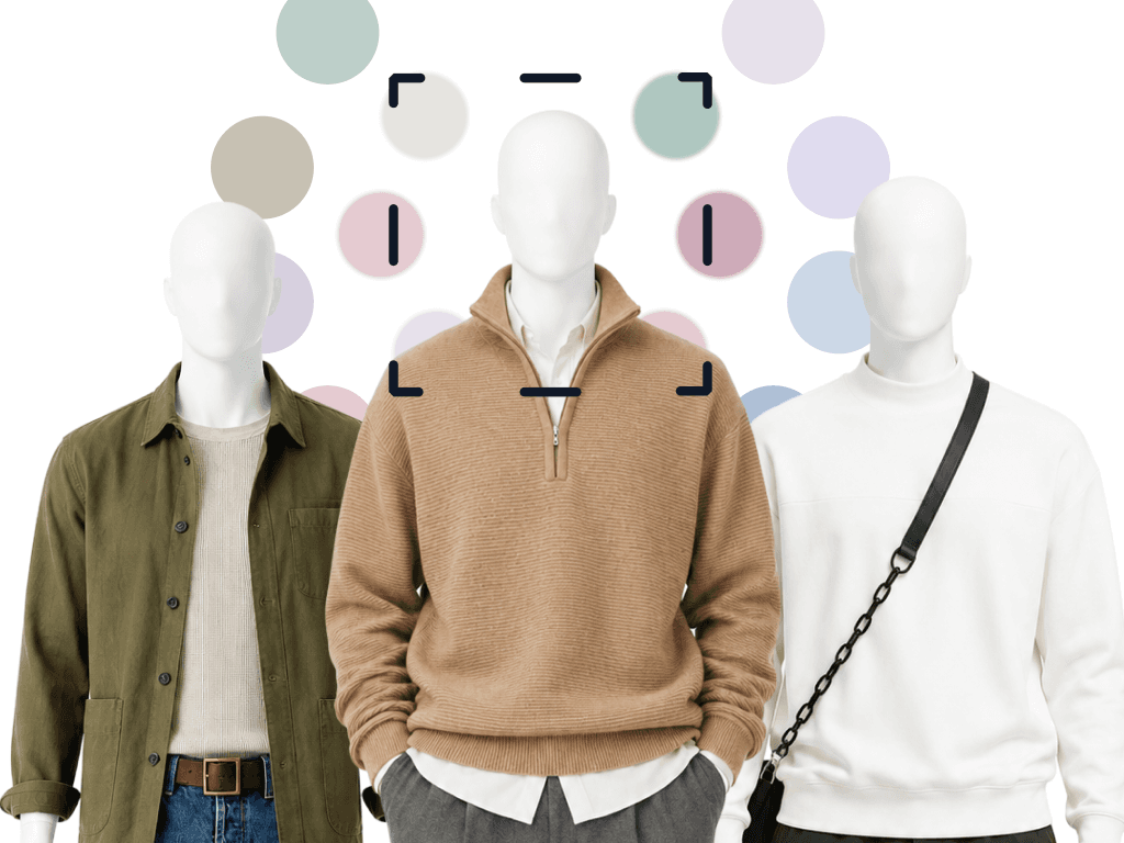
Color analysis for men works exactly as it does for women: it reads your undertone, how light or deep your coloring is, how clear or muted it is, and the contrast between your hair, skin and eyes, then sorts colors into the ones that belong near your face and the ones that do not. The difference is the wardrobe it lands in: a man has fewer pieces near his face, a collar, a knit, a tie, a jacket, so each verdict does more work.
On this page
Color analysis has a branding problem. The drapes, the studios, the pastel Instagram posts: it all reads as a women's ritual. Which is a shame, because the math actually favors men. Nor is the men's version new: in 1984 Carole Jackson followed her 1980 Color Me Beautiful with Color for Men.
Fewer variables, bigger payoff
A typical menswear outfit runs on four or five pieces and a narrow band of silhouettes. Shirt, trousers, knit, jacket, shoes. When the variables are few, each one carries more weight, and color is the variable most men never touch.
Here is the practical version: two men buy the same navy blazer. On one it looks sharp. On the other it looks like he borrowed it. Same cut, same size. The difference is that navy sits close to one man's natural contrast and fights the other's. Neither of them knows why, so one concludes he "can't wear blazers." He can. He just can't wear that navy.
Menswear has its own version of this rule. Alan Flusser's Dressing the Man sorts men into high, medium and low contrast between hair and skin, and advises echoing that contrast in the clothes that frame the face, as The Rake summarizes it. Seasonal color analysis keeps contrast and adds three readings: undertone (warm or cool), value (light or deep) and chroma (clear or muted). Contrast explains why the blazer worked on the first man. The other three tell the second man which navy to buy instead.
Where it shows up in a men's wardrobe
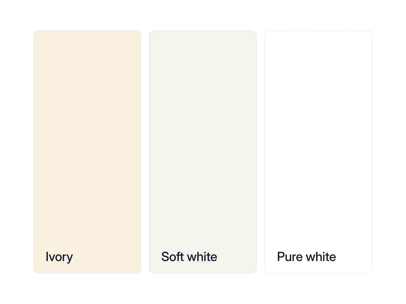
Your white. Pure white shirt versus ivory is the fastest tell there is. Warm coloring next to optic white looks washed out. Cool coloring next to ivory looks dingy. Soft white, a muted off-white, sits between the two. Every man owns white shirts; almost no man owns the right one on purpose.
Your "black." Black is the default menswear anchor, and near the face it suits fewer men than it is sold to. In the Wearly Labs season palettes, black is a Wear, collar included, for the three Winters only. The other nine seasons get it as a Depends: trousers, shoes, a belt. For those nine the fix is not exotic. Chocolate or espresso for most warm coloring, soft navy for the cool, soft Summers: either one grounds an outfit the way black does and lets your face keep its color.
Your denim wash. Light, mid, or dark wash is a value decision. Match it to your natural depth and jeans stop being random. The wash matters most where denim comes up to your face, in a denim shirt or a trucker jacket. Jeans sit in zone 3, where a wash that is wrong at the collar still works.
Your metal. Watch, belt buckle, wedding ring, glasses frames. Gold and brass on warm undertones, silver and steel on cool. Hold something steel and something gold against your jaw by a window, and if neither wins, run the undertone tests at home. That settles a lifetime of watch-strap debates.
Your power color. Every season has one shade that makes people say "you look well" without knowing why. For a True Autumn man it is often rust. For a Bright Winter, a saturated royal blue. Knowing yours means one sweater purchase per year does the work of five.
The five anchors in one real analysis
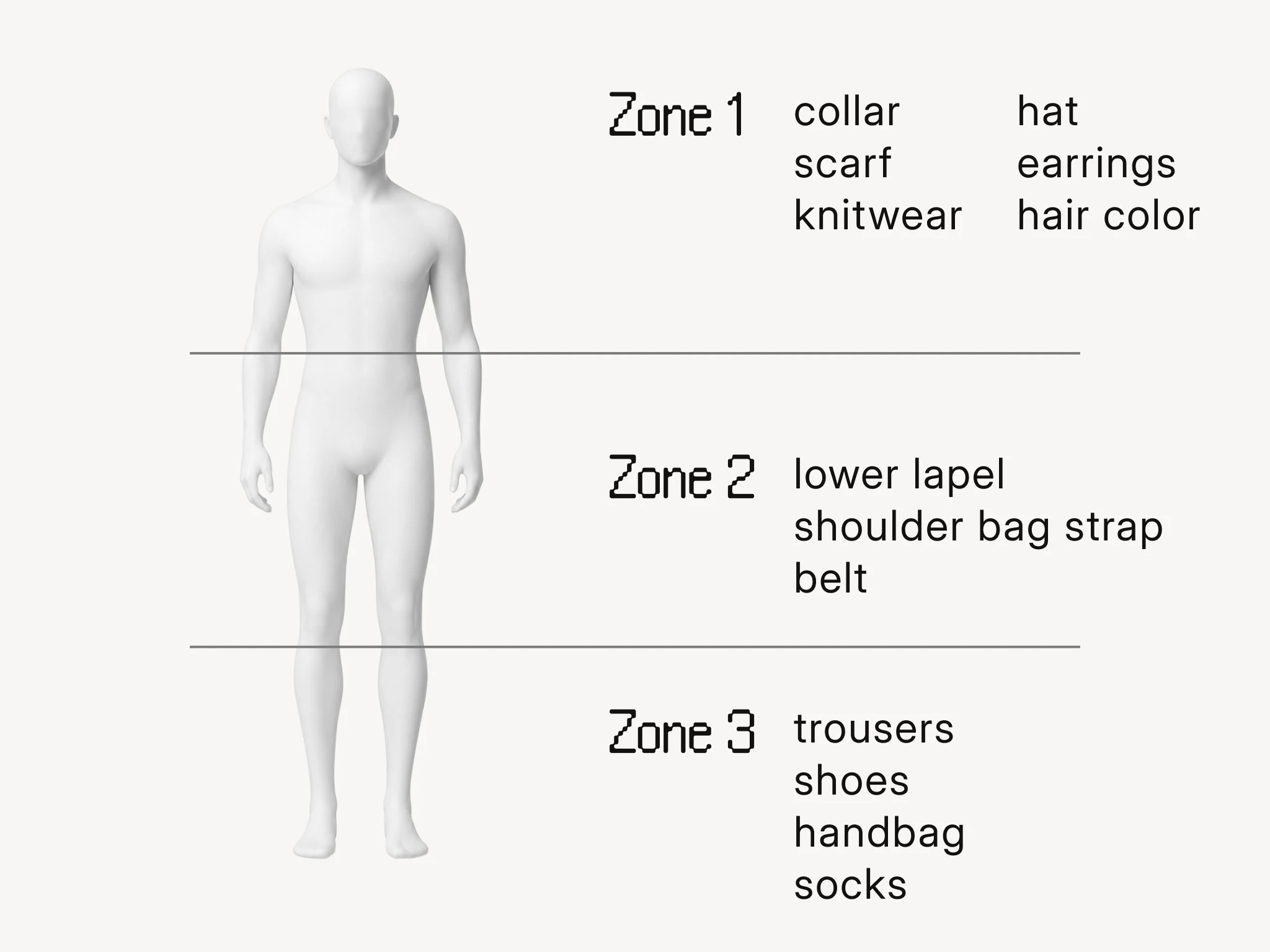
The sample analysis is the real result of co-founder Filip Poláček, published with his consent. He is a Deep Autumn, which Wearly Labs calls Dark Autumn: dark, warm and saturated. Each of his 50 colors gets a verdict, Wear, Depends or Skip, with its reason, and Depends means below the waist or as an accent only, which is zones 2 and 3 in the picture above.
| Anchor | What decides it | In the sample analysis |
|---|---|---|
| White | Undertone first | Ivory is a Wear: it "carries enough warmth to sit at the collar". Pure white and soft white are Depends, for trousers and shoes. |
| Black | Undertone and depth | Espresso is his black. Black itself is a Depends, below the waist, because "its coolness sits wrong close to your skin". |
| Denim | Depth | Light and medium denim are both Depends, below the waist only. Jeans, yes. A denim shirt, no. |
| Metal | Undertone | Gold, with bronze, copper and brass. Mirror-bright silver stays away from his face; antiqued silver or dark gunmetal works in a single piece. |
| Power color | The whole season | Rust, named in his AI profile. |
The efficiency argument
Most men do not want a bigger wardrobe. They want a smaller one that always works. That is precisely what a palette gives you: when every piece shares your undertone and depth, everything combines with everything. Getting dressed becomes assembly, not decision-making. Fewer purchases, fewer mistakes, no 7 a.m. staring contest with the closet.
And yes, the cut side matters too
Color is half the analysis. The other half reads your build: shoulder line, vertical proportion, where you carry mass, and translates it into cuts. Whether you need room in the thigh, whether an unstructured jacket suits your frame better than a padded one, where your trousers should sit.
In a Wearly Labs analysis that read comes from your answers and the two full-length photos, front and side, weighed by fixed rules. It names your shape, one of five in the men's library: triangle, trapezoid, rectangle, inverted triangle or oval. It names your line, sharp, medium or soft, which sets how crisp the edges of your clothes should be. Then each of the 125+ cuts in the men's library gets Wear, Depends or Skip, with the reason, and a Depends on a cut comes with its condition.
The sample analysis answers those three questions for one build, a trapezoid with a medium line. Straight trousers with room are a Wear: "The waistband and seat suit your frame, so the roomy thigh falls straight without pulling." The unstructured blazer and the padded-shoulder blazer are both a Depends, on the same condition: in a longer cut. And his trousers sit at a mid rise, so high-rise pleated trousers are a Skip: "The seat and the break both follow the wrong rise."
FAQ
The underlying analysis is identical: undertone, value, chroma, contrast, plus body geometry. What changes is the output vocabulary. You get verdicts on oxford shirts, chinos, and jacket construction, not wrap dresses. In a Wearly Labs analysis the questionnaire asks which cut library to use, women's or men's, and that choice decides the cuts, the five shapes you can be read as, and the example outfits.
It can shift your contrast and add warmth or ash near your face, and it is part of what the photos capture. If you swing between full beard and clean shaven, analyze in your usual state.
It moves your neutrals more than your season. Gray hair shifts your value and often softens contrast, which can nudge your best neutrals. Your undertone stays put. Menswear files it the same way: Flusser's low-contrast group includes gray-haired men. It is one of the better reasons to get an actual read instead of guessing from ten-year-old habits, and the Wearly Labs questionnaire lists gray or white among the natural hair colors, so the analysis reads the hair you have now.
The same as for women: the format sets the price, not who stands in front of the mirror. An analyst in person costs the most and an app the least, and what each price band buys is set out with examples. A Wearly Labs analysis is $29, paid once, for colors and cuts together. Four ways to get one, from a consultant to an AI chat, are compared side by side.
Nobody will say "nice palette." They will say you look rested, or fitter, or ask if you got a haircut. That is the tell.