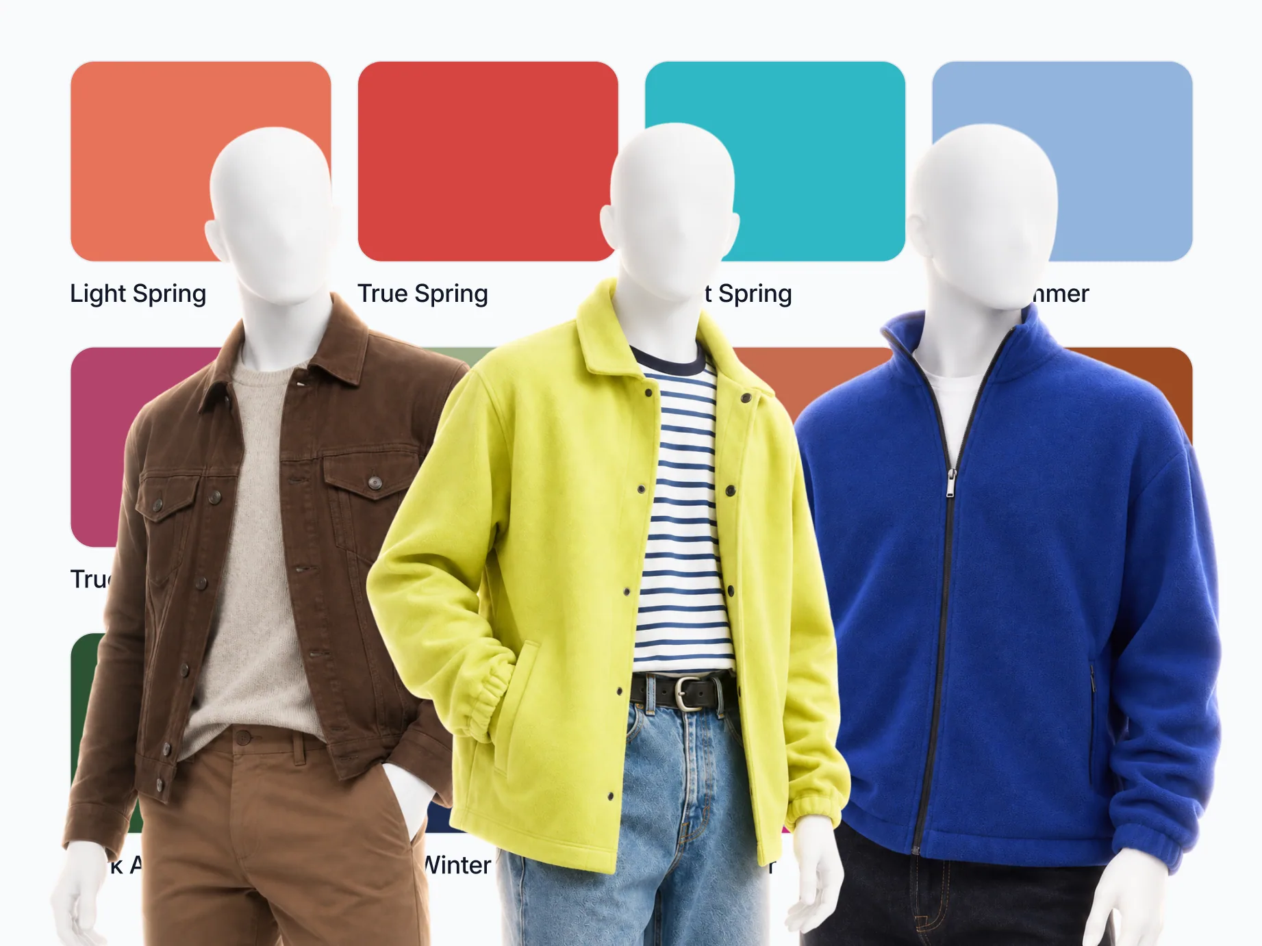
Men have the same 12 color seasons as women: Spring, Summer, Autumn and Winter, each split into three. What changes for a man is where the color lands, because near his face it comes down to a collar, a knit and a jacket, and his metal is mostly a watch.
On this page
- What is a color season?
- All 12 color seasons at a glance
- Spring: the warm, clear seasons
- Summer: the cool, soft seasons
- Autumn: the warm, muted seasons
- Winter: the cool, sharp seasons
- Can I wear black if I'm not a Winter?
- Which color season am I?
- Why does knowing my season make my wardrobe smaller?
- Men's style: common questions
- Related reading
Twelve seasons sounds like a lot to memorize, but the system is four readings taken off your face, and the twelve names are those readings stacked. Below is the whole grid in menswear terms: shirt, knit, jacket, trousers, shoes, watch, with one short paragraph per season. You will only ever need your own.
What is a color season?
Four axes decide it. Undertone: warm, cool, or neutral leaning one way. Value: how light or deep your natural coloring is. Chroma: whether clear color or muted color sits better on you. Contrast: the gap between your hair, your skin, and your eyes.
Stack the four and you land on one of twelve. Each season comes with a set of core colors, one white, and one metal. The metal is not a footnote in menswear. A watch, a belt buckle, and a wedding ring are the only jewelry most men wear, and they are on you every day.
Translated into a wardrobe, the axes get simpler. Undertone picks your white and your browns. Value picks your denim wash and how dark your jacket goes. Chroma decides whether a knit should be clear or dusty. Contrast decides how far your shirt is allowed to sit from your face. That is the short version of seasonal color analysis, with the drapes taken out.
Value and chroma are older than the seasons. Albert Munsell defined them in A Color Notation in 1905: value is "the quality by which we distinguish a light color from a dark one", chroma the one "by which we distinguish a strong color from a weak one". Contrast has a menswear pedigree of its own. Alan Flusser's Dressing the Man (2002) sorts men by the contrast between hair and skin rather than by season, files gray-haired men under low contrast, and advises echoing that contrast in the clothes that frame the face.
In 1984, Carole Jackson followed her bestseller Color Me Beautiful (1980) with Color for Men, which put men into the same four seasons. The twelve-season grid splits each of those four into three, so a soft Autumn and a dark one no longer share a palette.
All 12 color seasons at a glance
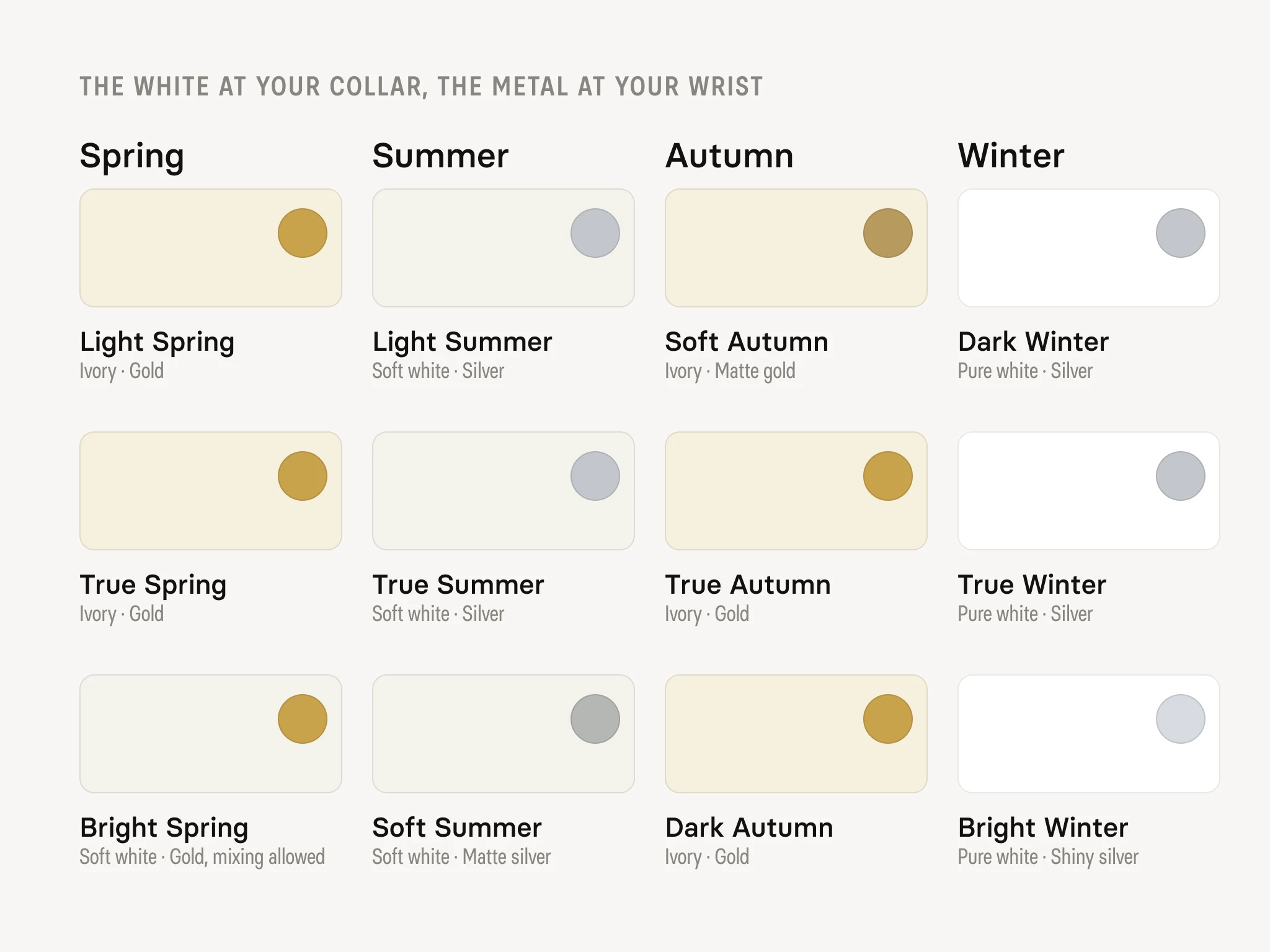
Every season is four readings, plus the white that belongs at your collar and the metal for your watch. Deep Autumn and Deep Winter are called Dark Autumn and Dark Winter in some guides. Each season name links to its full palette.
The four readings of each season
| Season | Undertone and value | Chroma and contrast |
|---|---|---|
| Light Spring | warm-neutral, light | soft to medium-bright, low contrast |
| True Spring | fully warm, medium | bright and clean, medium contrast |
| Bright Spring | warm-neutral, light to medium | very bright, high contrast |
| Light Summer | cool-neutral, light | soft, low contrast |
| True Summer | fully cool, medium | soft to medium, medium contrast |
| Soft Summer | cool-neutral, medium | markedly muted, low contrast |
| Soft Autumn | warm-neutral, medium | muted, low contrast |
| True Autumn | fully warm, medium to deep | muted to rich, medium contrast |
| Deep Autumn | warm-neutral, deep | medium to rich, high contrast |
| Deep Winter | fully cool, deep | medium to bright, high contrast |
| True Winter | fully cool, medium to deep | bright, high contrast |
| Bright Winter | cool-neutral, medium | very bright, very high contrast |
The white shirt and watch metal of each season
| Season | White shirt | Watch metal |
|---|---|---|
| Light Spring | ivory | gold |
| True Spring | ivory | gold |
| Bright Spring | soft white | gold, mixing allowed |
| Light Summer | soft white | silver |
| True Summer | soft white | silver |
| Soft Summer | soft white | matte silver |
| Soft Autumn | ivory | matte gold |
| True Autumn | ivory | gold |
| Deep Autumn | ivory | gold |
| Deep Winter | pure white | silver |
| True Winter | pure white | silver |
| Bright Winter | pure white | shiny silver |
Spring: the warm, clear seasons
Light Spring. Core: coral, peach, warm pink, light gold, leaf green, warm aquamarine, turquoise, light forget-me-not. Keep the whole outfit inside a narrow, light band. A latte or warm greige jacket sits at your weight. Charcoal does not.
True Spring. Core: tomato red, golden yellow, leaf green, coral, orange, turquoise, terracotta, warm aquamarine. Warm and clear is the entire instruction. A leaf green knit, an ivory shirt, a camel chino, brown shoes. Muted colors go flat on you.
Bright Spring. Core: turquoise, coral, golden yellow, tomato red, emerald, warm pink, warm aquamarine, leaf green. You can carry saturation that would swallow other men. Black is yours below the waist, and the spec is matte. Black trousers, yes. A black crew-neck under your chin, no.
Summer: the cool, soft seasons
Light Summer. Core: light forget-me-not, soft pink, lavender, dusty blue, mint, ice blue, dusty pink, light denim. Light denim and dusty blue are the workhorses. Everything in a narrow band of depth reads deliberate. One very deep piece in the middle reads like a mistake.
True Summer. Core: raspberry, dusty blue, muted emerald, mauve, soft pink, light forget-me-not, medium denim, lavender. Medium denim is a foundation, not a fallback. Muted emerald is the knit people comment on without knowing why.
Soft Summer. Core: sage, dusty pink, dusty blue, mauve, mint, light forget-me-not, medium denim, lavender. Black stays below the waist. Above it, swap black for medium gray or soft navy and your face stops competing with your clothes. Matte finishes over shiny, every time.
Autumn: the warm, muted seasons
Soft Autumn. Core: sage, terracotta, khaki, mustard, camel, muted rust, leaf green, peach. Camel and khaki do the neutral work that navy does for other men. A brushed watch case, not a polished one.
True Autumn. Core: rust, mustard, olive, terracotta, chocolate, golden yellow, forest green, khaki. Black stays below the waist, which is inconvenient and true. Above it, chocolate and espresso do everything black was doing for you, and do it better.
Deep Autumn. Core: rust, forest green, wine on its warm edge, mustard, espresso, olive, terracotta, chocolate. You can take depth that lighter men cannot. An espresso jacket over an ivory shirt is most of the formula.
Winter: the cool, sharp seasons
Deep Winter. Core: midnight blue, emerald, wine, plum, royal blue, raspberry, black, forest green on its cool edge. Black is genuinely yours. So is midnight blue, which does the same job with slightly less weight.
True Winter. Core: royal blue, fuchsia, emerald, sharp red, ice blue, deep purple, raspberry, midnight blue. A sharp red knit, a pure white shirt, midnight blue tailoring. Nothing dusty, nothing beige.
Bright Winter. Core: fuchsia, royal blue, emerald, sharp red, ice blue, turquoise on its cool edge, deep purple, lemon. The one season where a polished steel watch beats a brushed one. Your contrast is already high. Let the outfit match it.
Can I wear black if I'm not a Winter?
Yes, below the waist. A Wearly Labs analysis gives each of its 50 colors a verdict, Wear, Depends or Skip, with its reason, and Depends means below the waist or as an accent only. In the season palettes black is never a Skip: the three Winters wear it anywhere, the collar included, and the other nine seasons get it as a Depends, for trousers and shoes.
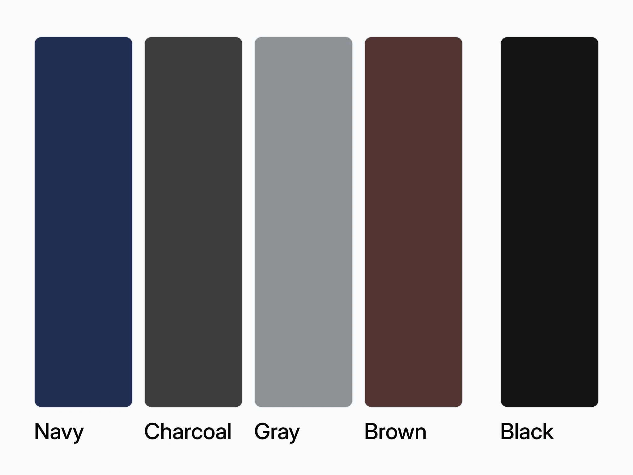
Navy is two colors, and they split the seasons. Midnight blue is a Wear for the three Winters and for Deep Autumn. Soft navy is a Wear for Light Spring, Bright Spring and the three Summers. True Spring, Soft Autumn and True Autumn get navy only as a Depends or not at all, which is why camel and chocolate do the navy job there.
The sample analysis, the real Deep Autumn result of co-founder Filip Poláček, shows how a verdict reads. Of his 50 colors, 11 are Wear, 22 Depends and 17 Skip. Black is a Depends, below the waist, with the reason "its coolness sits wrong close to your skin". Espresso is named as his black, the darkest neutral for trousers, belts and coats, and midnight blue is on his Wear list.
Which color season am I?
You cannot reliably pick your own off a list, and the list is not where men go wrong. Undertone is. A tan and a warm bathroom bulb both push your skin toward warm, and a beard changes the contrast around your jaw. Start with the undertone check at home, then run three checks by a window in daylight:
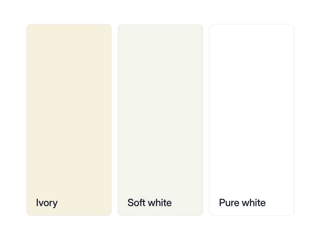
- Three whites. Hold a pure white, a soft white (off-white) and an ivory shirt under your chin in turn. The one that leaves your skin looking clean rather than gray or yellow narrows the table: pure white for the Winters, soft white for the Summers and Bright Spring, ivory for the Autumns and the other two Springs.
- Two metals. Hold something steel and something gold against your jaw. The one that makes your skin look clearer is your side of the undertone line.
- One gray photo. Take a daylight selfie and turn it black and white. If hair, brows and skin separate into distinct grays, your contrast is high. If they blur together, it is low.
Those point in a direction, no more. Value, chroma, and contrast are comparative, and your eye has nothing to compare you against except you, so they read better from photos with a known reference in frame. In a Wearly Labs analysis that reference is a sheet of white paper, and when a photo contradicts a clear answer, the answer decides. Photos fill in what the questionnaire doesn't ask: in the sample analysis, the photos alone pointed at True Autumn, and the answers settled it as Deep Autumn.
Why does knowing my season make my wardrobe smaller?
Because it deletes the pieces that only work in one outfit. When every shirt, knit, and jacket shares your undertone and sits inside a narrow band of depth, any two of them go together. That is the whole gain. Eight pieces that all combine beat twenty that combine six ways.
You also stop re-buying the same mistake. Plenty of men own one sweater in a color that fights them and three near-copies of it, bought because the first one never felt right and they blamed the shape. This is the mechanical version of the argument in the case for color analysis for men.
Men's style: common questions
Yes, and it usually means one axis is neutral rather than committed. That is what the warm-neutral and cool-neutral seasons are for. Work from the core colors both candidates share, then test the ones they do not. Adjacent seasons overlap on purpose.
No. Put them near your face and use neutrals everywhere else. A knit, a shirt, and a jacket collar are what people look at while you talk. Trousers and shoes carry far less.
No. Your undertone does not move. Your value shifts for a few months, which changes how deep your neutrals should go, not which colors are yours.
Usually not. Pick the metal that matches your undertone and keep it on the pieces you wear daily. Mixing reads as an accident on most men, and there is no gain in it when one metal already suits you. Bright Spring is the exception: its palette allows mixed metals, so a two-tone watch works there.