Spring · color season
Light Spring: your palette, and what to leave on the rail.
Light Spring is warm and light with low contrast. Here is the palette that follows from that, the neutrals to build on, and how to wear them together.
- 8 core colors
- gold at the wrist
- 10 minutes to get yours
Last updated
At a glance
Where Light Spring sits, and what follows from it.
- Light Summer
- True Summer
- Soft Summer
- Soft Autumn
- True Autumn
- Deep Autumn
- Deep Winter
- True Winter
- Bright Winter
- Bright Spring
- True Spring
- Light Spring
Each season sits between the two it shades into. The two Light seasons meet at the top, the two Deep ones at the bottom, the two Bright ones on the clear side and the two Soft ones on the muted side. Spring and Autumn are warm, Summer and Winter are cool.
- Undertone
- warm
- Value
- light
- Chroma
- saturated
- Buy first
- Coral
- Metal
- Gold
- Keep from the face
- Ice blue
- Emerald
- Lemon
- Royal blue
- Mistaken for
- Light SummerTrue SpringHow they differ
Am I a Light Spring?
Light Spring is coloring that is light first and warm second: your hair, skin and eyes sit close together near the light end of the scale (value), the cast under your skin (undertone) leans golden, and whether a color is clean or slightly grayed (chroma) matters less than whether it is light.
Light, warm colors such as peach and coral repeat that, so your face stays the brightest thing in the mirror, while dark or cool ones such as wine and royal blue outweigh it and leave the skin looking gray and tired beside them.
That order, lightness before warmth, is also how The Concept Wardrobe's Light Spring guide ranks the season, and the mirror shows it. Natural hair is golden or strawberry blond, light copper or light golden brown; if you dye it, judge by the roots, as the questionnaire does. Eyes are light blue, green, hazel or light brown, softer at the rim than sharply drawn. Skin is fair to medium with a peach or golden cast, often freckled.
Two checks need only a phone and a drawer. Turn a daylight selfie to black and white: hair, skin and eyes should all land in the light half of the grays, close together, with nothing dark. Then hold gold and silver at your jaw.
Gold settles into Light Spring skin and looks like it belongs there, while silver sits on top of it like hardware. Green veins at the wrist point the same way but count for less; the vein test is the first of three in finding your undertone at home.
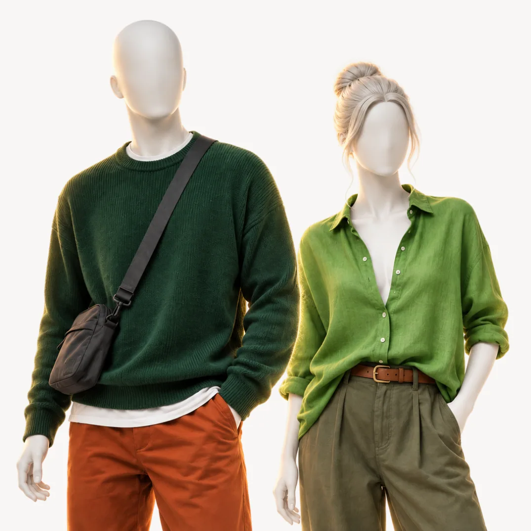
In a shop, take two greens to the mirror. A leaf green T-shirt matches the lightness of your face and is a Wear on a Light Spring page. A forest green one is a Skip, too dark for your light: it becomes a block of weight under the chin, and the face above it goes pale and flat. If the forest green holds its own on you, the read is a deeper season.
An analysis runs that comparison 50 times. AI reads five photos taken with a white sheet of paper in frame, your answers weigh the most, and fixed rules give every color Wear, Depends (below the waist or as an accent only) or Skip, with its reason. Warmth on its own does not make a Light Spring.
The sample analysis belongs to a Deep Autumn, warm like you and much deeper, and gives coral, your power color, a Skip: "Too light to hold its own against how deep you run." On a Light Spring that same coral leads the eight colors that carry the wardrobe.
Check the direction first.
Four questions from the questionnaire, scored by the rules the analysis uses. They show a direction, not a season: the analysis also reads your photos.
Question 1 of 4
Your natural hair color?
Pick the closest match. If you dye it, go by your roots.
The palette
The eight colors Light Spring is built on.
- Anywhere, the face included
Your power color: light enough to sit level with your face and warm enough to match it, so it belongs at the collar, in a knit, a shirt or a lipstick.
- Anywhere, the face included
The closest of the eight to Light Spring skin itself, which is why a peach blouse under a camel jacket reads as calm rather than colorful.
- Anywhere, the face included
For the days coral feels loud. It keeps the warmth, gives up a little strength, and suits a shirt dress or a summer cardigan.
- Anywhere, the face included
No other season of the twelve gets light gold as a Wear. Buy it as a whole garment, trousers or a fine knit, instead of a hint at the wrist.
- Anywhere, the face included
Your green for the face, light and fresh where olive turns heavy, and strong enough to carry a jacket or a crew neck at full size.
- Anywhere, the face included
Looks cool and watery yet runs warm underneath, so a linen shirt, a swimsuit or a light raincoat in it cools an outfit without cooling your skin.
- Anywhere, the face included
The deepest of your bright colors, and happiest alone: one turquoise shirt or knit with light neutrals around it, never beside coral.
- Anywhere, the face included
A soft periwinkle blue that does denim's job with less weight. Light Summer wears it too, as its power color, so it flatters you without proving your season.
Neutrals and metal
Your neutrals, your white, your metal
The neutrals: ivory, latte, camel, warm greige and soft navy. All five are a Wear. The first four are light and warm and sit within a step of each other, so trousers, coats and knits in any of them combine without a second look. Soft navy is the fifth and the darkest color your page lets near your face, which makes it the blazer, the suit and the winter coat. Two more Wears do a neutral's work: soft white, and light denim, which only Light Spring and Light Summer wear at the collar.
What the list leaves out: black, charcoal and the dark browns. Black, charcoal, chocolate and espresso are all a Depends, below the waist. Each sits several steps darker than your coloring, so as a jacket or a knit it becomes the heaviest thing in the picture and your face looks paler above it; as trousers, boots or a belt it is far enough away to work. That decides the expensive purchases: the coat and the suit jacket in soft navy, camel or warm greige, and the black in the trousers and the shoes.
The white: ivory, then soft white. A white shirt sits where light bounces up into your face, so the wrong white shows faster than any accent color. Optic white is brighter and cooler than Light Spring skin: beside it the face loses color and the shirt looks cleaner than the person in it.
Your page keeps pure white to an accent, a belt or a shoe. Ivory and soft white are both a Wear, and ivory is the better one, warm and half a step below your skin in brightness, so your face stays the lightest thing in the frame.
The metal: gold. Light, polished gold suits light coloring: yellow gold, rose gold, brass buttons on a navy blazer. It repeats the warmth in your skin, where silver reads cold beside it.
The power color: coral. If one colored piece goes in first, make it coral near the face, because it repeats your warmth at your own lightness and is still strong enough to be seen. Everything above has a reason to be on the list. The twelve colors that follow each have a reason to stay off it, and there are only two such reasons.
At the face
Wear this, skip that
- Light denimIce blue
Too cool beside your warmth.
- Warm aquamarineEmerald
Too cool beside your warmth.
- Light goldLemon
Too cool beside your warmth.
- Soft navyRoyal blue
Too cool beside your warmth.
The colors that fight you
Twelve of the 50 colors are a Skip on a Light Spring page. Not one of them fails for being too grayed, which sets this season apart from the other two Springs: chroma barely decides a Light Spring, lightness and warmth do.
Too cool beside your warmth: sharp red, raspberry, fuchsia, deep purple, royal blue, emerald, ice blue and lemon. Eight colors with a blue base. They pull the warmth out of golden skin, so the face reads sallow and the lips lose their color. Lemon and ice blue show that lightness cannot rescue a cool color: both are pale and sharp, and both are a Skip. The pairs above make the swap, light gold for lemon and soft navy for royal blue. Cool colors that are soft as well come back in a smaller role: lavender and soft pink as accents, dusty blue and mauve below the waist.
Too dark for your light: wine, plum, forest green and midnight blue. Four deep colors, each several steps below you. At the collar each becomes the heaviest thing in the outfit, and the face above it looks smaller and paler than it is. Soft navy does midnight blue's job a step lighter, and leaf green is the green to wear in place of forest green.
The neutrals that slip in. Gray is the usual one. Medium gray goes below the waist with black and charcoal, and light gray, like pure white, shrinks to an accent, a belt or a shoe. Each looks harmless on the hanger, which is how it reaches the wardrobe.
One rule at the rail. Soft navy is the darkest color you wear above the waist, so use it as a ruler: anything darker goes on your legs or back on the rail. For a Light Spring that single comparison sorts every dark color in the shop, from a black turtleneck to a wine shirt.
Every color
All 50 colors, judged for Light Spring.
Choose a color to see where it goes, the reason, and what the two seasons Light Spring is mistaken for do with it. 12 of the 50 are a Skip.
Use the arrow keys to move from color to color.
Anywhere, the face included
A shirt, a coat, anywhere.
The same color in the seasons Light Spring is mistaken for
- Light SummerNot worn
- True SpringAnywhere, the face included
Anywhere, the face included
A shirt, a coat, anywhere.
The same color in the seasons Light Spring is mistaken for
- Light SummerNot worn
- True SpringAnywhere, the face included
How to combine Light Spring colors
The rule your page gives is neighboring values, tone on tone, and at most one saturated accent. Value is Albert Munsell's word for how light or dark a color is, and neighboring values means each piece in an outfit sits within a step of the next, the way ivory, latte and camel do.
Your face is light and low in contrast, so an outfit built the same way puts nothing stronger than your face into the picture. That is also why black trousers under a soft white shirt fail although each half passes: the gap in value between them is wider than anything in your coloring.
- Office, men's: an ivory oxford shirt, a soft navy blazer, warm greige trousers and chocolate suede shoes, with a light forget-me-not tie when the day needs one.
- Weekend, women's: a peach knit, light denim jeans, a latte trench and light gold sandals.
- Wedding guest, women's: a coral dress as the one accent, with a camel clutch, ivory heels and gold earrings.
- Winter, men's: a camel overcoat over a turquoise crew neck, medium denim jeans and chocolate boots.
Your neighbors would wear the same outfits differently: on Light Summer the camel coat shrinks to a belt and a shoe, and on True Spring the peach knit becomes a scarf.
Mistaken for
Seasons Light Spring gets confused with
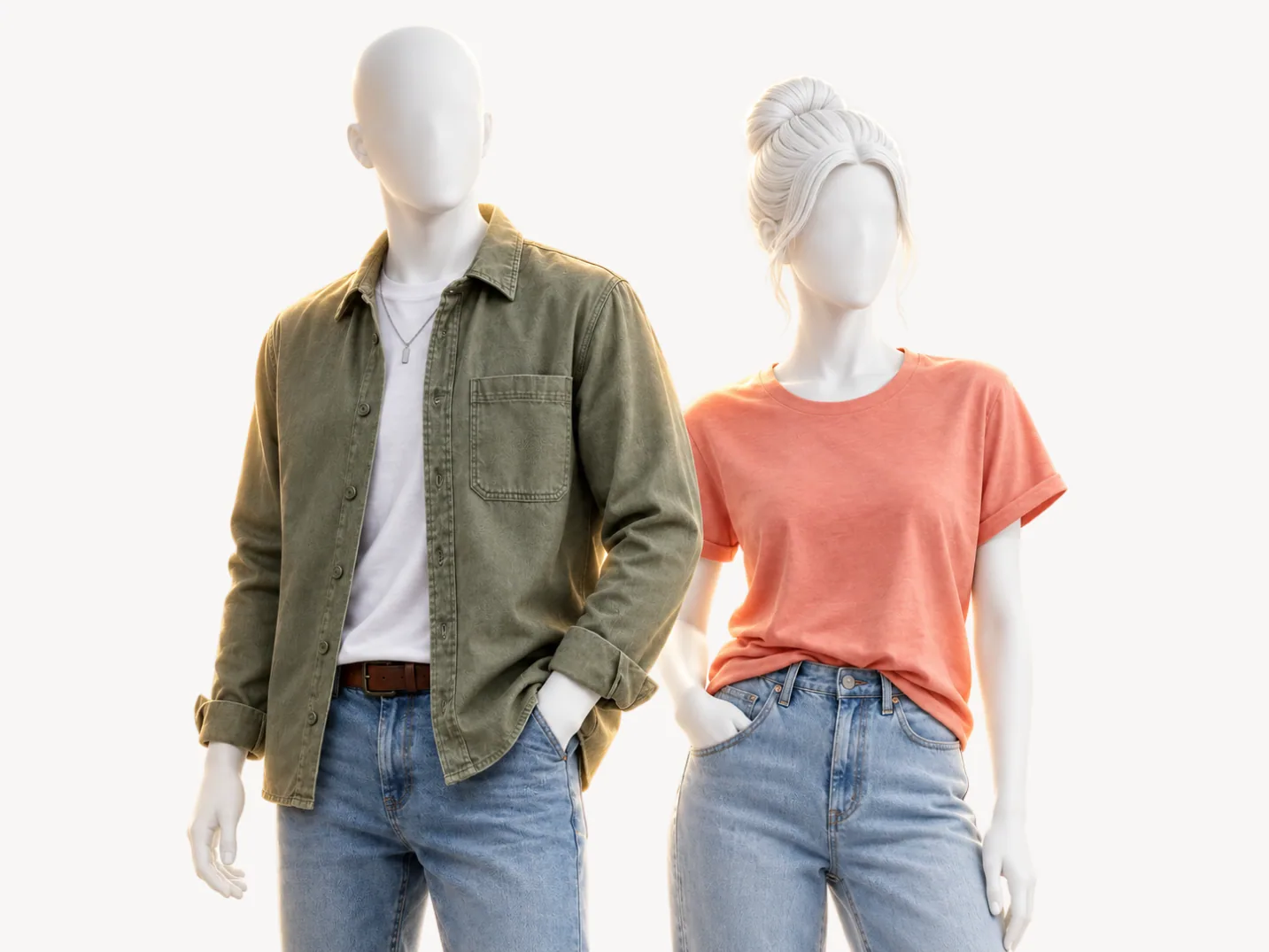 This pageLight Springwarm and light with low contrast |  Mistaken forLight Summercool and light with low contrast | 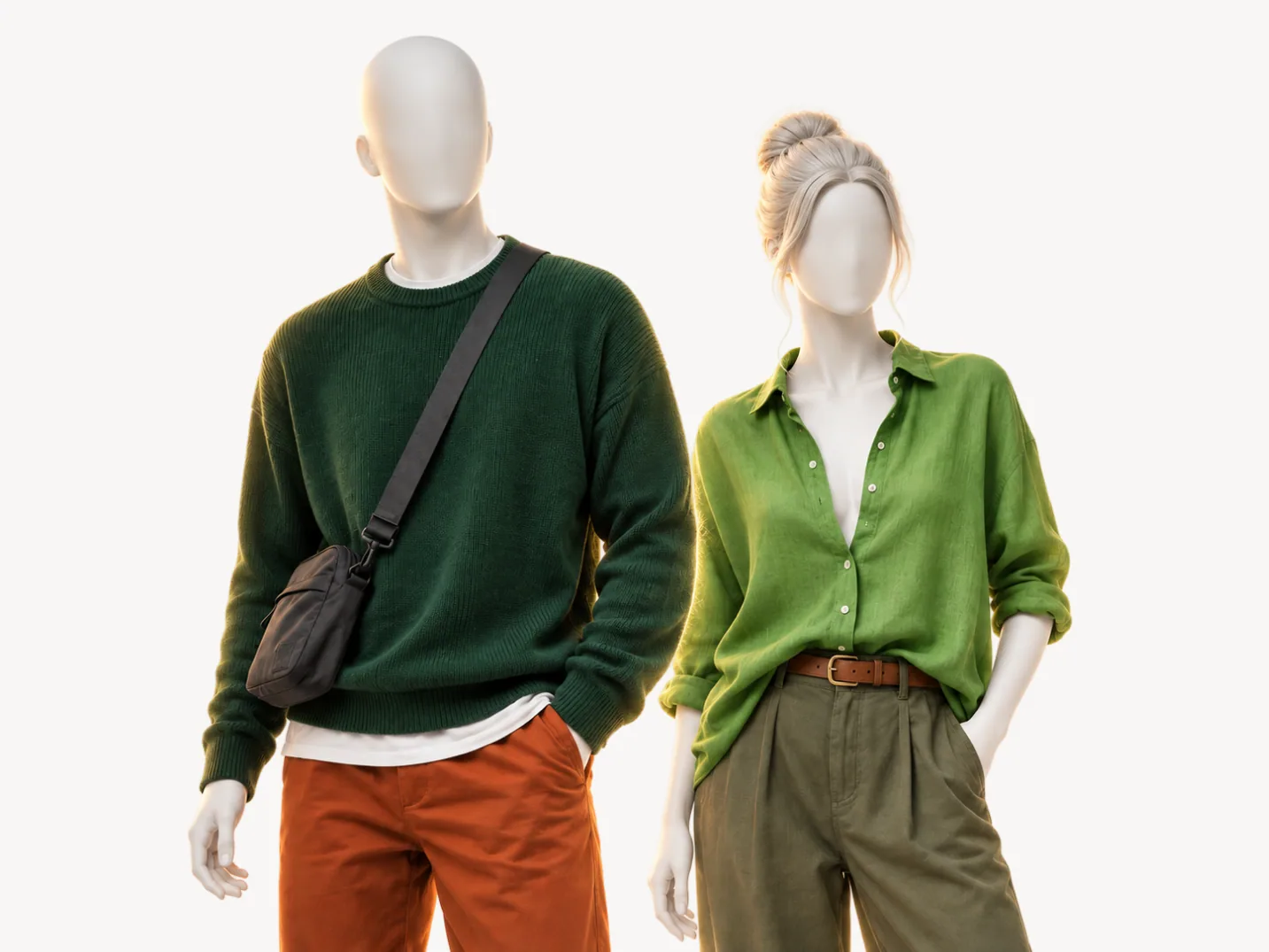 Mistaken forTrue Springfully warm and clear | |
|---|---|---|---|
| Undertone | warm | cool | warm |
| Value | light | light | medium |
| Chroma | saturated | muted | saturated |
| Metal | gold | silver | gold |
| Peach | |||
| Tomato red | |||
| Light gold | |||
| Soft navy | |||
| Ice blue | |||
| Ivory |
Light Summer. The look-alike: both seasons are light and low in contrast, and both wear the same soft periwinkle blue, greige and navy at the face. Yet the two pages give the same verdict on only 20 of the 50 colors, eight fewer than you share with True Spring, because undertone flips most of the palette.
Peach is the clearest tell, a Wear for you and a Skip for Light Summer, and ice blue is its mirror image. Hold the two at your face by a window and keep the one that leaves your skin clean rather than sallow or gray. If it stays close, ivory decides: a Wear at your collar, an accent only for Light Summer.
True Spring. Same family, same gold, more strength and more depth. The two pages give the same verdict on 28 of the 50 colors, three of them in a different place on the body. The tell is tomato red, True Spring's power color: a Wear there, an accent on your page.
Hold a tomato red sweater at your face: a True Spring holds its own beside it, while on a Light Spring the red arrives first and the face second. Soft navy and light gold run the other way, a Wear for you, while True Spring skips soft navy as too dusty and keeps light gold below the waist.
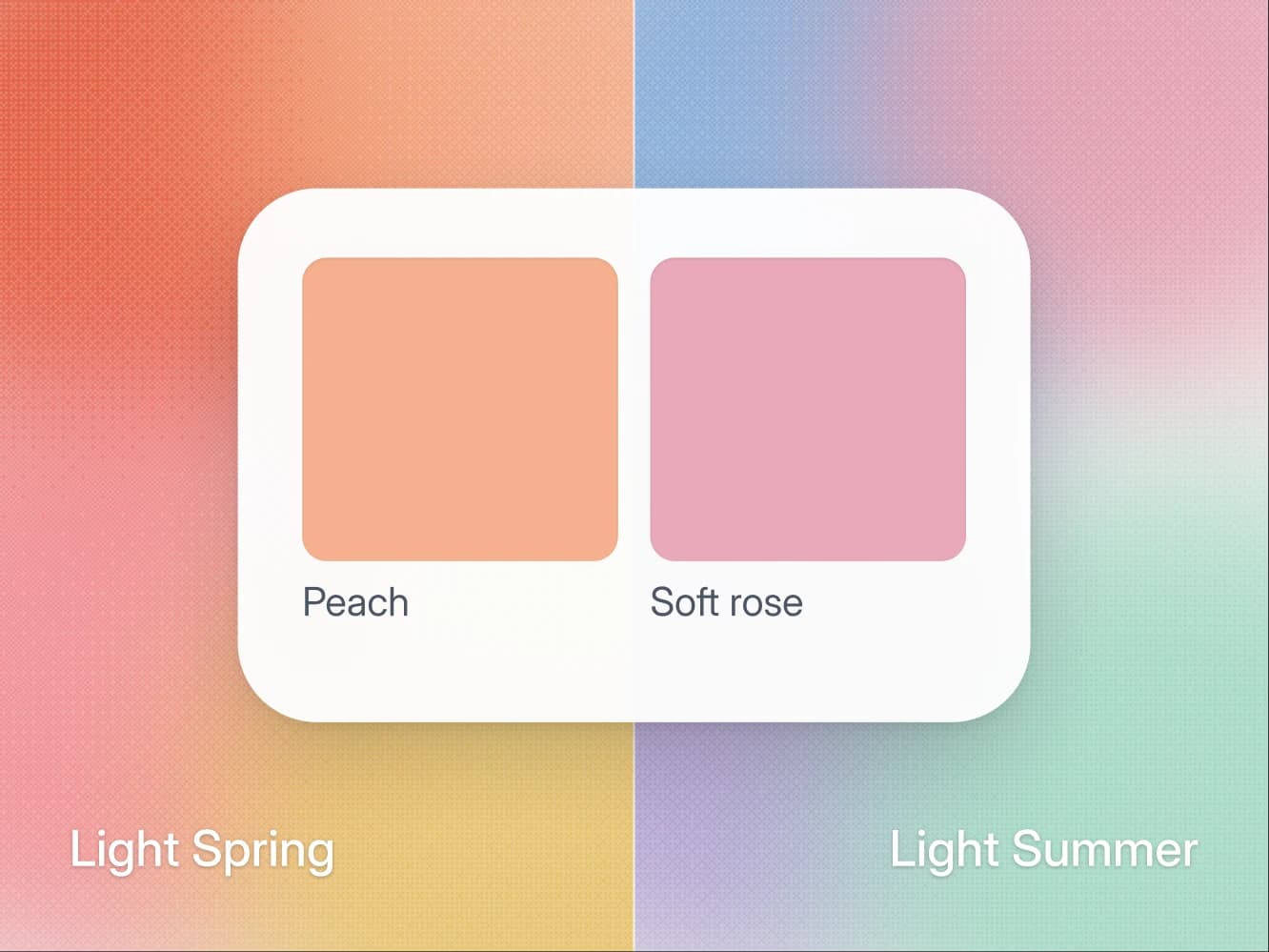
If the peach and ice blue test leaves you between the two light seasons, Light Spring vs Light Summer runs the deciding test step by step: a peach top against a soft rose one, read at the skin under the eye and the shadow under the jaw rather than at the cheek. If the doubt is True Spring, the tomato red sweater is the faster route. The sample analysis shows a full page of 50 verdicts with their reasons.
Where to go from Light Spring
How the color analysis works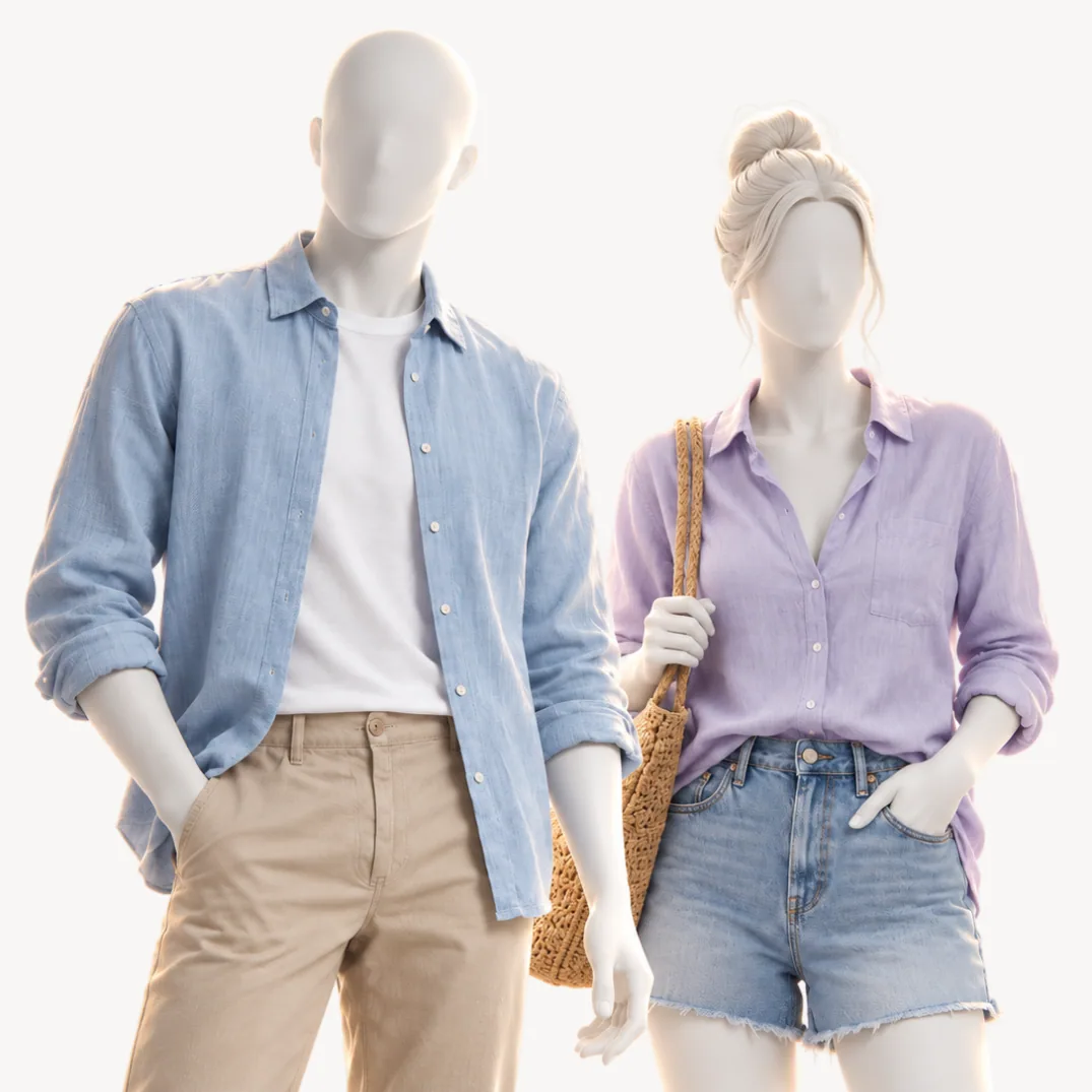 Color seasonLight Summercool and light with low contrast
 Color seasonTrue Springfully warm and clear
Seasons · 9 min
Light Spring vs Light Summer: how to tell which one you are
Both are light and low contrast, and both own periwinkle. Undertone is the main split, and the peach and pink test tells you which side you are on.
Seasons · 9 min
Find your undertone at home (warm, cool, or neutral)
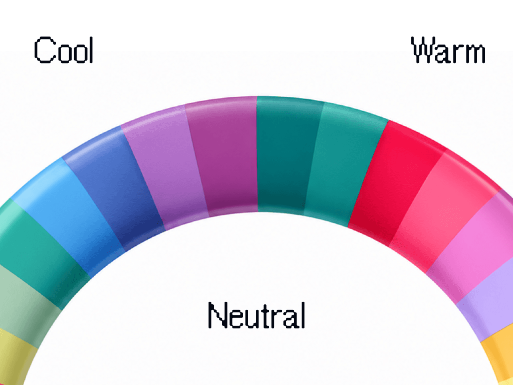
Three daylight tests to find your undertone at home: wrist veins, gold vs silver, white paper. Plus how to read a neutral or olive result.

Method · 8 min
How to take photos for an accurate color analysis
The light, the angles, and the white paper trick. How to take five photos that give a color analysis something real to work with.
- All 12 color seasons
FAQ
Light Spring questions.
Light Spring is warm and light with low contrast. The quick check is whether warm colors at a light value look better on you than their opposite, and whether gold suits you better than the other metal. That gets you close. The reason people land between two seasons is that the eye compares badly under mixed light, which is what a measured analysis is for.
Nothing dramatic. The colors furthest from your palette pull attention to shadows and to any unevenness in your skin, so you look tired rather than the color looking wrong. It shows most in the piece nearest your face and barely at all below the waist, which is why the palette matters more for a shirt than for trousers.
Below the waist only. Black is far darker than anything in your light, warm coloring, so near your face it is all anyone sees. Wear it as trousers or shoes and put soft navy or camel at the collar.
No. Light Spring is warm at its root, and that is the axis the whole system turns on. Two seasons can share a value and a chroma and still want opposite colors, because the undertone decides which version of a color suits you.
That is what the analysis does, but not from one photo and not from the photo alone. It reads five photos against your own answers about how you burn, what your veins look like and which metal suits you, and your answers outrank the photos where the two disagree. Your photos are used for your analysis and nothing else. They are never used to train AI models.
Yes, at full size: your page gives turquoise a Wear, the face included, so a turquoise shirt or knit works on its own. What it does not want is company: turquoise beside coral, or turquoise head to toe, is more color than a low contrast face can stand next to.
Below the waist, or small. Medium gray and charcoal are a Depends for trousers and shoes, and light gray is an accent only. All three grays are cool, so at the collar they drain the warmth your coloring runs on and the face looks flatter. Warm greige is the gray-beige to buy instead: a Wear, the face included, and a good color for a suit or a coat.
Barely. Your metal is gold, kept light and polished. Against golden skin silver reads cold and slightly gray, the same flatness pure white gives you, so a thin two-tone piece is the most of it you want. Gold covers every job silver would have done, from a watch to a buckle to the frames of your glasses.
The light ones, anywhere: camel and latte are a Wear, the face included. Chocolate and espresso are a Depends below the waist, right as boots, a belt or trousers and too heavy as a sweater. Rust and terracotta follow the same rule.
Light golden and strawberry shades, the ones closest to your natural color. Ash shades and very dark dyes pull against your coloring the way silver and black do. Whatever you dye it, the analysis reads your natural color: the questionnaire asks for it by the roots.
Another question about the method or your result? Write to us
Find out what suits you, and why.
A short questionnaire and five photos. Your key arrives by email, usually within 10 minutes.