Autumn · color season
Soft Autumn: your palette, and what to leave on the rail.
Soft Autumn is warm and muted with low contrast. Here is the palette that follows from that, the neutrals to build on, and how to wear them together.
- 8 core colors
- matte gold at the wrist
- 10 minutes to get yours
Last updated
At a glance
Where Soft Autumn sits, and what follows from it.
- Light Summer
- True Summer
- Soft Summer
- Soft Autumn
- True Autumn
- Deep Autumn
- Deep Winter
- True Winter
- Bright Winter
- Bright Spring
- True Spring
- Light Spring
Each season sits between the two it shades into. The two Light seasons meet at the top, the two Deep ones at the bottom, the two Bright ones on the clear side and the two Soft ones on the muted side. Spring and Autumn are warm, Summer and Winter are cool.
- Undertone
- warm
- Value
- medium
- Chroma
- muted
- Buy first
- Terracotta
- Metal
- Matte gold
- Keep from the face
- Golden yellow
- Ice blue
- Tomato red
- Forest green
- Mistaken for
- Soft SummerTrue AutumnHow they differ
Am I a Soft Autumn?
Soft Autumn is coloring that is muted first and warm second: low chroma, meaning grayed rather than clear, over a golden undertone, the cast under the skin, at a medium value, neither light nor dark, with little contrast between hair, skin and eyes.
Grayed warm colors such as sage, khaki and terracotta sit at that same low strength, so the skin looks even and the eyes lead, while clear or icy colors such as fuchsia and ice blue outshine the face and leave it looking gray and tired.
The Concept Wardrobe's Soft Autumn guide defines the season in the same order, muted as the primary trait and warm as the secondary, which places it between Soft Summer and True Autumn in the 12-season system. Chroma is what Albert Munsell, in A Color Notation (1905), called "the quality by which we distinguish a strong color from a weak one." A Soft Autumn sits toward the weak end, so most colors that suit you have some gray mixed into them.
Check yourself at a window in daylight, without makeup. Start with the eyes. A Soft Autumn iris is a mix, soft hazel, grayed green or muted brown, and at conversation distance its pattern blurs instead of resolving into sharp lines.
The hair runs from strawberry blond to medium golden brown with a slightly ashy cast, and the skin from fair to tan with a hint of sand: warm, but dusty. That ash is why, as the clothing brand Kettlewell puts it, Soft Autumns "very often look like they might be Summers."
If you dye your hair, judge by the brows and the roots, which is what the questionnaire asks for. Wrist veins are the weakest signal: green, or green mixed with blue, says warm-neutral and nothing about softness, the trait this season leads with (how to read them).
The shop test goes straight to that trait. Hold a terracotta knit under your chin, then an orange one. Both are warm, so only strength differs: terracotta settles into a Soft Autumn face and the eyes look clearer, while orange arrives before the face does and the skin beside it looks grayer. A Wearly Labs analysis marks the pair the same way, terracotta a Wear and orange a Skip, "too clean for your softness."
It does that for all 50 colors, each Wear, Depends or Skip with its reason, and Depends means below the waist or as an accent. For Soft Autumn the count is 14 Wear, 23 Depends and 13 Skip. Warmth alone does not put you here, because depth counts too.
The sample analysis, the real result of co-founder Filip Poláček, is a Deep Autumn, and it sends khaki to the trousers: "Too soft in depth for your face, it settles fine on the lower body." Peach, a Soft Autumn core color, is a Skip there: "Too light and thin a tone for a face this rich." The eight colors below are the ones a Soft Autumn wears right up to the jaw.
Check the direction first.
Four questions from the questionnaire, scored by the rules the analysis uses. They show a direction, not a season: the analysis also reads your photos.
Question 1 of 4
Your natural hair color?
Pick the closest match. If you dye it, go by your roots.
The palette
The eight colors Soft Autumn is built on.
- Anywhere, the face included
Gray-green with a trace of yellow, at exactly your low strength. A sage knit or overshirt goes over every neutral you own; Soft Summer wears it too, so it suits you without proving which soft season you are.
- Anywhere, the face included
Your power color: orange clay with the brightness taken out. Warm enough for your undertone and quiet enough for your chroma, it belongs at the collar as a knit, a scarf or a lipstick.
- Anywhere, the face included
Half color, half neutral, and a Wear right up to the face for you. Try it above the waist, as a khaki shirt or a field jacket, and let the chinos be the second piece.
- Anywhere, the face included
Proof that a muted season can wear yellow: the brown and gray in mustard bring it down to your strength. A mustard cardigan over khaki reads rich rather than loud.
- Anywhere, the face included
The coat. Light enough for medium coloring and warm enough for golden skin, a camel coat over ivory and chocolate needs nothing added to it.
- Anywhere, the face included
Orange with brown already mixed in, which is how a muted season gets to wear it while orange itself is a Skip. Rust corduroy, a rust sweater, a rust dress.
- Anywhere, the face included
Your light, yellow green, and a Wear at the face for Soft Autumn alone among the three Autumns. Wear it where summer asks for it: a linen shirt, a cotton knit, a sundress.
- Anywhere, the face included
The light color that proves the season: Soft Summer skips it and True Autumn keeps it to an accent. A matte peach blouse, or a peach blush, sits right against your skin's own warmth.
Neutrals and metal
Your neutrals, your white, your metal
- Ivory
- Latte
- Warm greige
- Khaki
- Chocolate
- Matte gold
Soft Autumn neutrals are ivory, latte, warm greige, khaki and chocolate, all five a Wear at the face and all sandy and low in strength, so any two sit together without a hard edge. Chocolate is the darkest color your palette allows at the collar, which makes it your black: the coat, the suit, the boots. The Concept Wardrobe gives the same answer, dark browns in place of black. Camel and medium denim are Wear colors on the same footing, so a denim shirt is one of your easiest buys.
Missing from the list are gray, black and navy, the three neutrals most wardrobes are built on. Each is colder or harder than your coloring, so a Soft Autumn base starts in brown, khaki and latte instead, and the section below says where the other three can still go.
Your white is ivory. Pure white is colder and brighter than anything in warm, muted coloring, so beside it the skin looks tired and the outfit gains an edge of contrast your face cannot answer. Soft white, the Summer white, is closer and still slightly cold. Both are a Depends on a Soft Autumn page, below the waist: white jeans and white sneakers stay, and the white shirt becomes an ivory one.
Your metal is matte gold. A polished finish throws a hard shine that behaves like a clear color, which a muted season cannot carry, so pick brushed or antique gold and warm bronze. The Concept Wardrobe says both metals look good on neutral-warm skin and gold looks better, and it ranks brushed, matte, satin and hammered finishes ahead of shiny ones, so silver you own can stay if it is brushed or hammered.
Your power color is terracotta: at the collar it warms the face without turning orange. The colors that go wrong for you fail on temperature, on strength or on depth, and the pairs below set each kind beside the color that wins.
At the face
Wear this, skip that
- MustardGolden yellow
Too clean for your softness.
- IvoryIce blue
Too cool beside your warmth.
- TerracottaTomato red
Too clean for your softness.
- OliveForest green
Too dark for your light.
The colors that fight you
Thirteen of the 50 colors are a Skip for Soft Autumn, and your page gives each one its reason. Twelve fall into the three groups below; the thirteenth is turquoise, and warm aquamarine is the blue-green you keep, as an accent. Another 23 colors are a Depends, which moves a color rather than banning it: trousers, shoes or an accent.
Too cool beside your warmth. Sharp red, raspberry, fuchsia, lemon, emerald, royal blue, ice blue and deep purple. Each leans cool against skin that leans warm, and most are clear as well, so they miss both of your traits at once. That double miss is why fuchsia can look wonderful on the hanger and hostile at your jaw, and why ice blue loses to ivory in the pairs above.
Too clean for your softness. Tomato red, orange and golden yellow. These are warm, so they pass the vein test, and they fail on strength instead: at full saturation the garment reads first and your face second. The pairs above give two of them a replacement at your strength, terracotta for tomato red and mustard for golden yellow.
Too deep for your coloring. Forest green, on its own. The temperature is right and the depth is not: deeper than your medium coloring, it leaves a shadow under the jaw. Olive, its partner in the pairs above, is the deep green that stays.
The neutrals people buy by accident. A charcoal suit, a black coat, a navy blazer, a white shirt. None is a Skip and none belongs at your collar. The grays, black and pure white are a Depends below the waist, soft navy is an accent and midnight blue goes to trousers, which leaves the navy blazer no place at all.
In a shop, hold a new piece against a khaki or camel sleeve by the window. If it looks lit from inside beside them, it is above your strength. If it sits in the same quiet register, it belongs.
Every color
All 50 colors, judged for Soft Autumn.
Choose a color to see where it goes, the reason, and what the two seasons Soft Autumn is mistaken for do with it. 13 of the 50 are a Skip.
Use the arrow keys to move from color to color.
Anywhere, the face included
A shirt, a coat, anywhere.
The same color in the seasons Soft Autumn is mistaken for
- Soft SummerNot worn
- True AutumnAnywhere, the face included
Anywhere, the face included
A shirt, a coat, anywhere.
The same color in the seasons Soft Autumn is mistaken for
- Soft SummerNot worn
- True AutumnAnywhere, the face included
How to combine Soft Autumn colors
Your rule is warm, grayed layers at low contrast, with no bright cool in the frame.
Low contrast means a short step from the lightest piece to the darkest, the same short step your hair, skin and eyes take, so the outfit repeats your coloring instead of competing with it. A bright cool breaks both halves of the rule at once. When an outfit feels flat, add texture rather than brightness: suede, brushed wool and raw linen give depth without raising chroma.
- Office, men's: a camel overcoat over a sage merino knit and an ivory shirt, chocolate wool trousers, chocolate suede shoes and a matte gold watch.
- Weekend, women's: a rust cardigan over a latte tee, khaki wide-leg trousers and camel loafers, with a coral scarf as the one accent.
- Summer: a leaf green linen shirt, white jeans and camel sandals.
- Evening, women's: a peach silk blouse, chocolate wide-leg trousers, a mustard leather clutch and brushed gold earrings.
Soft Summer builds the same quiet outfits in cool grays and soft white, which is exactly where the two seasons get mixed up.
Mistaken for
Seasons Soft Autumn gets confused with
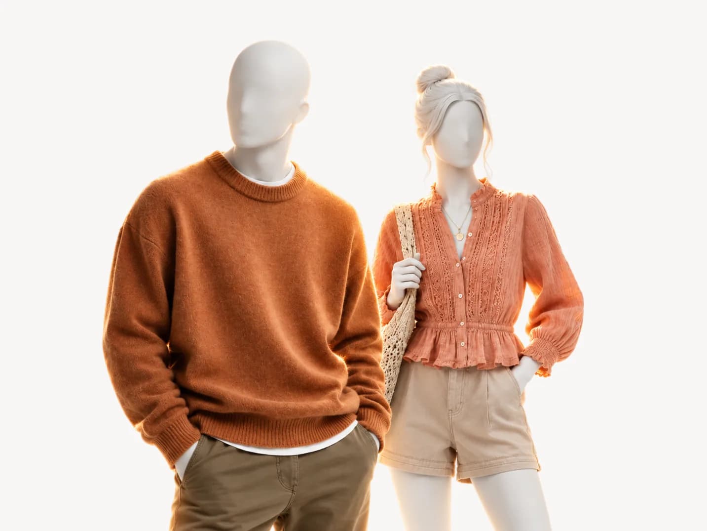 This pageSoft Autumnwarm and muted with low contrast | 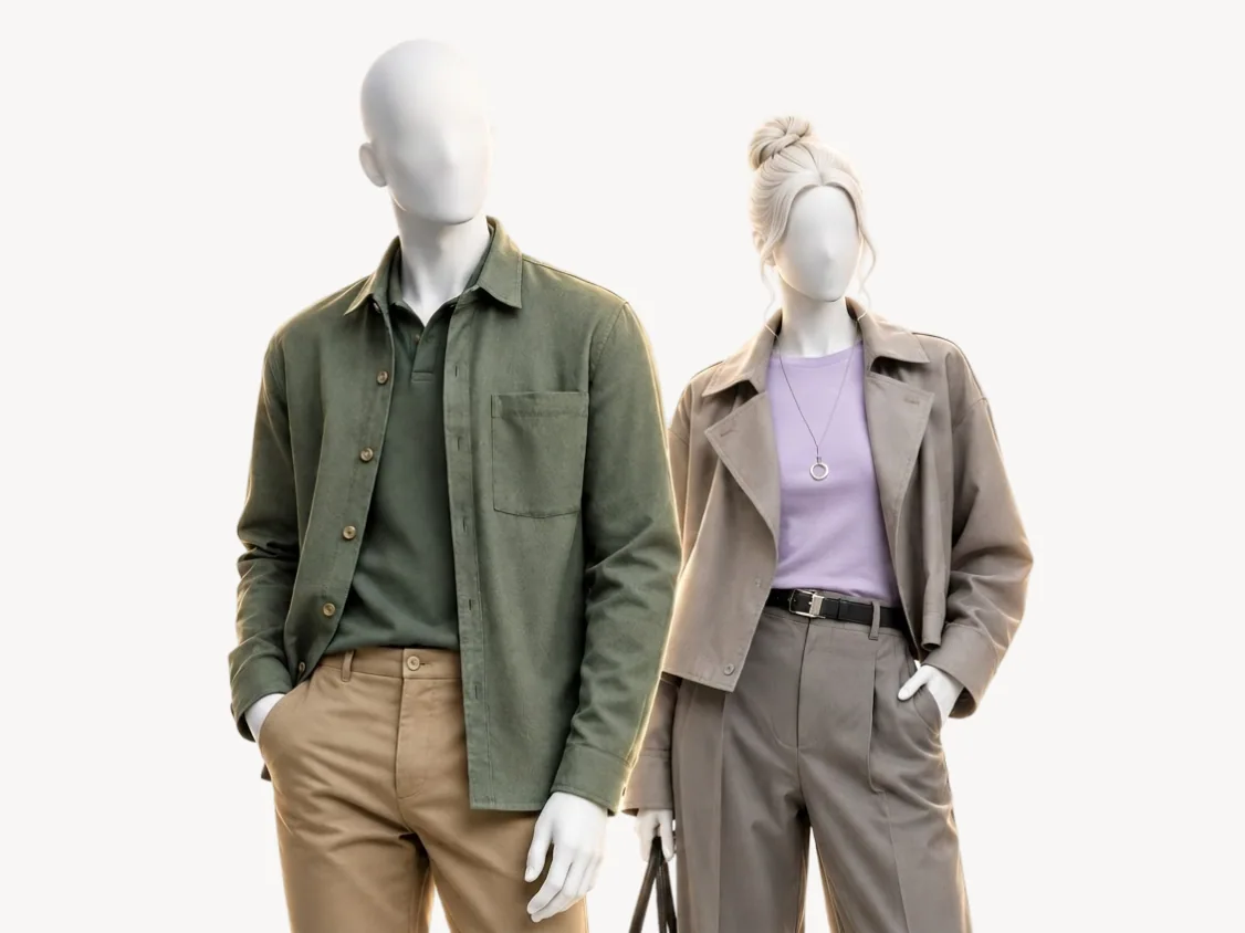 Mistaken forSoft Summercool and grayed down | 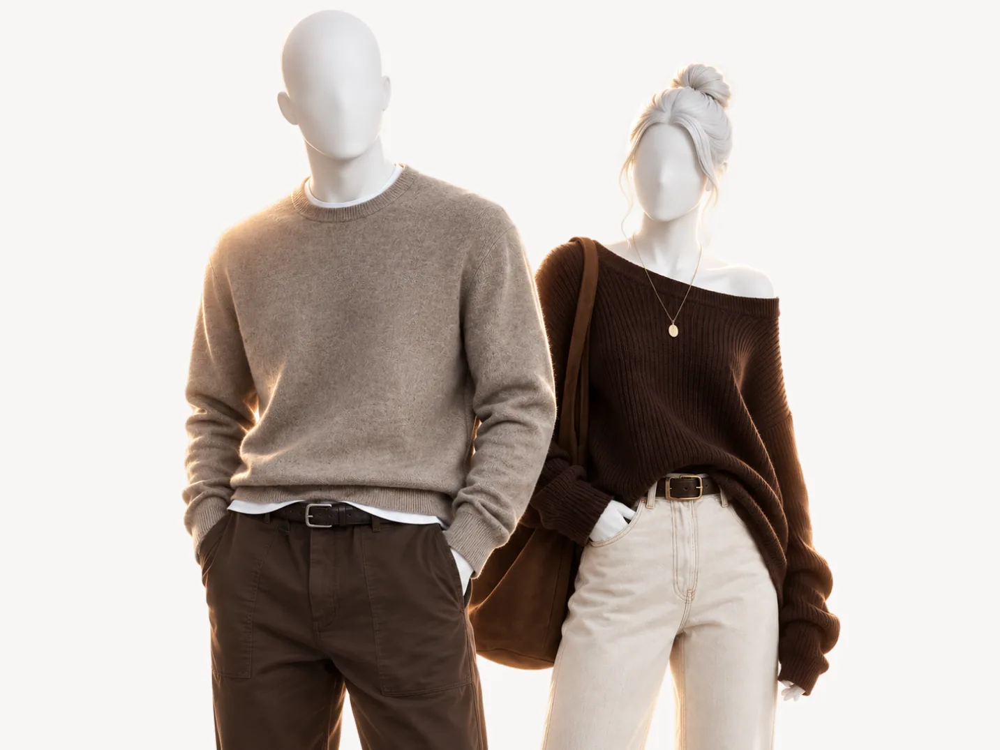 Mistaken forTrue Autumnfully warm and rich | |
|---|---|---|---|
| Undertone | warm | cool | warm |
| Value | medium | medium | medium |
| Chroma | muted | muted | saturated |
| Metal | matte gold | matte silver | gold |
| Peach | |||
| Mustard | |||
| Golden yellow | |||
| Forest green | |||
| Ivory | |||
| Soft white |
Soft Summer. Your neighbor across the line between warm and cool. Both seasons lead with softness, sit at a medium value and run at low contrast, so they part on the second trait only: warm for you, cool for Soft Summer. That one trait still flips most of the palette, and the two give the same verdict on just 23 of the 50 colors.
The whites show it first: ivory is a Wear for you and a Depends below the waist for Soft Summer, and soft white runs the other way. Peach and mustard go further, a Wear for you and a Skip for Soft Summer. For a mirror test, The Concept Wardrobe suggests a plain mid gray at the face: eyes that turn grayish point to Soft Summer, eyes that stay green or hazel point to Soft Autumn.
True Autumn. The same family, warmth and medium value, so the vein test and the gold test barely separate you, and the table above marks both seasons warm and medium, with chroma and metal apart: muted and matte gold for you, saturated and gold for True Autumn. What differs is how much strength the colors keep. Munsell described it with two leaves of the same color: the one left out in the weather "fades into a neutral gray," while the one pressed in a book "preserves its strong chroma almost intact."
True Autumn is the pressed leaf, and Soft Autumn sits partway toward the gray one. The two give the same verdict on 32 of the 50 colors and part where strength decides: golden yellow and forest green are a Wear for True Autumn and a Skip for you. Hold golden yellow at your jaw in daylight. If it takes over your face, you are the Soft Autumn.
If you are still between two, the Soft Autumn vs Soft Summer comparison runs the white test step by step, and Soft Autumn vs True Autumn settles the strength question with a defocus test at a window. A color analysis answers it from five photos and your answers: AI reads the photos, with a white sheet of paper in frame to correct the light, fixed rules make the call, and your answers weigh the most, as the method page sets out.
Where to go from Soft Autumn
How the color analysis works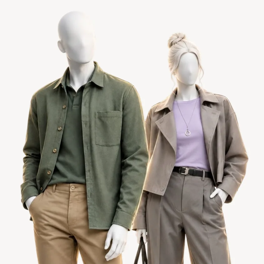 Color seasonSoft Summercool and grayed down
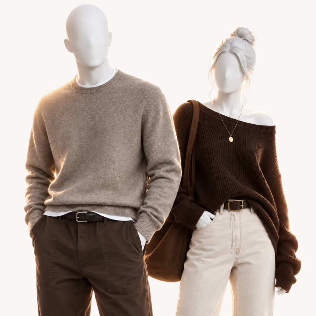 Color seasonTrue Autumnfully warm and rich
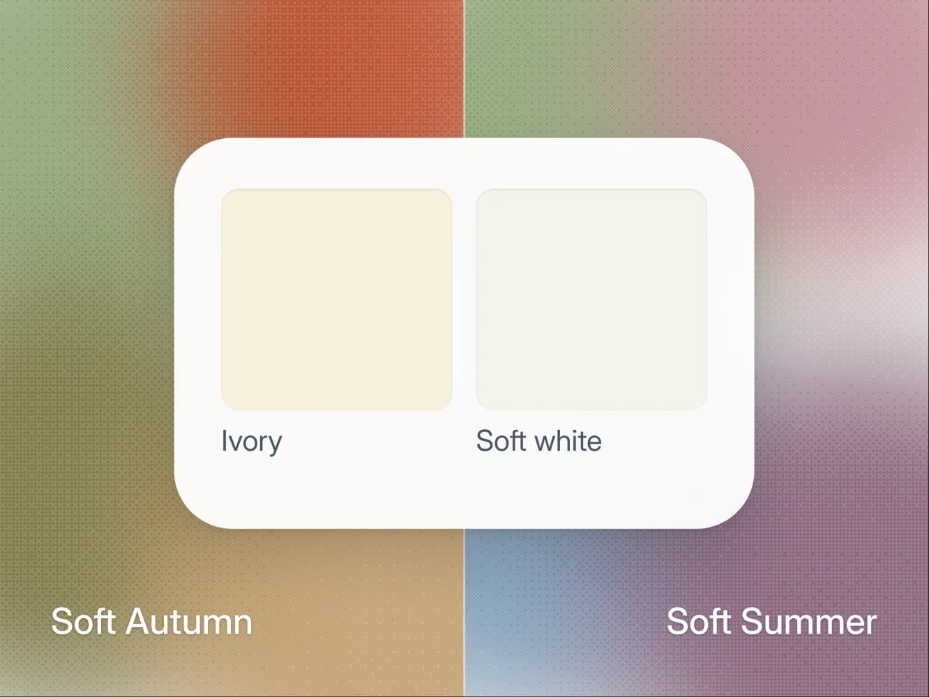
Seasons · 12 min
Soft Autumn vs Soft Summer: how to tell which one you are
Both are muted, medium and low contrast. Undertone splits them: ivory and matte gold for Soft Autumn, soft white and matte silver for Soft Summer.
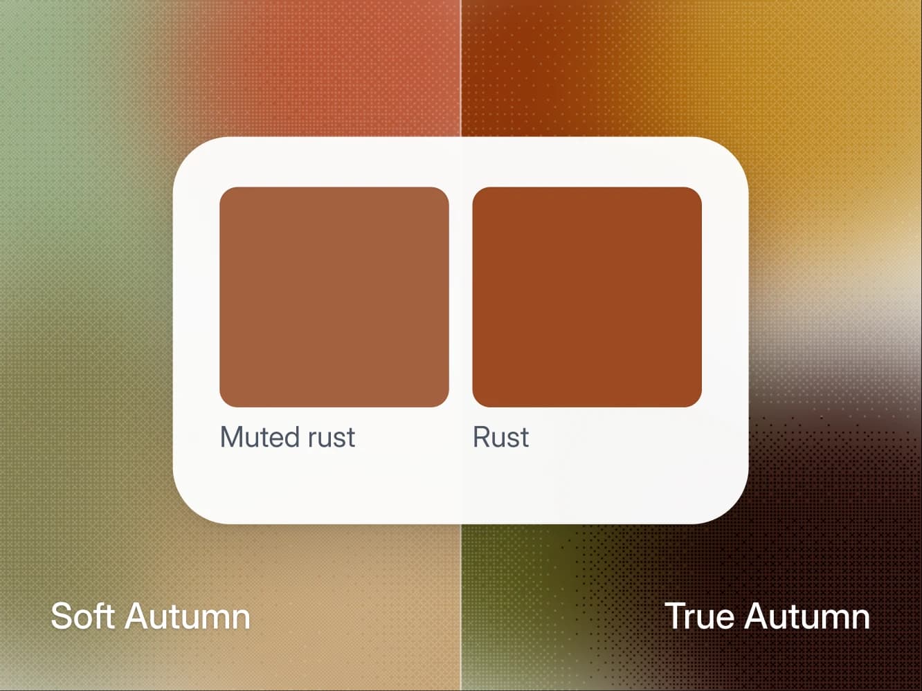
Seasons · 11 min
Soft Autumn vs True Autumn: how to tell which one you are
Both are warm. True Autumn wears rust and golden yellow at full strength, Soft Autumn grayed down, and one defocus test at a window shows which you are.
Seasons · 9 min
Find your undertone at home (warm, cool, or neutral)
Three daylight tests to find your undertone at home: wrist veins, gold vs silver, white paper. Plus how to read a neutral or olive result.

Method · 8 min
How to take photos for an accurate color analysis
The light, the angles, and the white paper trick. How to take five photos that give a color analysis something real to work with.
- All 12 color seasons
FAQ
Soft Autumn questions.
Soft Autumn is warm and muted with low contrast. The quick check is whether warm colors at a medium value look better on you than their opposite, and whether matte gold suits you better than the other metal. That gets you close. The reason people land between two seasons is that the eye compares badly under mixed light, which is what a measured analysis is for.
Nothing dramatic. The colors furthest from your palette pull attention to shadows and to any unevenness in your skin, so you look tired rather than the color looking wrong. It shows most in the piece nearest your face and barely at all below the waist, which is why the palette matters more for a shirt than for trousers.
Below the waist. Black is too hard and too dark for your low contrast and drains the warmth from your face. Keep it to shoes or trousers and wear latte, khaki or warm greige near your face.
No. Soft Autumn is warm at its root, and that is the axis the whole system turns on. Two seasons can share a value and a chroma and still want opposite colors, because the undertone decides which version of a color suits you.
That is what the analysis does, but not from one photo and not from the photo alone. It reads five photos against your own answers about how you burn, what your veins look like and which metal suits you, and your answers outrank the photos where the two disagree. Your photos are used for your analysis and nothing else. They are never used to train AI models.
Warm-neutral. It leans warm, which is why matte gold and ivory work, and it holds enough neutrality to wear sage and warm greige at the face. Softness leads and warmth comes second, so its colors run less warm than True Autumn's, and the skin reads neutral to neutral-warm: silver looks fine on it, gold looks better.
Terracotta. Worn near the face, against khaki, ivory or latte, it is the single color that does the most at your collar. It is also a Skip for Soft Summer, so a terracotta top doubles as a test between the two soft seasons.
A warm, softened shade near your natural one: golden brown, honey, a muted copper. Blue-black and icy platinum bring the hard contrast and the cold cast your palette keeps away from the face, for the same reasons black and pure white stay below your waist. Whatever you choose, the questionnaire asks for your natural color, read at the roots.
Below the waist. Light gray, medium gray and charcoal are a Depends for you: trousers, skirts and shoes. At the collar, warm greige does the work gray does in other wardrobes, a gray with the warmth left in.
Only the icy ones. Peach is a core color and it is light, so the line runs through coldness and clarity rather than lightness. Ice blue is the one pastel that is a Skip, mint and periwinkle stay as accents, and lavender and soft pink go below the waist.
Another question about the method or your result? Write to us
Find out what suits you, and why.
A short questionnaire and five photos. Your key arrives by email, usually within 10 minutes.